
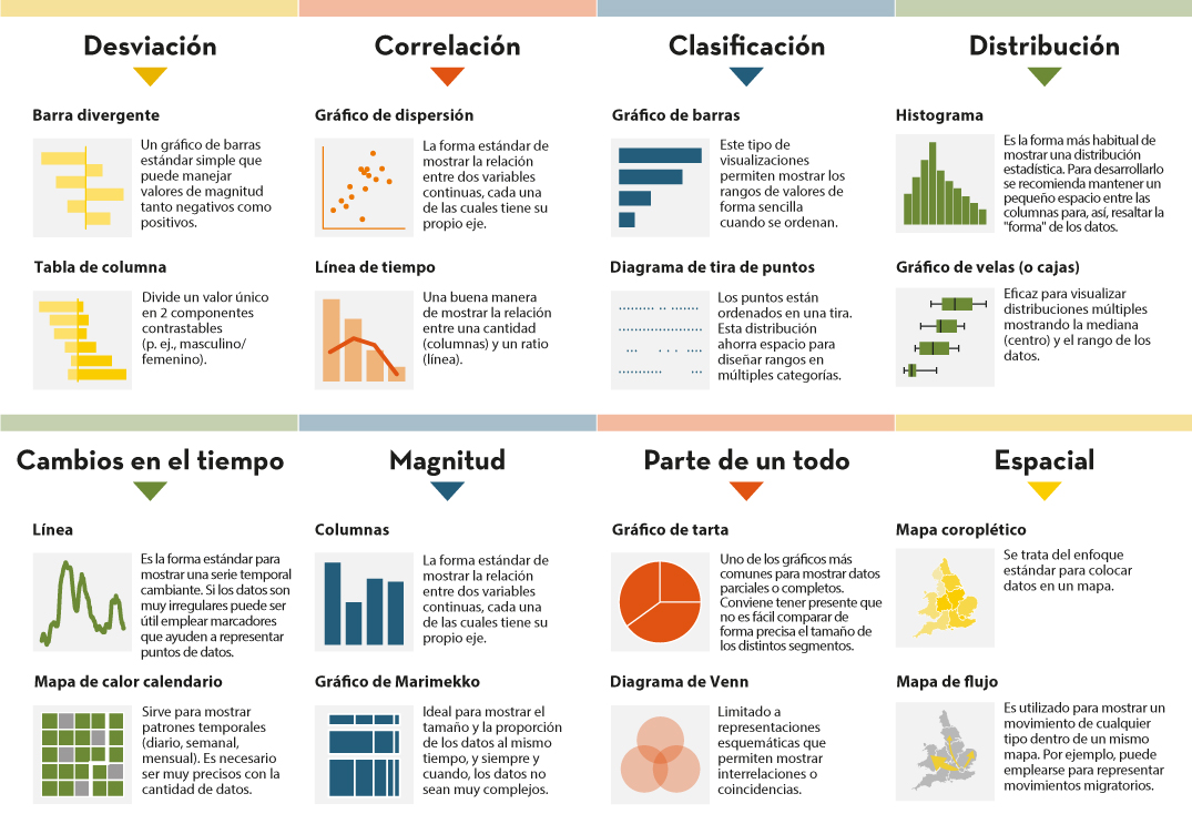
Description
Open data should be inherently accessible, meaning it must be available for free and without barriers that could restrict access and reuse. Accessibility is a fundamental and complex issue because it means that these data sets should not only be available in reusable formats but also that anyone should be able to access and interpret them.
To ensure that access to open data is democratic, it must meet fundamental accessibility criteria that affect both the platform (web) and the way its content is displayed (e.g., through visualizations). In this context, this post delves into the essential principles to ensure that open data is inclusive and useful for a diverse audience. Discover recommendations aimed at improving the accessibility of open data portals and platforms, as well as best practices for data visualization, with a focus on the importance of inclusive design that considers the needs of all users.
Levels of Web Accessibility
When focusing on the platform, open data portals can refer to the web accessibility specifications identified by the World Wide Web Consortium (W3C), the leading international organization for web standardization, which sets guidelines for web accessibility that a website should meet.
-
Perceivable: Information and user interface components must be presented to users in ways they can perceive, regardless of any physical or cognitive disabilities they might have.
-
Operable: User interface components and navigation must be operable. Therefore, users who use the keyboard instead of the mouse must be able to interact correctly with a webpage; no time limit should be imposed on users to complete interactions, and there should be ways to navigate and find content easily.
-
Understandable: Text must be clear and easy to understand, the user interface and navigation must be consistent and predictable, and webpages must help users when they make mistakes filling out a form, for example.
- Robust: Content must be robust enough to be reliably interpreted by a variety of web browsers and other software, such as screen readers.
Each guideline has compliance criteria that can be tested. These criteria are classified into three levels: A, AA, AAA. The levels, from least to most, are:
- A (Minimum): All non-text content like images and videos must have textual alternatives; videos and audios must have subtitles; navigation should be possible using only the keyboard; the page must have a clear title and assigned language.
- AA (Acceptable): In addition to all level A requirements, other functionalities are added, such as live videos also having subtitles; the contrast ratio between text and background must be at least 4.5:1; text must be resizable up to 200% without losing content or functionality; text images should not be used.
- AAA (Optimal): This level requires all the features of levels A and AA, along with other requirements such as sign language interpretation for videos or a contrast ratio between text and background of at least 7:1.
Accessible Open Data Websites and Visualizations
Considering the conditions and recommendations set by W3C, the European Open Data Portal offers a Data Visualization Guide that includes best practices for accessibility in data visualization. Following the guidelines of this Guide, to respect inclusivity from the design stage, a good data visualization must meet three conditions: it must be perceivable, understandable, and adaptable.
-
Perceivable: Colors must be adapted for people with vision problems, and the font size and contrast must be adequate.
-
Understandable: The interface must be user-friendly and intuitive. Whenever possible, the graphic should be understandable regardless of the user's background.
- Adaptable: The visualization must be responsive, meaning it adapts to the dimensions of each electronic device, flexible, editable, or with viewing options for people with cognitive disabilities.
Once these three conditions are identified, we can analyze if our graphic meets them by paying attention to issues such as the use of an appropriate color palette for people with vision problems, good contrast, and understandable titles and text. It is also advisable to include alternative text (adapted for people with intellectual disabilities) and, when necessary, a visualization guide to understand the graphic.
Tools to Improve Accessibility
To apply accessibility principles in data visualization, we can use three resources:
-
Accessibility Audit Tools: Conducting accessibility audits is a good practice, for example, using Chartability which analyzes websites considering all aspects related to inclusion.
-
HTML: The fundamental web markup language was developed with accessibility in mind, so using its elements semantically correctly is a simple way to ensure a basic level of accessibility. This applies to the context of a visualization (which should use elements like headers and paragraphs correctly, for example), interactive elements (like links, buttons, and inputs), and the elements of a visualization itself. It is better to offer a visualization in HTML than in image format (jpg or png) whenever possible. When not possible, it is necessary to provide an accessible alternative (an alternative text, as mentioned earlier).
- SVG: Scalable Vector Graphics (SVG) is a format for two-dimensional vector graphics, both static and animated, in Extensible Markup Language (XML) format, meaning it is composed of code and its specification is an open standard developed by W3C to generate accessible graphics.
- Datawrapper: Among many data visualization tools, Datawrapper offers the possibility to test accessible color palettes and write alternative descriptions, among other accessibility-related functions.
In summary, data visualization is a method to make a data set and its visualizations more accessible. Taking these accessibility tips into account and incorporating them by default into the design when presenting a data set visually will enrich the result and reach a wider audience.
Content developed based on the Data Visualization Guide from the European Open Data Portal: https://data.europa.eu/apps/data-visualisation-guide/accessibility-of-data-visualisation

Comments