The importance of graphical visualization of data


Fecha de la noticia: 22-05-2018

"The simple graph has brought more information to the data analyst’s mind than any other device.” — John Tukey
The graphic visualization of data constitutes a discipline within data science universe. This practice has become important milestones throughout history in data analytics. In this post we help you discover and understand its importance and impact in an enjoyable and practical way.
But, let's start the story at the beginning. In 1975, a 33-year-old man began to teach a course in statistics at Princeton University, laying the foundations of the future discipline of visual analytics. That young man, named Edward Tufte, is considered the Leonardo da Vinci of the data. Currently, Tufte is a professor emeritus of political science, statistics and computer science at Yale University. Between 2001 and 2006, Professor Tufte wrote a series of 4 books - considered already classic - on the graphic visualization of data. Some central ideas of Tufte's thesis refer to the elimination of useless and non-informative elements in the graphs. Tufte stand for the elimination of non-quantitative and decorative elements from the visualizations, arguing that these elements distract attention from the elements that are really explanatory and valuable.
From the simplest graph to the most complex and refined one (figure 1), all graphs offer high value both to the analyst, during his data science process, and to the end user, to whom we are communicating a data-based story.
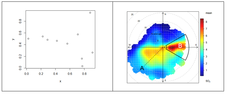
Figure 1. The figure shows the difference between two graphical visualizations of data. On the left, an example of the simplest data visualization that can be performed. Point representation in Cartesian coordinates x | y. On the right, an example of a complex data visualization in which the distribution of a pollutant (SO2) is represented in polar coordinates. The axes represent the wind directions N | S E | W (in degrees) while the radius of the distribution represents the wind speed according to the direction in m / s. The colour scale represents the average concentration of SO2 (in ppb) for those directions and wind speeds. With this type of visualization we can represent graphically three variables (wind direction, wind speed and concentration of pollutants) in a "flat" graph with two dimensions (2D). 2D visualization is very convenient because it is easier to interpret for the human brain.
Why is graphic visualization of data so important?
In data science there are many different types of data to analyze. One way of classifying data is according to their level of logical structure. For example, it is understood that data in spreadsheet-like formats - those data that are structured in the form of rows and columns - are data with a well-defined structure - or structured data. However, those data such as the 140 characters of a twitter feed are considered data without structure - or unstructured data. In the middle of these two extremes is a whole range of greys, from files delimited by special characters (commas, periods and commas, spaces, etc.) to images or videos on YouTube. It is evident that images and videos only make sense for humans once they are visually represented. It would be useless (for a human) to represent an image as a matrix integrated by numbers that represent a combination of RGB colors (Red, Green, Blue).
In the case of structured data, its graphic representation is necessary for all stages of the analysis process, from the exploratory stage to the final presentation of results. Let's see an example:
In 1963, the American airline company Pam Am used the graphic representation (time series 1949-1960) applied to the monthly number of international passengers in order to forecast the future demand for aircraft and place a purchase order. In the example, we see the difference between the matrix representation of the data and its graphic representation. The advantage of graphically representing the data is obvious with the example of Figure 2.
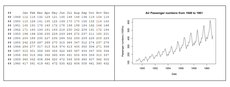
Figure 2. Difference between the tabular representation of the data and the graphic representation or visualization.
The graphic visualization of the data plays a fundamental role in all stages of data analysis. There are multiple approaches on how to perform a data analysis process correctly and completely. According to Garrett Grolemund and Hadley Wickham in their recent book R for Data Science, a standard process in data analysis would be as follows (figure 3):
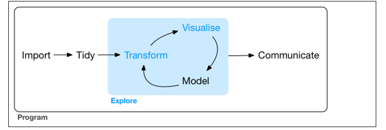
Figure 3. Representation of a standard process using advanced data analytics.
Data visualization is at the core of the process. It is a basic tool for data analyst or data scientist who, through an iterative process, is transforming and composing a logical model with data. Based on the visualization, the analyst discovers the secrets buried in the data. The visualization allows quickly:
- Discard unrepresentative or erroneous data.
- Identify those variables that depend on each other and, therefore, contain redundant information
- Cut the data to be able to observe them from different perspectives.
- Finally, check that those models, trends, predictions and groups that we have applied to the data give us back the expected result.
Tools for visual data analysis
So important is the graphic visualization of data in all areas of science, engineering, business, banking, environment, etc. that there are many tools to design, develop and communicate the graphic visualization of the data.
These tools cover a broad spectrum of the target audience, from software developers, to data scientists, journalists or communication professionals.
- For software developers, there are hundreds of libraries and software packages containing thousands of types of visualizations. The developers just have to load these libraries in their respective programming frameworks and parameterize the type of graphic they wish to generate. The developer only has to indicate the data source that he wants to represent, the type of graph (lines, bars, etc.) and the parameterization of that graph (scales, colors, labels, etc.). In the last few years, web visualization has been in fashion, and the most popular libraries are based on JavaScript frameworks (most open source). Perhaps one of the most popular, according to its power, is D3.JS, although there are many more.
- The data scientist is accustomed to working with a concrete analysis framework that normally includes all the components, such as the visual analysis engine of the data, among others. Currently, the most popular environments for data science are R and Python, and both include native libraries for visual analytics. Perhaps the most popular and powerful library in R is ggplot2, while, matplotlib and Plotly are among the most popular in Python.
- For professional communicators or non-technical personnel from the different business areas (Marketing, Human Resources, Production, etc.) that need to make decisions based on data, there are tools - which are not only visual analytics tools - with functionalities to generate graphic representations of the data. Modern self-service Business Intelligence tools such as MS Excel, MS Power BI, Qlik, Tableau, etc. are great tools to communicate data without the need of programming or coding skills.
In conclusion, the visualization tools allow all these professionals to access to data in a more agile and simple way. In a universe where the amount of useful data to be analysed is continuously growing, this type of tools are becoming more and more necessary. This tools facilitate the creation of value from the data and, with this, improve decisions making regarding the present and the future of our business or activity.
If you want to know more about data visualization tools, we recommend the report Data visualization: definition, technologies and tools, as well as the training material Use of basic data processing tools.
Content prepared by Alejandro Alija, expert in Digital Transformation and innovation.
Contents and points of view expressed in this publication are the exclusive responsibility of its author.