Noticia
On August 1, the Junta de Castilla y León opened the deadline to receive new proposals in the field of open data. Thus, with the aim of "recognizing the realization of projects that provide any type of idea, study, service, website or applications for mobile devices, and that use datasets from the Open Data Portal of the Junta de Castilla y León", they have launched a new edition of their open data contest.
The initiative, which has been running since 2016, aims to awaken interest in open data and the multiple economic possibilities associated with it. In this way, it manages to encourage the production of services and projects linked to the reuse of public information and the data economy of Castilla y León.
The period for submitting projects in the different categories set out in the rules (Ideas, Products and Services, Educational Resource and Data Journalism) will be open for two months, extending until October 2. The procedure for submitting applications follows the same dynamics as in previous years: participants can choose to apply in person or electronically. The latter will be carried out through the Electronic Headquarters of Castilla y León and can be processed by both individuals and legal entities.
Promoting open data through four differentiated categories
As in previous editions, the projects and associated prizes are divided into four different categories:
Teaching Resource: Creation of open teaching resources (published under Creative Commons licenses), new and innovative, that use datasets from the Junta de Castilla y León's Open Data portal and that serve as support for classroom teaching. The 6th edition of the contest awarded the GeoChef project in this category. Its author received €1,500 in prize money.
Products and Services: Projects that provide studies, services, websites or applications for mobile devices using datasets from the Junta de Castilla y León's Open Data portal. In the 2022 edition, the first prize in this category went to 'Oferta de Formación profesional de Castilla y León, una alternativa atractiva y accesible con herramientas no-cod'. Its author won €2,500.
Data Journalism: This category includes journalistic pieces published or updated (in a relevant way) in any medium (written or audiovisual), using datasets from the Open Data portal of the Junta de Castilla y León. In the previous edition, Asociación Maldita took the first place thanks to the informative service, 'Elections 13-F in Castilla y León: there will be 186 polling stations less than in the autonomic elections of 2019'.
Ideas: This includes those projects that describe an idea that can be used to create studies, services, websites or applications for mobile devices. The main requirement they must meet is to use datasets from the Junta de Castilla y León's Open Data portal. Last year the project 'Elige tu Universidad (Castilla y León)' was awarded the first prize of €1,500.
Regarding the awards of this seventh edition, the prizes have an economic endowment of 12,000 €, which is distributed according to the awarded category and the position achieved.
Ideas Category
- First prize 1,500 €.
- Second prize 500 €.
Products and services category
- First prize 2.500 €
- Second prize 1.500 €.
- Third prize 500 €.
- Students prize: 1.500 €.
Educational resource category
- First prize 1.500 €.
Data Journalism Category
- First prize 1.500 €
- Second prize 1.000 €
As in previous editions of the competition, the final verdict will be issued by a jury made up of members with proven experience in the field of open data, information analysis or the digital economy. The jury's decisions will be made by majority vote and, in the event of a tie, the final decision will rest with the president.
Once the result is known, the winners will have a period of five working days to accept the award. If the prize is not accepted, it will be understood that the prize has been waived. If you want to consult in detail the conditions and legal bases of the contest you can access them through this link.
Blog
Open data is a valuable tool for making informed decisions that encourage the success of a process and enhance its effectiveness. From a sectorial perspective, open data provides relevant information about the legal, educational, or health sectors. All of these, along with many other areas, utilize open sources to measure improvement compliance or develop tools that streamline work for professionals.
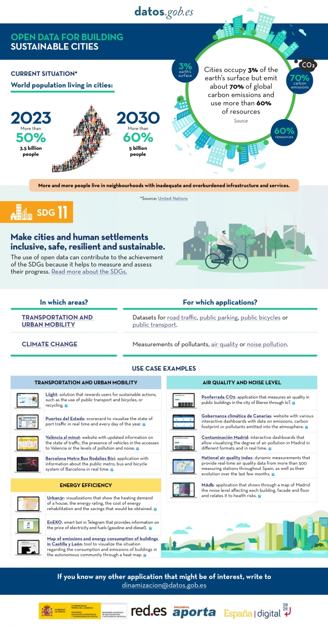
The benefits of using open data are extensive, and their variety goes hand in hand with technological innovation: every day, more opportunities arise to employ open data in the development of innovative solutions. An example of this can be seen in urban development aligned with the sustainability values advocated by the United Nations (UN).
Cities cover only 3% of the Earth's surface; however, they emit 70% of carbon emissions and consume over 60% of the world's resources, according to the UN. In 2023, more than half of the global population lives in cities, and this figure is projected to keep growing. By 2030, it is estimated that over 5 billion people would live in cities, meaning more than 60% of the world's population.
Despite this trend, infrastructures and neighborhoods do not meet the appropriate conditions for sustainable development, and the goal is to "Make cities and human settlements inclusive, safe, resilient, and sustainable," as recognized in Sustainable Development Goal (SDG) number 11. Proper planning and management of urban resources are significant factors in creating and maintaining sustainability-based communities. In this context, open data plays a crucial role in measuring compliance with this SDG and thus achieving the goal of sustainable cities.
In conclusion, open data stands as a fundamental tool for the strengthening and progress of sustainable city development.
In this infographic, we have gathered use cases that utilize sets of open data to monitor and/or enhance energy efficiency, transportation and urban mobility, air quality, and noise levels. Issues that contribute to the proper functioning of urban centers.
Click on the infographic to view it in full size.
Blog
Open solutions, including Open Educational Resources (OER), Open Access to Scientific Information (OA), Free and Open-Source Software (FOSS), and open data, encourage the free flow of information and knowledge, serving as a foundation for addressing global challenges, as reminded by UNESCO.
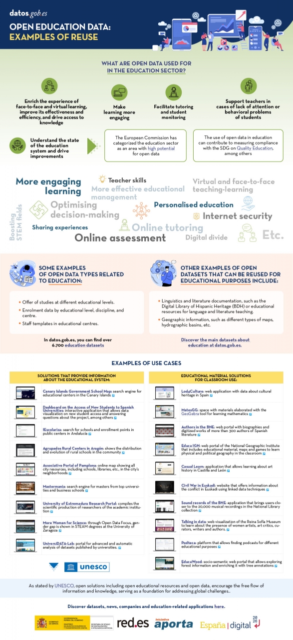
The United Nations Educational, Scientific and Cultural Organization (UNESCO) recognizes the value of open data in the educational field and believes that its use can contribute to measuring the compliance of the Sustainable Development Goals, especially Goal 4 of Quality Education. Other international organizations also recognize the potential of open data in education. For example, the European Commission has classified the education sector as an area with high potential for open data.
Open data can be used as a tool for education and training in different ways. They can be used to develop new educational materials and to collect and analyze information about the state of the educational system, which can be used to drive improvement.
The global pandemic marked a milestone in the education field, as the use of new technologies became essential in the teaching and learning process, which became entirely virtual for months. Although the benefits of incorporating ICT and open solutions into education, a trend known as Edtech, had been talked about for years, COVID-19 accelerated this process.
Benefits of Using Open Data in the Classroom
In the following infographic, we summarize the benefits of utilizing open data in education and training, from the perspective of both students and educators, as well as administrators of the education system.
There are many datasets that can be used for developing educational solutions. At datos.gob.es, there are more than 6,700 datasets available, which can be supplemented by others used for educational purposes in different fields, such as literature, geography, history, etc.
Many solutions have been developed using open data for these purposes. We gather some of them based on their purpose: firstly, solutions that provide information on the education system to understand its situation and plan new measures, and secondly, those that offer educational material to use in the classroom.
In essence, open data is a key tool for the strengthening and progress of education, and we must not forget that education is a universal right and one of the main tools for the progress of humanity.
Blog
The emergence of artificial intelligence (AI), and ChatGPT in particular, has become one of the main topics of debate in recent months. This tool has even eclipsed other emerging technologies that had gained prominence in a wide range of fields (legal, economic, social and cultural). This is the case, for example, of web 3.0, the metaverse, decentralised digital identity or NFTs and, in particular, cryptocurrencies.
There is an unquestionable direct relationship between this type of technology and the need for sufficient and appropriate data, and it is precisely this last qualitative dimension that justifies why open data is called upon to play a particularly important role. Although, at least for the time being, it is not possible to know how much open data provided by public sector entities is used by ChatGPT to train its model, there is no doubt that open data is a key to improving their performance.
Regulation on the use of data by AI
From a legal point of view, AI is arousing particular interest in terms of the guarantees that must be respected when it comes to its practical application. Thus, various initiatives are being promoted that seek to specifically regulate the conditions for its use, among which the proposal being processed by the European Union stands out, where data are the object of special attention.
At the state level, Law 15/2022, of 12 July, on equal treatment and non-discrimination, was approved a few months ago. This regulation requires public administrations to promote the implementation of mechanisms that include guarantees regarding the minimisation of bias, transparency and accountability, specifically with regard to the data used to train the algorithms used for decision-making.
There is a growing interest on the part of the autonomous communities in regulating the use of data by AI systems, in some cases reinforcing guarantees regarding transparency. Also, at the municipal level, protocols are being promoted for the implementation of AI in municipal services in which the guarantees applicable to the data, particularly from the perspective of their quality, are conceived as a priority requirement.
The possible collision with other rights and legal interests: the protection of personal data
Beyond regulatory initiatives, the use of data in this context has been the subject of particular attention as regards the legal conditions under which it is admissible. Thus, it may be the case that the data to be used are protected by third party rights that prevent - or at least hinder - their processing, such as intellectual property or, in particular, the protection of personal data. This concern is one of the main motivations for the European Union to promote the Data Governance Regulation, a regulation that proposes technical and organisational solutions that attempt to make the re-use of information compatible with respect for these legal rights.
Precisely, the possible collision with the right to the protection of personal data has motivated the main measures that have been adopted in Europe regarding the use of ChatGPT. In this regard, the Garante per la Protezione dei Dati Personali has ordered a precautionary measure to limit the processing of Italian citizens' data, the Spanish Data Protection Agency has initiated ex officio inspections of OpenAI as data controller and, with a supranational scope, the European Data Protection Supervisor (EDPB) has created a specific working group.
The impact of the regulation on open data and re-use
The Spanish regulation on open data and re-use of public sector information establishes some provisions that must be taken into account by IA systems. Thus, in general, re-use will be admissible if the data has been published without conditions or, in the event that conditions are set, when they comply with those established through licences or other legal instruments; although, when they are defined, the conditions must be objective, proportionate, non-discriminatory and justified by a public interest objective.
As regards the conditions for re-use of information provided by public sector bodies, the processing of such information is only allowed if the content is not altered and its meaning is not distorted, and the source of the data and the date of its most recent update must be mentioned.
On the other hand, high-value datasets are of particular interest for these AI systems characterised by the intense re-use of third-party content given the massive nature of the data processing they carry out and the immediacy of the requests for information made by users. Specifically, the conditions established by law for the provision of these high-value datasets by public bodies mean that there are very few limitations and also that their re-use is greatly facilitated by the fact that the data must be freely available, be susceptible to automated processing, be provided through APIs and be provided in the form of mass downloading, where appropriate.
In short, considering the particularities of this technology and, therefore, the very unique circumstances in which the data are processed, it seems appropriate that the licences and, in general, the conditions under which public entities allow their re-use be reviewed and, where appropriate, updated to meet the legal challenges that are beginning to arise.
Content prepared by Julián Valero, Professor at the University of Murcia and Coordinator of the "Innovation, Law and Technology" Research Group (iDerTec).
The contents and points of view reflected in this publication are the sole responsibility of the author.
Blog
As more of our daily lives take place online, and as the importance and value of personal data increases in our society, standards protecting the universal and fundamental right to privacy, security and privacy - backed by frameworks such as the Universal Declaration of Human Rights or the European Declaration on Digital Rights - become increasingly important.
Today, we are also facing a number of new challenges in relation to our privacy and personal data. According to the latest Lloyd's Register Foundation report, at least three out of four internet users are concerned that their personal information could be stolen or otherwise used without their permission. It is therefore becoming increasingly urgent to ensure that people are in a position to know and control their personal data at all times.
Today, the balance is clearly tilted towards the large platforms that have the resources to collect, trade and make decisions based on our personal data - while individuals can only aspire to gain some control over what happens to their data, usually with a great deal of effort.
This is why initiatives such as MyData Global, a non-profit organisation that has been promoting a human-centred approach to personal data management for several years now and advocating for securing the right of individuals to actively participate in the data economy, are emerging. The aim is to redress the balance and move towards a people-centred view of data to build a more just, sustainable and prosperous digital society, the pillars of which would be:
- Establish relationships of trust and security between individuals and organisations.
- Achieve data empowerment, not only through legal protection, but also through measures to share and distribute the power of data.
- Maximising the collective benefits of personal data, sharing it equitably between organisations, individuals and society.
And in order to bring about the changes necessary to bring about this new, more humane approach to personal data, the following principles have been developed:
1 - People-centred control of data.
It is individuals who must have the power of decision in the management of everything that concerns their personal lives. They must have the practical means to understand and effectively control who has access to their data and how it is used and shared.
Privacy, security and minimal use of data should be standard practice in the design of applications, and the conditions of use of personal data should be fairly negotiated between individuals and organisations.
2 - People as the focal point of integration
The value of personal data grows exponentially with its diversity, while the potential threat to privacy grows at the same time. This apparent contradiction could be resolved if we place people at the centre of any data exchange, always focusing on their own needs above all other motivations.
Any use of personal data must revolve around the individual through deep personalisation of tools and services.
3 - Individual autonomy
In a data-driven society, individuals should not be seen solely as customers or users of services and applications. They should be seen as free and autonomous agents, able to set and pursue their own goals.
Individuals should be able to securely manage their personal data in the way they choose, with the necessary tools, skills and support.
4 - Portability, access and re-use
Enabling individuals to obtain and reuse their personal data for their own purposes and in different services is the key to moving from silos of isolated data to data as reusable resources.
Data portability should not merely be a legal right, but should be combined with practical means for individuals to effectively move data to other services or on their personal devices in a secure and simple way.
5 - Transparency and accountability
Organisations using an individual's data must be transparent about how they use it and for what purpose. At the same time, they must be accountable for their handling of that data, including any security incidents.
User-friendly and secure channels must be created so that individuals can know and control what happens to their data at all times, and thus also be able to challenge decisions based solely on algorithms.
6 - Interoperability
There is a need to minimise friction in the flow of data from the originating sources to the services that use it. This requires incorporating the positive effects of open and interoperable ecosystems, including protocols, applications and infrastructure. This will be achieved through the implementation of common norms and practices and technical standards.
The MyData community has been applying these principles for years in its work to spread a more human-centred vision of data management, processing and use, as it is currently doing for example through its role in the Data Spaces Support Centre, a reference project that is set to define the future responsible use and governance of data in the European Union.
And for those who want to delve deeper into people-centric data use, we will soon have a new edition of the MyData Conference, which this year will focus on showcasing case studies where the collection, processing and analysis of personal data primarily serves the needs and experiences of human beings.
Content prepared by Carlos Iglesias, Open data Researcher and consultant, World Wide Web Foundation.
The contents and views expressed in this publication are the sole responsibility of the author.
Blog
Books are an inexhaustible source of knowledge and experiences lived by others before us, which we can reuse to move forward in our lives. Libraries, therefore, are places where readers looking for books, borrow them, and once they have used them and extracted from them what they need, return them. It is curious to imagine the reasons why a reader needs to find a particular book on a particular subject.
In case there are several books that meet the required characteristics, what might be the criteria that weigh most heavily in choosing the book that the reader feels best contributes to his or her task. And once the loan period of the book is over, the work of the librarians to bring everything back to an initial state is almost magical.
The process of putting books back on the shelves can be repeated indefinitely. Both on those huge shelves that are publicly available to all readers in the halls, and on those smaller shelves, out of sight, where books that for some reason cannot be made publicly available rest in custody. This process has been going on for centuries since man began to write and to share his knowledge among contemporaries and between generations.
In a sense, data are like books. And data repositories are like libraries: in our daily lives, both professionally and personally, we need data that are on the "shelves" of numerous "libraries". Some, which are open, very few still, can be used; others are restricted, and we need permissions to use them.
In any case, they contribute to the development of personal and professional projects; and so, we are understanding that data is the pillar of the new data economy, just as books have been the pillar of knowledge for thousands of years.
As with libraries, in order to choose and use the most appropriate data for our tasks, we need "data librarians to work their magic" to arrange everything in such a way that it is easy to find, access, interoperate and reuse data. That is the secret of the "data wizards": something they warily call FAIR principles so that the rest of us humans cannot discover them. However, it is always possible to give some clues, so that we can make better use of their magic:
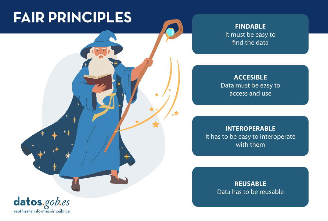
- It must be easy to find the data. This is where the "F" in the FAIR principles comes from, from "findable". For this, it is important that the data is sufficiently described by an adequate collection of metadata, so that it can be easily searched. In the same way that libraries have a shingle to label books, data needs its own label. The "data wizards" have to find ways to write the tags so that the books are easy to locate, on the one hand, and provide tools (such as search engines) so that users can search for them, on the other. Users, for our part, have to know and know how to interpret what the different book tags mean, and know how the search tools work (it is impossible not to remember here the protagonists of Dan Brown's "Angels and Demons" searching in the Vatican Library).
- Once you have located the data you intend to use, it must be easy to access and use. This is the A in FAIR's "accessible". Just as you have to become a member and get a library card to borrow a book from a library, the same applies to data: you have to get a licence to access the data. In this sense, it would be ideal to be able to access any book without having any kind of prior lock-in, as is the case with open data licensed under CC BY 4.0 or equivalent. But being a member of the "data library" does not necessarily give you access to the entire library. Perhaps for certain data resting on those shelves guarded out of reach of all eyes, you may need certain permissions (it is impossible not to remember here Umberto Eco's "The Name of the Rose").
- It is not enough to be able to access the data, it has to be easy to interoperate with them, understanding their meaning and descriptions. This principle is represented by the "I" for "interoperable" in FAIR. Thus, the "data wizards" have to ensure, by means of the corresponding techniques, that the data are described and can be understood so that they can be used in the users' context of use; although, on many occasions, it will be the users who will have to adapt to be able to operate with the data (impossible not to remember the elvish runes in J.R.R. Tolkien's "The Lord of the Rings").
- Finally, data, like books, has to be reusable to help others again and again to meet their own needs. Hence the "R" for "reusable" in FAIR. To do this, the "data wizards" have to set up mechanisms to ensure that, after use, everything can be returned to that initial state, which will be the starting point from which others will begin their own journeys.
As our society moves into the digital economy, our data needs are changing. It is not that we need more data, but that we need to dispose differently of the data that is held, the data that is produced and the data that is made available to users. And we need to be more respectful of the data that is generated, and how we use that data so that we don't violate the rights and freedoms of citizens. So it can be said, we face new challenges, which require new solutions. This forces our "data wizards" to perfect their tricks, but always keeping the essence of their magic, i.e. the FAIR principles.
Recently, at the end of February 2023, an Assembly of these data wizards took place. And they were discussing about how to revise the FAIR principles to perfect these magic tricks for scenarios as relevant as European data spaces, geospatial data, or even how to measure how well the FAIR principles are applied to these new challenges. If you want to see what they talked about, you can watch the videos and watch the material at the following link: https://www.go-peg.eu/2023/03/07/go-peg-final-workshop-28-february-20203-1030-1300-cet/
Content prepared by Dr. Ismael Caballero, Lecturer at UCLM
The contents and views reflected in this publication are the sole responsibility of the author.
Blog
The humanitarian crisis following the earthquake in Haiti in 2010 was the starting point for a voluntary initiative to create maps to identify the level of damage and vulnerability by areas, and thus to coordinate emergency teams. Since then, the collaborative mapping project known as Hot OSM (OpenStreetMap) has played a key role in crisis situations and natural disasters.
Now, the organisation has evolved into a global network of volunteers who contribute their online mapping skills to help in crisis situations around the world. The initiative is an example of data-driven collaboration to solve societal problems, a theme we explore in this data.gob.es report.
Hot OSM works to accelerate data-driven collaboration with humanitarian and governmental organisations, as well as local communities and volunteers around the world, to provide accurate and detailed maps of areas affected by natural disasters or humanitarian crises. These maps are used to help coordinate emergency response, identify needs and plan for recovery.
In its work, Hot OSM prioritises collaboration and empowerment of local communities. The organisation works to ensure that people living in affected areas have a voice and power in the mapping process. This means that Hot OSM works closely with local communities to ensure that areas important to them are mapped. In this way, the needs of communities are considered when planning emergency response and recovery.
Hot OSM's educational work
In addition to its work in crisis situations, Hot OSM is dedicated to promoting access to free and open geospatial data, and works in collaboration with other organisations to build tools and technologies that enable communities around the world to harness the power of collaborative mapping.
Through its online platform, Hot OSM provides free access to a wide range of tools and resources to help volunteers learn and participate in collaborative mapping. The organisation also offers training for those interested in contributing to its work.
One example of a HOT project is the work the organisation carried out in the context of Ebola in West Africa. In 2014, an Ebola outbreak affected several West African countries, including Sierra Leone, Liberia and Guinea. The lack of accurate and detailed maps in these areas made it difficult to coordinate the emergency response.
In response to this need, HOT initiated a collaborative mapping project involving more than 3,000 volunteers worldwide. Volunteers used online tools to map Ebola-affected areas, including roads, villages and treatment centres.
This mapping allowed humanitarian workers to better coordinate the emergency response, identify high-risk areas and prioritize resource allocation. In addition, the project also helped local communities to better understand the situation and participate in the emergency response.
This case in West Africa is just one example of HOT's work around the world to assist in humanitarian crisis situations. The organisation has worked in a variety of contexts, including earthquakes, floods and armed conflict, and has helped provide accurate and detailed maps for emergency response in each of these contexts.
On the other hand, the platform is also involved in areas where there is no map coverage, such as in many African countries. In these areas, humanitarian aid projects are often very challenging in the early stages, as it is very difficult to quantify what population is living in an area and where they are located. Having the location of these people and showing access routes "puts them on the map" and allows them to gain access to resources.
In this article The evolution of humanitarian mapping within the OpenStreetMap community by Nature, we can see graphically some of the achievements of the platform.
How to collaborate
It is easy to start collaborating with Hot OSM, just go to https://tasks.hotosm.org/explore and see the open projects that need collaboration.
This screen allows us a lot of options when searching for projects, selected by level of difficulty, organisation, location or interests among others.
To participate, simply click on the Register button.
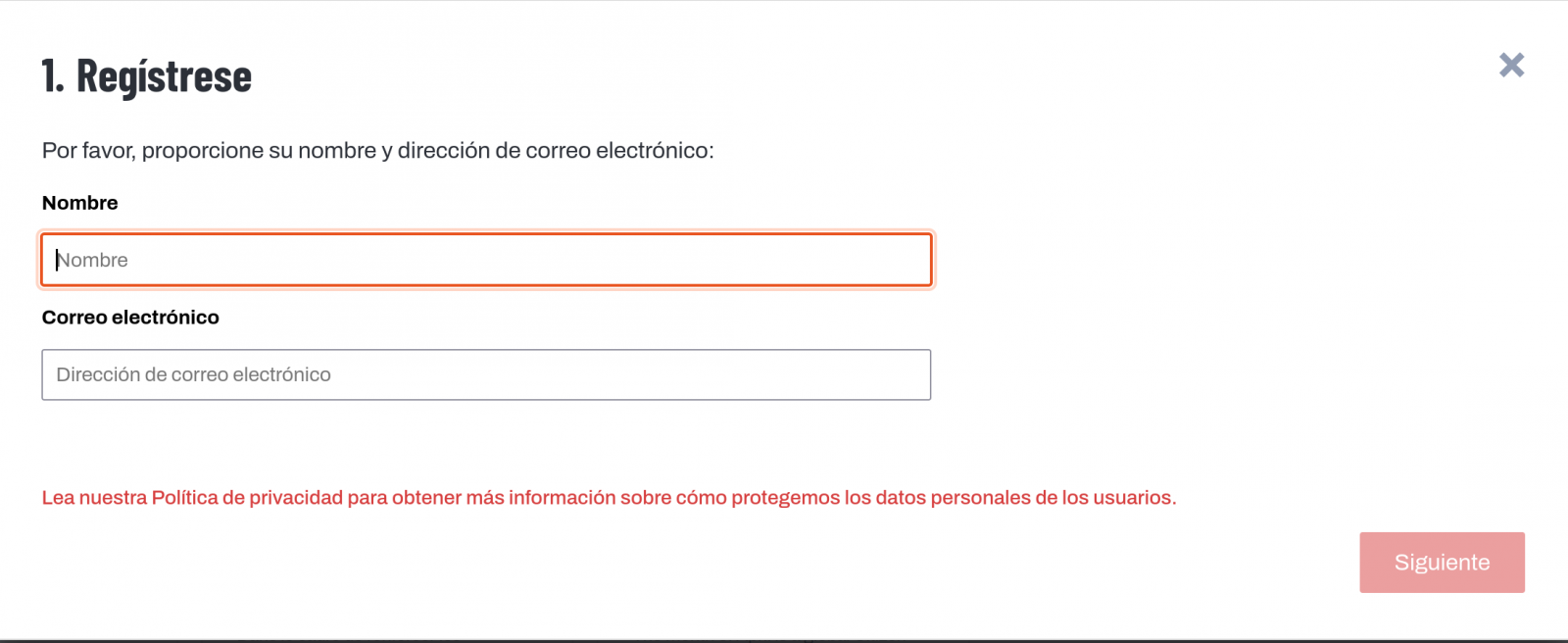
Give a name and an e-mail adress on the next screen:
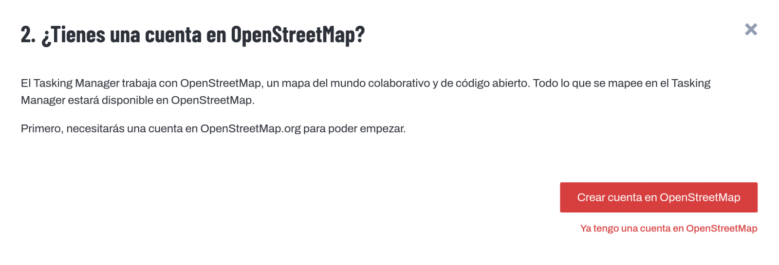
It will ask us if we have already created an account in Open Street Maps or if we want to create one.
If we want to see the process in more detail, this website makes it very easy.
Once the user has been created, on the learning page we find help on how to participate in the project.
It is important to note that the contributions of the volunteers are reviewed and validated and there is a second level of volunteers, the validators, who validate the work of the beginners. During the development of the tool, the HOT team has taken great care to make it a user-friendly application so as not to limit its use to people with computer skills.
In addition, organisations such as the Red Cross and the United Nations regularly organise mapathons to bring together groups of people for specific projects or to teach new volunteers how to use the tool. These meetings serve, above all, to remove the new users' fear of "breaking something" and to allow them to see how their voluntary work serves concrete purposes and helps other people.
Another of the project's great strengths is that it is based on free software and allows for its reuse. In the MissingMaps project's Github repository we can find the code and if we want to create a community based on the software, the Missing Maps organisation facilitates the process and gives visibility to our group.
In short, Hot OSM is a citizen science and data altruism project that contributes to bringing benefits to society through the development of collaborative maps that are very useful in emergency situations. This type of initiative is aligned with the European concept of data governance that seeks to encourage altruism to voluntarily facilitate the use of data for the common good.
Content by Santiago Mota, senior data scientist.
The contents and views reflected in this publication are the sole responsibility of the author.
Noticia
The Asociación Multisectorial de la Información (ASEDIE) has published the eleventh edition of its Report on the Infomediary Sector, in which it reviews the health of companies that generate applications, products and/or services based on information from the public sector, taking into account that it is the holder of the most valuable data.
Many of the datasets that enable the infomediary sector to develop solutions are included in the lists of High Value Datasets (HVDS) recently published by the European Union. An initiative that recognises the potential of public information and adds to the aim of boosting the data economy in line with the European Parliament's proposed Data Law.
ASEDIE brings together companies from different sectors that promote the data economy, which are mainly nourished by the data provided by the public sector. Among its objectives is to promote the sector and contribute to raising society's awareness of its benefits and impact. It is estimated that the data economy will generate €270 billion of additional GDP for EU Member States by 2028.
The presentation of this edition of the report, entitled 'The Data Economy in the infomediary field', took place on 22 March in Red.es's Enredadera room. In this year's edition of the report, 710 active companies have been identified, with a turnover of more than 2,278 million euros. It should be noted that the first report in 2013 counted 444 companies. Therefore, the sector has grown by 60% in a decade.
Main conclusions of the report
- The infomediary sector has grown by 12.1%, a figure above the national GDP growth of 7.6%. These data are drawn from the analysis of the 472 companies (66% of the sample) that submitted their accounts for the previous years.
- The number of employees is 22,663. Workers are highly concentrated in a few companies: 62% of them have less than 10 workers. The subsector with the highest number of professionals is Geographic information, with 30% of the total. Together with the sub-sectors Financial economics, Technical consultancy and Market research, they account for 75% of the employees.
- Employment in the companies of the Infomediary Sector grew by 1.7%, compared to a fall of 1.1% in the previous year. All sub-sectors have grown, except for Tourism and Culture, which have remained the same, and Technical Consultancy and Market Research, which have decreased.
- The average turnover per employee exceeded 100,000 euros, an increase of 6.6% compared to the previous year. On the other hand, the average expenditure per employee was 45,000 euros.
- The aggregate turnover was 2,279,613,288 euros. The Geographical Information and Economic and Financial subsectors account for 46% of sales.
- The aggregate subscribed capital is 250,115,989 euros. The three most capitalised subsectors are Market Research, Economic and Financial and Geographic Information, which account for 66% of capitalisation.
- The net result exceeds 180 million euros, 70 million more than last year. The Economic and Financial subsector accounted for 66% of total profits.
- The sub-sectors of Geographical Information, Market Research, Financial Economics and Computer Infomediaries account for 76% of the infomediary companies, with a total of 540 companies out of the 710 active companies.
- The Community of Madrid is home to the largest number of companies in the sector, with 39%, followed by Catalonia (13%), Andalusia (11%) and the Community of Valencia (9%).
As the report shows, the arrival of new companies is driving the development of a sector that already has a turnover of around 2,300 million euros per year, and which is growing at a higher rate than other macroeconomic indicators in the country. These data show not only that the Infomediary Sector is in good health, but also its resilience and growth potential.
Progress of the Study on the impact of open data in Spain
The report also includes the results of a survey of the different actors that make up the data ecosystem, in collaboration with the Faculty of Information Sciences of the Complutense University of Madrid. This survey is presented as the first exercise of a more ambitious study that aims to know the impact of open data in Spain and to identify the main barriers to its access and availability. To this end, a questionnaire has been sent to members of the public, private and academic sectors. Among the main conclusions of this first survey, we can highlight the following:
- As main barriers to publishing information, 65% of respondents from the public sector mentioned lack of human resources, 39% lack of political leadership and 38% poor data quality.
- The biggest obstacle in accessing public data for re-use is for public sector respondents that the information provided in the data is not homogeneous (41.9%). Respondents from the academic sector point to the lack of quality of the data (43%) and from the private sector it is believed that the main barrier is the lack of updating (49%).
- In terms of the frequency of use of public data, 63% of respondents say that they use the data every day or at least once a week.
- 61% of respondents use the data published on the datos.gob.es portal.
- Respondents overwhelmingly believe that the impact of data openness on the private sector is positive. Thus, 77% of private sector respondents indicate that accessing public data is economically viable and 89% of them say that public data enables them to develop useful solutions.
- 95% of respondents call for a compendium of regulations affecting the access, publication and re-use of public sector data.
- 27% of public sector respondents say they are not aware of the six categories of high-value data set out in Commission Implementing Regulation (EU) 20137138 .
This shows that most respondents are aware of the potential of the sector and the impact of public sector data, although they indicate that some obstacles to re-use need to be overcome and believe that a compendium of the different existing regulations would facilitate their implementation and help the development of the sector.
Top 3 ASEDIE
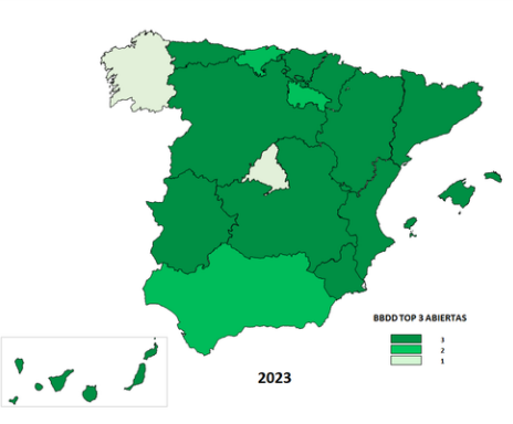
As in previous editions, the report includes the status of the Top 3 ASEDIE, an initiative that aims for all Autonomous Communities to fully open three sets of data, following unified criteria that facilitate their reuse, and which is included in the IV Open Government Plan. In 2019, the opening of the Cooperatives, Associations and Foundations databases was proposed, and there are currently 16 Autonomous Communities in which they can be accessed in full. Moreover, in eight of them, it is possible to access the NIF with a unique identifier, which improves transparency and makes the information more accurate.
Taking into account the good results of the first proposal, in 2020 a new request for opening data was launched, the Second Top 3 ASEDIE, in this case of Energy Efficiency Certificates, SAT Registries (Agricultural Transformation Companies) and Industrial Estates, whose evolution has also been very positive. The following map shows the opening situation of these three new databases in 2023.
The Top 3 ASEDIE initiative has been a success and has become a reference in the sector, promoting the opening of databases in a joint manner and demonstrating that it is possible to harmonise public data sources to put them at the service of society.
The next steps in this sense will be to monitor the databases already open and to disseminate them at all levels, including the identification of good practices of the Administration and the selection of examples to encourage public-private collaboration in open data. In addition, a new top 3 will be identified to advance in the opening of new databases, and a new initiative will be launched to reach the bodies of the General State Administration, with the identification of a new Top 3 AGE.
Success stories
The report also includes a series of success stories of products and services developed with public sector data, such as Iberinform's API Market, which facilitates access to and integration of 52 sets of company and self-employed data in company management systems. Another successful case is Geocode, a solution focused on standardisation, validation, correction, codification and geolocation processes for postal addresses in Spain and Portugal.
Geomarketing makes it possible to increase the speed of calculating geospatial data and Infoempresa.com has improved its activity reports on Spanish companies, making them more visual, complete and intuitive. Finally, Pyramid Data makes it possible to access the Energy Efficiency Certificates (EEC) of a given property portfolio.
As examples of good practices in the public sector, the ASEDIE report highlights the open statistical data as a driver of the Data Economy of the Canary Islands Statistics Institute (ISTAC) and the technology for the opening of data of the Open Data Portal of the Andalusian Regional Government (Junta de Andalucía).
As a novelty, the category of examples of good practices in the academic sector has been incorporated, which recognises the work carried out by the Geospatial Code and the Report on the state of open data in Spain III, by the Rey Juan Carlos University and FIWARE Foundation.
The 11th ASEDIE Report on the Data Economy in the infomediary field can be downloaded from the ASEDIE website in Spanish. The presentations of the economic indicators and the Top 3 and the Data Ecosystem are also available.
In summary, the report shows the good health of the industry that confirms its recovery after the pandemic, its resilience and growth potential and, in addition, the good results of public-private collaboration and its impact on the data economy are observed.
Noticia
In recent years, we have been witnessing a technological revolution that increasingly pushes us to broaden our training to adapt to the new digital devices, tools and services that are already part of our daily lives. In this context, training in digital skills is more relevant than ever.
Last October, the European Commission, led by its President Ursula Von Der Leyen, announced its intention to make 2023 the "European Year of Skills", including digital skills. The reason lies in the difficulties that have been identified among European citizens in adapting to new technologies and exploiting their full potential, especially in the professional sphere.
The European digital skills gap
According to data provided by Eurostat, more than 75% of EU companies have reported difficulties in finding professionals with the necessary skills to do the job they are looking for. Moreover, the European Labour Agency warns that there is a severe shortage of ICT specialists and STEM-qualified workers in Europe. This is exacerbated by the fact that currently only 1 in 6 IT specialists is female.
When it comes to digital skills, the figures are not flattering either. As noted in the Digital Economy and Society Index (DESI), based on data from 2021, only 56% of the European population possesses basic digital skills, including information and data literacy, communication and collaboration, digital content creation, security and problem-solving skills.
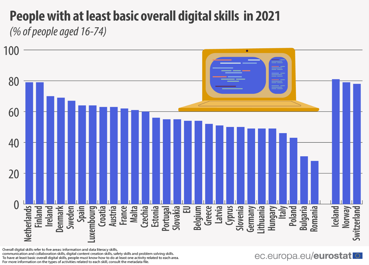
EU citizens with the least basic digital skills by country. Source: Eurostat, 2022.
European initiatives to promote the development of digital competences
As mentioned above, improving education and digital skills is one of the major objectives that the European Commission has set for 2023. If we look at the longer term, the goal is more ambitious: The EU aims for at least 80% of EU adults to have basic digital skills such as those mentioned above by 2030. In terms of the professional sector, the target focuses on having around 20 million ICT professionals, with a significant number of women in the sector.
In order to realise these objectives, there are a number of measures and initiatives that have been launched at European level. One of them stems from the European Skills Agency, whose action points 6 and 7 are focused on improving all relevant skills for the green and digital transitions, as well as increasing the number of ICT graduates.
Through the NextGenerationEU funds and its Resilience and Recovery Mechanism, EU member states will be eligible for support to finance digital skills-related reforms, as €560 million will be made available for this purpose.
In addition, other EU funding programmes such as the Digital Europe Programme (DEP) or the Connecting Europe Facility (CEF) will respectively offer financial support for the development of education programmes specialised in digital skills or the launch of the European Digital Skills and Jobs Platform to make information and related resources available to citizens.
Alongside these, there are also other initiatives dedicated to digital skills training in the Digital Education Action Plan, which has created the European Centre for Digital Education, or in the mission of the Digital Skills and Jobs Coalition, which aims to raise awareness and address the digital skills gap together with public administrations, companies and NGOs.
The importance of open data in the 'European Year of Digital Skills'.
In order to promote the development of digital skills among European citizens, the European open data portal carries out several actions that contribute to this end and where open data plays a key role. Along these lines, Data Europa remains firmly committed to promoting training and the dissemination of open data. Thus, in addition to the objectives listed below, it is also worth highlighting the value at the knowledge level that lies behind each of the workshops and seminars programmed by its academic section throughout the year.
- To support Member States in the collection of data and statistics on the demand for digital skills in order to develop specific measures and policies.
- Work together with national open data portals to make data available, easily accessible and understandable.
- Provide support to regional and local open data portals where there is a greater need for help with digitisation.
- Encourage data literacy, as well as the collection of use cases of interest that can be reused.
- Develop collaborative environments that facilitate public data providers in the creation of a smart data-driven society.
Thus, just as data.europa academy functions as a knowledge centre created so that open data communities can find relevant webinars and trainings to improve their digital skills, in Spain, the National Institute of Public Training includes among its training options several courses on data whose task is to keep public administration workers up to date with the latest trends in this field.
In this line, during the spring of 2023, a training on Open Data and Information Reuse will take place, through which an approach to the open data ecosystem and the general principles of reuse will be carried out. Likewise, from 24 May to 5 June, the INAP is organising another course on the Fundamentals of Big Data, which will address blocks of knowledge such as data visualisation, cloud computing, artificial intelligence and the different strategies in the field of Data Governance.
Likewise, if you are not a public sector worker, but you are interested in expanding your knowledge of open data, artificial intelligence, machine learning or other topics related to the data economy, in the blog and documentation section of datos.gob.es you can find adapted training materials, monographs on various topics, case studies, infographs and step-by-step visualisations that will help you to understand more tangibly the different theoretical applications involving open data.
At datos.gob.es, we have prepared publications that compile different free training courses on different topics and specialisations. For example, on artificial intelligence or data visualisations.
Finally, if you know of more examples or other initiatives dedicated to fostering digital skills both at national and European level, do not hesitate to let us know through our mailbox dinamizacion@datos.gob.es. We look forward to all your suggestions!
Blog
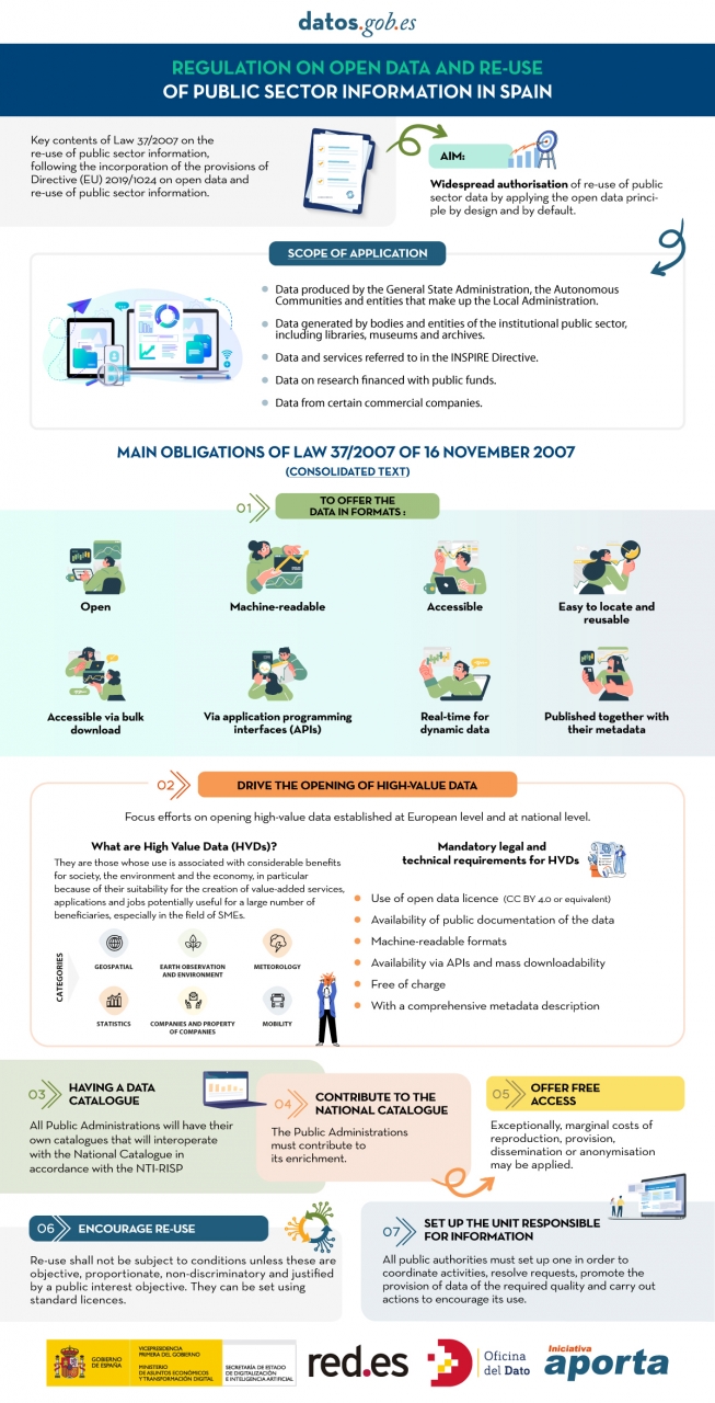
The public sector in Spain will have the duty to guarantee the openness of its data by design and by default, as well as its reuse. This is the result of the amendment of Law 37/2007 on the reuse of public sector information in application of European Directive 2019/1024.
This new wording of the regulation seeks to broaden the scope of application of the Law in order to bring the legal guarantees and obligations closer to the current technological, social and economic context. In this scenario, the current regulation takes into account that greater availability of public sector data can contribute to the development of cutting-edge technologies such as artificial intelligence and all its applications.
Moreover, this initiative is aligned with the European Union's Data Strategy aimed at creating a single data market in which information flows freely between states and the private sector in a mutually beneficial exchange.
From high-value data to the responsible unit of information: obligations under Law 37/2007
In the following infographic, we highlight the main obligations contained in the consolidated text of the law. Emphasis is placed on duties such as promoting the opening of High Value Datasets (HVDS), i.e. datasets with a high potential to generate social, environmental and economic benefits. As required by law, HVDS must be published under an open data attribution licence (CC BY 4.0 or equivalent), in machine-readable format and accompanied by metadata describing the characteristics of the datasets. All of this will be publicly accessible and free of charge with the aim of encouraging technological, economic and social development, especially for SMEs.
In addition to the publication of high-value data, all public administrations will be obliged to have their own data catalogues that will interoperate with the National Catalogue following the NTI-RISP, with the aim of contributing to its enrichment. As in the case of HVDS, access to the datasets of the Public Administrations must be free of charge, with exceptions in the case of HVDS. As with HVDS, access to public authorities' datasets should be free of charge, except for exceptions where marginal costs resulting from data processing may apply.
To guarantee data governance, the law establishes the need to designate a unit responsible for information for each entity to coordinate the opening and re-use of data, and to be in charge of responding to citizens' requests and demands.
In short, Law 37/2007 has been modified with the aim of offering legal guarantees to the demands of competitiveness and innovation raised by technologies such as artificial intelligence or the internet of things, as well as to realities such as data spaces where open data is presented as a key element.
Click on the infographic to see it full size: