Noticia
The Canary Islands Statistics Institute (ISTAC) has added more than 500 semantic assets and more than 2100 statistical cubes to its catalogue.
This vast amount of information represents decades of work by the ISTAC in standardisation and adaptation to leading international standards, enabling better sharing of data and metadata between national and international information producers and consumers.
The increase in datasets not only quantitatively improves the directory at datos.canarias.es and datos.gob.es, but also broadens the uses it offers due to the type of information added.
New semantic assets
Semantic resources, unlike statistical resources, do not present measurable numerical data , such as unemployment data or GDP, but provide homogeneity and reproducibility.
These assets represent a step forward in interoperability, as provided for both at national level with the National Interoperability Scheme ( Article 10, semantic assets) and at European level with the European Interoperability Framework (Article 3.4, semantic interoperability). Both documents outline the need and value of using common resources for information exchange, a maxim that is being pursued at implementing in a transversal way in the Canary Islands Government. These semantic assets are already being used in the forms of the electronic headquarters and it is expected that in the future they will be the semantic assets used by the entire Canary Islands Government.
Specifically in this data load there are 4 types of semantic assets:
- Classifications (408 loaded): Lists of codes that are used to represent the concepts associated with variables or categories that are part of standardised datasets, such as the National Classification of Economic Activities (CNAE), country classifications such as M49, or gender and age classifications.
- Concept outlines (115 uploaded): Concepts are the definitions of the variables into which the data are disaggregated and which are finally represented by one or more classifications. They can be cross-sectional such as "Age", "Place of birth" and "Business activity" or specific to each statistical operation such as "Type of household chores" or "Consumer confidence index".
- Topic outlines (2 uploaded): They incorporate lists of topics that may correspond to the thematic classification of statistical operations or to the INSPIRE topic register.
- Schemes of organisations (6 uploaded): This includes outlines of entities such as organisational units, universities, maintaining agencies or data providers.
All these types of resources are part of the international SDMX (Statistical Data and Metadata Exchange) standard, which is used for the exchange of statistical data and metadata. The SDMX provides a common format and structure to facilitate interoperability between different organisations producing, publishing and using statistical data.
Noticia
On September 14th, the II National Open Data Meeting took place under the theme "Urgent Call to Action for the Environment" at the Pignatelli building, the headquarters of the Government of Zaragoza. The event, held in person in the Crown Room, allowed attendees to participate and exchange ideas in real-time.
The event continued the tradition started in 2022 in Barcelona, establishing itself as one of the main gatherings in Spain in the field of public sector data reuse. María Ángeles Rincón, Director-General of Electronic Administration and Corporate Applications of the Government of Aragon, inaugurated the event, emphasizing the importance of open data in terms of transparency, reuse, economic development, and social development. She highlighted that high-quality and neutral data available on open data portals are crucial for driving artificial intelligence and understanding our environmental surroundings.
The day continued with a presentation by María Jesús Fernández Ruiz, Head of the Technical Office of Open Government of the City of Zaragoza, titled "Why Implement Data Governance in Our Institutions?" In her presentation, she stressed the need to manage data as a strategic asset and a public good, integrating them into governance and management policies. She also emphasized the importance of interoperability and the reuse of large volumes of data to turn them into knowledge, as well as the formation of interdisciplinary teams for data management and analysis.
The event included three panel discussions with the participation of professionals, experts, and scientists related to the management, publication, and use of open data, focusing on environmental data.
The first panel discussion highlighted the value of open data for understanding the environment we live in. In this video, you can revisit the panel discussion moderated by Borja Carvajal of the Diputación de Castellón: II National Open Data Meeting, Zaragoza, September 14, 2023 (morning session).
Secondly, Magda Lorente from the Diputación de Barcelona moderated the discussion "Open Data, Algorithms, and Artificial Intelligence: How to Combat Environmental Disinformation?" This second panel featured professionals from data journalism, science, and the public sector who discussed the opportunities and challenges of disseminating environmental information through open data.

Conclusions from Challenges 1 and 2 on Open Data: Interadministrative Collaboration and Professional Competencies
After the second panel discussion, the conclusions of Challenges 1 and 2 on open data were presented, two lines of work defined at the I National Open Data Meeting held in 2022.
In last year's conference, several challenges were identified in the field of open data. The first of them (Challenge 1) involved promoting collaboration between administrations to facilitate the opening of data sets and generate valuable exchanges for both parties. To address this challenge, annual work was carried out to establish the appropriate lines of action.
You can download the document summarizing the conclusions of Challenge 1 here: https://opendata.aragon.es/documents/90029301/115623550/Reto_1_encuentro_datos_Reto_1.pptx
On the other hand, Challenge 2 aimed to identify the need to define professional roles, as well as essential knowledge and competencies that public employees who take on tasks related to data opening should have.
To address this second challenge, a working group of professionals with expertise in the sector was also established, all pursuing the same goal: to promote the dissemination of open data and thus improve public policies by involving citizens and businesses throughout the opening process.
To resolve the key issues raised, the group addressed two related lines of work:
- Defining competencies and basic knowledge in the field of open data for different public professional profiles involved in data opening and use.
- Identifying and compiling existing training materials and pathways to provide workers with a starting point.
Key Professional Competencies for Data Opening
To specify the set of actions and attitudes that a worker should have to complete their work with open data, it was considered necessary to identify the main profiles in the administration needed, as well as the specific needs of each position. In this regard, the working group has based its analysis on the following roles:
- Open Data Manager role: responsible for technical leadership in promoting open data policies, data policy definition, and data model activities.
- Technical role in data opening (IT profile): encourages execution activities more related to system management, data extraction processes, data cleaning, etc., among others.
- Functional role in data opening (service technician): carries out execution activities more related to selecting data to be published, quality, promotion of open data, visualization, data analytics, for example.
- Use of data by public workers: performs activities involving data use for decision-making, basic data analytics, among others. Analyzing the functions of each of these roles, the team has established the necessary competencies and knowledge for performing the functions defined in each of these roles.
You can download the document with conclusions about professional capabilities for data opening here: https://opendata.aragon.es/documents/90029301/115623550/reto+2_+trabajadores+p%C3%BAblicos+capacitados+para+el+uso+y+la+apertura+de+datos.docx
Training Materials and Pathways on Open Data
In line with the second line of work, the team of professionals has developed an inventory of online training resources in the field of open data, which can be accessed for free. This list includes courses and materials in Spanish, co-official languages, and English, covering topics such as open data, their processing, analysis, and application.
You can download the document listing training materials, the result of the work of Challenge 2's group, here: [https://opendata.aragon.es/datos/catalogo/dataset/listado-de-materiales-formativos-sobre-datos-abiertos-fruto-del-trabajo-del-grupo-del-reto-2
In conclusion, the working group considered that the progress made during this first year marks a solid start, which will serve as a basis for administrations to design training and development plans aimed at the different roles involved in data opening. This, in turn, will contribute to strengthening and improving data policies in these entities.
Furthermore, it was noted that the effort invested in these months to identify training resources will be key in facilitating the acquisition of essential knowledge by public workers. On the other hand, it has been highlighted that there is a large number of free and open training resources with a basic level of specialization. However, the need to develop more advanced materials to train the professionals that the administration needs today has been identified.
The third panel discussion, moderated by Vicente Rubio from the Diputación de Castellón, focused on public policies based on data to improve the living environment of its inhabitants.
At the end of the meeting, it was emphasized how important it is to continue working on and shaping different challenges related to the functions and services of open data portals and data opening processes. In the III National Open Data Meeting to be held next year in the Province of Castellón, progress in this area will be presented.
Evento
From September 25th to 27th , Madrid will be hosting the fourth edition of the Open Science Fair, an international event on open science that will bring together experts from all over the world with the aim of identifying common practices, bringing positions closer together and, in short, improving synergies between the different communities and services working in this field.
This event is an initiative of OpenAIRE, an organisation that aims to create more open and transparent academic communication. This edition of the Open Science Fair is co-organised by the Spanish Foundation for Science and Technology (FECYT), which depends on the Ministry of Science and Innovation, and is one of the events sponsored by the Spanish Presidency of the spanish Presidency of the Council of the European Union.
The current state of open science
Science is no longer the preserve of scientists. Researchers, institutions, funding agencies and scientific publishers are part of an ecosystem that carries out work with a growing resonance with the public and a greater impact on society. In addition, it is becoming increasingly common for research groups to open up to collaborations with institutions around the world. Key to making this collaboration possible is the availability of data that is open and available for reuse in research.
However, to enable international and interdisciplinary research to move forward, it is necessary to ensure interoperability between communities and services, while maintaining the capacity to support different workflows and knowledge systems.
The objectives and programme of the Open Science Fair
In this context, the Open Science Fair 2023 is being held, with the aim of bringing together and empowering open science communities and services, identifying common practices related to open science to analyse the most suitable synergies and, ultimately sharing experiences that are developed in different parts of the world.
The event has an interesting programme that includes keynote speeches from relevant speakers, round tables, workshops, and training sessions, as well as a demonstration session. Attendees will be able to share experiences and exchange views, which will help define the most efficient ways for communities to work together and draw up tailor-made roadmaps for the implementation of open science.
This third edition of Open Science will focus on 'Open Science for Future Generations' and the main themes it will address, as highlighted on the the event's website, are:
- Progress and reform of research evaluation and open science. Connections, barriers and the way forward.
- Impact of artificial intelligence on open science and impact of open science on artificial intelligence.
- Innovation and disruption in academic publishing.
- Fair data, software and hardware.
- Openness in research and education.
- Public engagement and citizen science.
Open science and artificial intelligence
The artificial intelligence is gaining momentum in academia through data analysis. By analysing large amounts of data, researchers can identify patterns and correlations that would be difficult to reach through other methods. The use of open data in open science opens up an exciting and promising future, but it is important to ensure that the benefits of artificial intelligence are available to all in a fair and equitable way.
Given its high relevance, the Open Science Fair will host two keynote lectures and a panel discussion on 'AI with and for open science'. The combination of the benefits of open data and artificial intelligence is one of the areas with the greatest potential for significant scientific breakthroughs and, as such, will have its place at the event is one of the areas with the greatest potential for significant scientific breakthroughs and, as such, will have its place at the event. It will look from three perspectives (ethics, infrastructure and algorithms) at how artificial intelligence supports researchers and what the key ingredients are for open infrastructures to make this happen.
The programme of the Open Science Fair 2023 also includes the presentation of a demo of a tool for mapping the research activities of the European University of Technology EUt+ by leveraging open data and natural language processing. This project includes the development of a set of data-driven tools. Demo attendees will be able to see the developed platform that integrates data from public repositories, such as European research and innovation projects from CORDIS, patents from the European Patent Office database and scientific publications from OpenAIRE. National and regional project data have also been collected from different repositories, processed and made publicly available.
These are just some of the events that will take place within the Open Science Fair, but the full programme includes a wide range of events to explore multidisciplinary knowledge and research evaluation.
Although registration for the event is now closed, you can keep up to date with all the latest news through the hashtag #OSFAIR2023 on Twitter, LinkedIn and Facebook, as well as on the event's website website.
In addition, on the website of datos.gob.es and on our social networks you can keep up to date on the most important events in the field of open data, such as those that will take place during this autumn.
Noticia
Mark them on your calendar, make a note in your agenda, or set reminders on your mobile to not forget about this list of events on data and open government taking place this autumn. This time of year brings plenty of opportunities to learn about technological innovation and discuss the transformative power of open data in society.
From practical workshops to congresses and keynote speeches, in this post, we present some of the standout events happening in October and November. Sign up before the slots fill up!
Data spaces in the EU: synergies between data protection and data spaces
At the beginning of the tenth month of the year, the Spanish Data Protection Agency (AEPD) and the European Cybersecurity Agency (ENISA) will hold an event in English to address the challenges and opportunities of implementing the provisions of the General Data Protection Regulation (GDPR) in EU data spaces.
During the conference, the conference will review best practices of existing EU data spaces, analyse the interaction between EU legislation and policies on data exchange and present data protection engineering as an integral element in the structure of data spaces, as well as its legal implications.
- Who is it aimed at? This event promises to be a platform for knowledge and collaboration of interest to anyone interested in the future of data in the region.
- When and where is it? On October 2nd in Madrid from 9:30 AM to 6:00 PM and available for streaming with prior registration until 2:45 PM.
- Registration: link no longer available
SEMIC Conference 'Interoperable Europe in the age of AI'
Also in October, the annual SEMIC conference organised by the European Commission in collaboration with the Spanish Presidency of the Council of the European Union returns. This year's event takes place in Madrid and will explore how interoperability in the public sector and artificial intelligence can benefit each other through concrete use cases and successful projects.
Sessions will address the latest trends in data spaces, digital governance, data quality assurance and generative artificial intelligence, among others. In addition, a proposal for an Interoperable Europe Act will be presented.
- Who is it aimed at? Public or private sector professionals working with data, governance and/or technology. Last year's edition attracted more than 1,000 professionals from 60 countries.
- When and where is it? The conference will be held on October 18th at the Hotel Riu Plaza in Madrid and can also be followed online. Pre-conference workshops will take place on October 17th at the National Institute of Public Administration
- Registration: https://semic2023.eu/registration/

Data and AI in action: sustainable impact and future realities
From October 25th to 27th, an event on the value of data in artificial intelligence is taking place in Valencia, with the collaboration of the European Commission and the Spanish Presidency of the Council of the European Union, among others.
Over the course of the three days, approximately one-hour presentations will be given on a variety of topics such as sectoral data spaces, the data economy and cybersecurity.
- Who is it aimed at? Members of the European Big Data Value Forum will receive a discounted entrance fee and associate members receive three tickets per organisation. The ticket price varies from 120 to 370 euros.
- When and where is it? It will take place on October 25th, 26th and 27th in Valencia.
- Registration: bipeek.
European Webinars: open data for research, regional growth with open data and data spaces
The European Open Data Portal organises regular webinars on open data projects and technologies. In datos.gob.es we report on this in summary publications on each session or in social networks. In addition, once the event is over, the materials used to carry out the didactic session are published. The October events calendar is now available on the portal's website. Sign up to receive a reminder of the webinar and, subsequently, the materials used.
Data spaces: Discovering block architecture
- When? On October 6th from 10:00 AM to 11:30 AM
- Registration: data.europa academy 'Data spaces: Discovering the building blocks' (clickmeeting.com)
How to use open data in your research?
- When? On October 19th from 10:00 AM to 11:30 AM
- Registration: How to use open data for your research (clickmeeting.com)
Open Data Maturity Report: The in-depth impact dimension
- When? On October 27th from 10:00 AM to 11.30 AM
- Registration: data.europa academy 'Open Data Maturity 2022: Diving deeper into the impact dimension' (clickmeeting.com)
ODI SUMMIT 2023: Changes in data
November starts with an Open Data Institute (ODI) event that poses the following question by way of introduction: how does data impact on technology development to address global challenges? For society to benefit from such innovative technologies as artificial intelligence, data is needed.
This year's ODI SUMMIT features speakers of the calibre of World Wide Web founder Tim Berners-Lee, Women Income Network co-founder Alicia Mbalire and ODI CEO Louise Burke. It is a free event with prior registration.
- Who is it aimed at? Teachers, students, industry professionals and researchers are welcome to attend the event.
- When and where is it? It is on November 7th, online.
- Entry: Form (hsforms.com)
These are some of the events that are scheduled for this autumn. Anyway, don't forget to follow us on social media so you don't miss any news about innovation and open data. We are on Twitter and LinkedIn; you can also write to us at dinamizacion@datos.gob.es if you want us to add any other event to the list or if you need extra information.
Application
The UNA Women application offers a personalized dashboard with training options for young women according to their socioeconomic circumstances.
The main objective of the project is to contribute to reducing the gender employment gap. For this purpose, the company ITER IDEA has used more than 6 million lines of data processed from different sources, such as data.europa.eu, Eurostat, Censis, Istat (Italian National Institute of Statistics) or NUMBEO.
In terms of user experience, the application first asks the user to fill in a form to find out key data about the person seeking information: age, education or professional sector, training budget, etc. Once the data has been collected, the app offers an interactive map with all the training options in Europe. Each city has a panel that shows interesting data about studies, cost of living in the city, etc.
Blog
The main motivation of this first article - of a series of three - is to explain how to use the UNE 0077 data governance specification (see Figure 1) to establish approved and validated mechanisms that provide organizational support for aspects related to data openness and publication for subsequent use by citizens and other organizations.
To understand the need and utility of data governance, it must be noted that, as a premise, every organization should start with an organizational strategy. To better illustrate the article, consider the example of the municipality of an imaginary town called Vistabella. Suppose the organizational strategy of the Vistabella City Council is to maximize the transparency and quality of public services by reusing public service information.
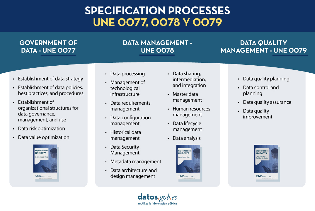
Fig. 1. Specification processes UNE 0077, 0078 and 0079
To support this organizational strategy, the Vistabella City Council needs a data strategy, the main objective of which is to promote the publication of open data on the respective open data portals and encourage their reuse to provide quality data to its residents transparently and responsibly. The Mayor of the Vistabella City Council must launch a data governance program to achieve this main objective. For this purpose, a working group composed of specialized data experts from the City Council is assigned to tackle this program. This group of experts is given the necessary authority, a budget, and a set of responsibilities.
When starting, these experts decide to follow the process approach proposed in UNE 0077, as it provides them with a suitable guide to carry out the necessary data governance actions, identifying the expected process outcomes for each of the processes and how these can be materialized into specific artifacts or work products.
This article explains how the experts have used the processes in the UNE 0077 specification to achieve their goal. Out of the five processes detailed in the specification, we will focus, by way of example, on only three of them: the one describing how to establish the data strategy, the one describing how to establish policies and best practices, and the one describing how to establish organizational structures.
Before we begin, it is important to remember the structure of the process descriptions in the different UNE specifications (UNE 0077, UNE 0078, and UNE 0079). All processes are described with a purpose, a list of expected process outcomes (i.e., what is expected to be achieved when the process is executed), a set of tasks that can be followed, and a set of artifacts or work products that are the manifestation of the process outcomes.
"Data Strategy Establishment Process"
The team of experts from the Vistabella City Council decided to follow each of the tasks proposed in UNE 0077 for this process. Below are some aspects of the execution of these tasks:
T1. Evaluate the capabilities, performance, and maturity of the City Council for the publication of open data. To do this, the working group gathered all possible information about the skills, competencies, and experiences in publishing open data that the Vistabella City Council already had. They also collected information about the downloads that have been made so far of published data, as well as a description of the data itself and the different formats in which it has been published. They also analyzed the City Council's environment to understand how open data is handled. The work product generated was an Evaluation Report on the organization's data capabilities, performance, and maturity.
T2. Develop and communicate the data strategy. Given its importance, to develop the data strategy, the working group used the Plan to promote the opening and reuse of open data as a reference to shape the data strategy stated earlier, which is to "promote the publication of open data on the respective open data portals and encourage their reuse to provide quality data to its residents transparently and responsibly." Additionally, it is important to note that data openness projects will be designed to eventually become part of the structural services of the Vistabella City Council. The work products generated will be the adapted Data Strategy itself and a specific communication plan for this strategy.
T3. Identify which data should be governed according to the data strategy. The Vistabella City Council has decided to publish more data about urban public transport and cultural events in the municipality, so these are the data that should be governed. This would include data of different types: statistical data, geospatial data, and some financial data. To do this, they propose using the Plan to promote the opening and reuse of open data again. The work product will be a list of the data that should be governed, and in this case, also published on the platform. Later on, the experts will be asked to reach an agreement on the meaning of the data and choose the most representative metadata to describe the different business, technical, and operational characteristics.
T4. Develop the portfolio of data programs and projects. To achieve the specific objective of the data strategy, a series of specific projects related to each other are identified, and their viability is determined. The work product generated through this task will be a portfolio of projects that covers these objectives:
- Planning, control, and improvement of the quality of open data
- Ensuring compliance with security standards
- Deployment of control mechanisms for data intermediation
- Management of the configuration of data published on the portal
T5. Monitor the degree of compliance with the data strategy. To do this, the working group defines a series of key performance indicators that are measured periodically to monitor key aspects related to the quality of open data, compliance with security standards, use of data intermediation mechanisms, and management of changes to the data published on the portal. The work product generated consists of periodic reports on the monitoring of the data strategy.
"Establishment of Data Policies, Best Practices, and Procedures Process"
The data strategy is implemented through a series of policies, best practices, and procedures. To determine these policies or procedures, you can follow the process of Establishing Data Policies, Best Practices, and Procedures detailed in UNE 0077. For each of the data identified in the previous process, it may be necessary to define specific policies for each area of action described in the established data strategy.
To have a systematic and consistent way of working and to avoid errors, the Vistabella City Council's working group decides to model and publish its own process for defining strategies based on the generic definition of that process contained in Specification UNE 0077, tailored to the specific characteristics of the Vistabella City Council.
This process could be followed by the working group as many times as necessary to define and approve data policies, best practices, and procedures.
In any case, it is important for the customization of this process to identify and select the principles, standards, ethical aspects, and relevant legislation related to open data. To do this, a framework is defined, consisting of a regulatory framework and a framework of standards.
The regulatory framework includes:
- The legal framework related to the reuse of public sector information.
- The General Data Protection Regulation (GDPR) to ensure that the minimum requirements for the security and privacy of information are met when publishing open data on the portal.
The framework of standards includes, among others:
- The practical guide for improving the quality of open data, which provides support to ensure that the shared data is of quality.
- The UNE specifications 0077, 0078, and 0079 themselves, which contain best practices for data governance, management, and quality.
This framework, along with the defined process, will be used by the working group to develop specific data policies that should be communicated through the appropriate publication, taking into account the most appropriate legal tools available. Some of these policies may be published, for example, as municipal resolutions or announcements, in compliance with the current regional or national legislation.
"Establishment of Organizational Structures for Data Governance, Management, and Use Process"
Even though the established Working Group is making initial efforts to address the strategy, it is necessary to create an organizational structure responsible for coordinating the necessary work related to the governance, management, and quality management of open data. For this purpose, the corresponding process detailed in UNE 0077 will be followed. Similar to the first section, the explanation is provided with the structure of the tasks to be developed:
T1. Define an organizational structure for data governance, management, and use. It is interesting to visualize the Vistabella City Council as a federated set of council offices and other municipal services that could share a common way of working, each with the necessary independence to define and publish their open data. Remember that initially, this data pertained to urban transport and cultural events. This involves identifying individual and collective roles, chains of responsibility, and accountability, as well as defining a way of communicating among them. The main product of this work will be an organizational structure to support various activities. These organizational structures must be compatible with the functional role structures that already exist in the City Council. In this regard, one can mention, by way of example, the information responsible unit, whose role is highlighted in Law 37/2007 as one of the most important roles. The information responsible unit primarily has the following four functions:
- Coordinate information reuse activities with existing policies regarding publications, administrative information, and electronic administration.
- Facilitate information about competent bodies within their scope for receiving, processing, and resolving reuse requests transmitted.
- Promote the provision of information in appropriate formats and keep it updated as much as possible.
- Coordinate and promote awareness, training, and promotional activities.
T2. Establish the necessary skills and knowledge. For each of the functions mentioned above of the information responsible units, it will be necessary to identify the skills and knowledge required to manage and publish the open data for which they are responsible. It is important to note that knowledge and skills should encompass both technical aspects in the field of open data publication and domain-specific knowledge related to the data being opened. All these knowledge and skills should be appropriately recognized and listed. Later on, a working group may be tasked with designing training plans to ensure that individuals involved in the information responsible units possess these knowledge and skills.
T3. Monitor the performance of organizational structures. In order to quantify the performance of organizational structures, it will be necessary to define and measure a series of indicators that allow modeling different aspects of the work of the people included in the organizational structures. This may include aspects such as the efficiency and effectiveness of their work or their problem-solving ability.
We have reached the end of this first article in which some aspects of how to use three of the five processes in the UNE 0077:2023 specification have been described to outline what open data governance should look like. This was done using an example of a City Council in an imaginary town called Vistabella, which is interested in publishing open data on urban transport and cultural events.
The content of this guide can be downloaded freely and free of charge from the AENOR portal through the link below by accessing the purchase section. Access to this family of UNE data specifications is sponsored by the Secretary of State for Digitalization and Artificial Intelligence, Directorate General for Data. Although the download requires prior registration, a 100% discount on the total price is applied at the time of finalizing the purchase. After finalizing the purchase, the selected standard or standards can be accessed from the customer area in the my products section.
https://tienda.aenor.com/norma-une-especificacion-une-0077-2023-n0071116
Content developed by Dr. Ismael Caballero, Associate Professor at UCLM, and Dr. Fernando Gualo, PhD in Computer Science, and Chief Executive Officer and Data Quality and Data Governance Consultant. The content and viewpoints reflected in this publication are the sole responsibility of the authors."
Application
This free software application offers a map with all the trees in the city of Barcelona geolocated by GPS. The user can access in-depth information on the subject. For example, the program identifies the number of trees in each street, their condition and even the species.
The application's developer, Pedro López Cabanillas, has used datasets from Barcelona's open data portal (Open Data Barcelona) and states, in his blog, that it can be useful for botany students or "curious users". The Barcelona Trees application is now in its third beta version.
The program uses the framework Qt, C++ and QML languages, and can be built (using a suitable modern compiler) for the most common targets: Windows, macOS, Linux and Android operating systems.
Blog
In recent years, climate change has become one of the most pressing challenges of our time because, according to the main reports of different international institutions, it is accelerating beyond the most pessimistic forecasts. Rising global temperatures, melting glaciers, rising sea levels and the frequency of extreme weather events have been well documented in reports such as that produced by the Intergovernmental Panel on Climate Change (IPCC). Similarly, the report CO2 Emissions in 2022 of the International Energy Agency (IEA) warns of the continuous growth of carbon emissions and their contribution to global warming, while calling for urgent efforts to reduce them.
In this critical context that threatens the stability of our planet, open data becomes a fundamental tool to understand, monitor and combat the phenomenon of global climate change with solutions. Moreover, there are several dimensions in which open data is playing an essential role in the fight against climate change.
Climate Modeling and Prediction: planning for a Sustainable Future
Climate models make it possible to predict how the climate will change in the future and, when properly trained, also help to identify potential impacts in specific regions. This enables governments and communities to take measures to adapt to rapidly changing conditions.
Increasingly, these models are fed by open datasets, and some climate models have even begun to be published freely and openly. In this line, we find the climate models published on the MIT Climate portal or the data and models published by NOAA Climate.gov. In this way, all kinds of institutions, scientists and even citizens can contribute to identifying possibilities for mitigating the effects of climate change.
Carbon emissions monitoring: carbon footprint tracking
Thanks to open data and some paid-for datasets, it is now possible to accurately track the carbon emissions of countries, cities and even companies on an ongoing basis. As exemplified by the International Energy Agency's (IEA) World Energy Outlook 2022 or the U.S. Environmental Protection Agency's Global Greenhouse Gas Emissions Data, these data are essential not only for measuring and analyzing emissions globally, but also for assessing progress towards emission reduction targets.
Adapting Agriculture: cultivating a resilient future
It is clear that climate change has a direct impact on agriculture and that this impact threatens a global food security that in itself is already a global challenge. Open data on weather patterns, rainfall and temperatures, land use and fertilizer and pesticide use, coupled with local data captured in the field, allow farmers to adapt their practices and evolve towards a model of precision agriculture. Choosing crops that are resilient to changing conditions, and managing inputs more efficiently thanks to this data, is crucial to ensure that agriculture remains sustainable and productive in the new scenarios.
Among other organizations, the Food and Agriculture Organization of the United Nations (FAO) highlights the importance of open data in climate-smart agriculture and publishes datasets on pesticide use, inorganic fertilizers, greenhouse gas emissions, agricultural production, etc., which contribute to improved land, water and food security management.
Natural Disaster Response: minimizing Impact
The analysis of data on extreme weather events, such as hurricanes or floods, makes it possible to design strategies that lead to a faster and more effective response when these events occur. In this way, on the one hand, lives are saved and, on the other, the high impact on affected communities is partially mitigated.
Open data such as those published by the US National Hurricane Center (NHC) or the European Environment Agency are valuable tools in natural disaster management as they help streamline disaster preparedness decision-making and provide an objective basis for assessment and prioritization.
Biodiversity and conservation: protecting our natural wealth
While it seems clear that biodiversity is vital to the health of the Earth, human activity continues to put it under great pressure, combining with climate change to threaten its stability. Open data on species populations, deforestation and other ecological indicators such as those published by governments and organizations around the world in the Global Biodiversity Information Facility (GBIF) help us to identify areas at risk more quickly and accurately and thus prioritize conservation efforts.
With the increased availability of open data, governments, institutions, companies and citizens can make informed decisions to mitigate the consequences of climate change and work together towards a more sustainable future.
Content prepared by Jose Luis Marín, Senior Consultant in Data, Strategy, Innovation & Digitalization.
The contents and points of view reflected in this publication are the sole responsibility of its author.
Documentación
The digitalization in the public sector in Spain has also reached the judicial field. The first regulation to establish a legal framework in this regard was the reform that took place through Law 18/2011, of July 5th (LUTICAJ). Since then, there have been advances in the technological modernization of the Administration of Justice. Last year, the Council of Ministers approved a new legislative package to definitively address the digital transformation of the public justice service, the Digital Efficiency Bill.
This project incorporates various measures specifically aimed at promoting data-driven management, in line with the overall approach formulated through the so-called Data Manifesto promoted by the Data Office.
Once the decision to embrace data-driven management has been made, it must be approached taking into account the requirements and implications of Open Government, so that not only the possibilities for improvement in the internal management of judicial activity are strengthened, but also the possibilities for reuse of the information generated as a result of the development of said public service (RISP).
Open data: a premise for the digital transformation of justice
To address the challenge of the digital transformation of justice, data openness is a fundamental requirement. In this regard, open data requires conditions that allow their automated integration in the judicial field. First, an improvement in the accessibility conditions of the data sets must be carried out, which should be in interoperable and reusable formats. In fact, there is a need to promote an institutional model based on interoperability and the establishment of homogeneous conditions that, through standardization adapted to the singularities of the judicial field, facilitate their automated integration.
In order to deepen the synergy between open data and justice, the report prepared by expert Julián Valero identifies the keys to digital transformation in the judicial field, as well as a series of valuable open data sources in the sector.
If you want to learn more about the content of this report, you can watch the interview with its author.
Below, you can download the full report, the executive summary, and a summary presentation.
Blog
Summer is coming to an end. August is winding down, and September is on the horizon, bringing with it the return to routine and all that it entails. The start of the school year and the end of vacations can be challenging. However, this time of year, along with January, is a time for fresh beginnings and resolutions. As you head back to school, we at datos.gob.es propose a challenge: to learn more about open data and new technologies.
Whether you're looking for a career change, seeking to enrich your professional profile, or simply curious about this burgeoning field, we've selected content on disruptive technologies that we hope will pique your interest. In this post, you'll find articles, books, and even interviews covering data and the innovative technologies surrounding it.
Take note and prepare your backpack with readings on open data!
Piensa claro, Ocho reglas para descifrar el mundo y tener éxito en la era de los datos - Kiko Llaneras (2022)
In this compilation of data-based curiosities, El País journalist Kiko Llaneras offers practical advice for making reliable predictions, avoiding common mistakes, and questioning our intuition.
- What's it about? The book uses data to highlight situations such as the fact that most footballers are born in January or to explain the relationship between data and the Chernobyl disaster. These and other topics serve as the starting point for the development of eight independent chapters, in which Llaneras provides advice, based on his experience, on the use and treatment of data to arrive at sound conclusions.
- Who's it for? It's a very easy-to-understand book, and no prior knowledge of the subject is required. If the reader has an understanding of statistical topics and data analysis, they will enjoy some references. However, the examples the journalist uses to explain each piece of advice make the book an ideal choice for the general public.
Yasmín Belén Quiroga: “Promoting Transparency and Confidence in the Justice System through Gender-Perspective Open Data”; UN Women; Interview (03/24/2023)
The fifth United Nations Development Goal sets the target of achieving gender equality and empowering all women and girls. Open data plays a significant role in measuring its attainment and shaping the measures to achieve it. Lawyer and gender and data specialist Yasmín Belén Quiroga is one of the authors of "Gender-Perspective Open Data and Open Justice," a research project conducted within the framework of the Spotlight Initiative. In this project, the expert analyzes the experience of the court where she works and makes all the court's resolutions and judgments available through digital means.
- What's it about? The lawyer discusses various topics such as the importance of having a gender-perspective open data observatory, the role of open justice in social development, or recommendations for ensuring ethical data reuse. It's a light read that takes no more than 5 minutes.
- Who's it for? It may be of interest to anyone curious about the application of open data in the judicial system and gender perspective in the sector.
- For further reading: The United Nations portal has published "Gender-Perspective Open Data and Open Justice: The Experience of Court 10," a research project in which Quiroga participated, analyzing the importance of having a source of open and accessible data to eliminate issues like gender inequality.
"The Data Science Handbook: Advice and Insights from 25 Amazing Data Scientists"; Book (2020)
In this book, authored by four professionals in the data field, you'll find 25 interviews with leading American data scientists, including several leaders from major companies.
- What's it about? The book provides firsthand information from experienced data scientists and offers advice for a successful career in the field.
- Who's it for? It's designed for data professionals, whether beginners or more experienced individuals. Each interview offers a professional and personal perspective on the world of data, as well as practical advice.
"10 Breakthrough Technologies 2023"; MIT Technology Review; Article (01/09/2023)
Every year, the world's oldest technology magazine publishes a compilation of the most disruptive technological advancements of the year. In the 2023 list, technologies such as gene-editing tools, generative AI and its possibilities, and expanded geospatial data analysis are highlighted more than ever before.
- What's it about? It's a list of articles that delve into each technology in depth, discussing its current and future applications, as well as the contributions it can make to society.
- Who's it for? Anyone curious about developments in the world of technology.
The content on data and technology is endless, and the works mentioned above represent just a small sample intended to serve as an example. Therefore, with the aim of enriching this selection, we encourage you to complete this list in the comments. Would you like to recommend a book or article? We're all ears!