Noticia
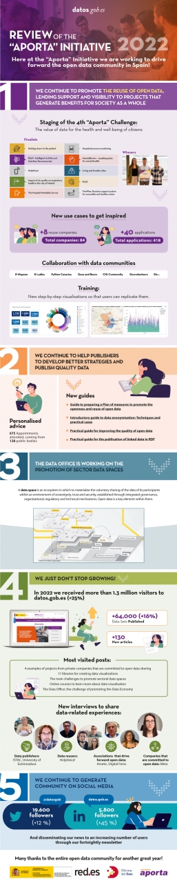
Just a few days before the end of 2022, we’d like to take this opportunity to take stock of the year that is drawing to a close, a period during which the open data community has not stopped growing in Spain and in which we have joined our joint forces and desires with the Data Office. The latter unit is responsible for boosting the management, sharing and use of data throughout all the production sectors of the Spanish Economy and Society, focusing its efforts in particular on promoting spaces for sharing and making use of sectoral data.
It is precisely thanks to the incorporation of the Data Office under the Aporta Initiative that we have been able to double the dissemination effect and promote the role that open data plays in the development of the data economy.
Concurrently, during 2022 we have continued working to bring open data closer to the public, the professional community and public administrations. Thus, and with the aim of promoting the reuse of open data for social purposes, we have once again organised a new edition of the Aporta Challenge.
Focusing on the health and well-being of citizens, the fourth edition of this competition featured three winners of the very highest level and the common denominator of their digital solutions is to improve the physical and mental health of people, thanks to services developed with open data.
New examples of use cases and step-by-step visualisations
In turn, throughout this year we have continued to characterise new examples of use cases that help to increase the catalogue of open data reuse companies and applications. With the new admissions, datos.gob.es already has a catalogue of 84 reuse companies and a total of 418 applications developed from open data. Of the latter, more than 40 were identified in 2022.
Furthermore, since last year we inaugurated the step-by -step visualisations section, we have continued to explore their potential so that users can be inspired and easily replicate the examples.
Reports, guides and audio-visual material to promote the use of open data
For the purpose of continuing to provide advice to the communities of open data publishers and reusers, another of the mainstays in 2022 has been a focus on offering innovative reports on the latest trends in artificial intelligence and other emerging technologies, as well as the development of guides , infographics and videos which foster an up-close knowledge of new use cases and trends related with open data.
Some of the most frequently read articles at the datos.gob.es portal have been '4 examples of projects by private companies that are committed to open data sharing', 'How is digital transformation evolving in Spain?' either 'The main challenges to promote sectoral data spaces', inter alia. As far as the interviews are concerned, we would highlight those held with the winners of the 4th “Aporta” Challenge, with Hélène Verbrugghe, Public Policy Manager for Spain and Portugal of Meta or with Alberto González Yanes, Head of the Economic Statistics Service of the Canary Islands Institute of Statistics (ISTAC), inter alia.
Finally, we would like to thank the open data community for its support for another year. During 2022, we have managed to ensure that the National Data Catalogue exceeds 64,000 published data sets. In addition, datos.gob.es has received more than 1,300,000 visits, 25% more than in 2021, and the profiles of datos.gob.es on LinkedIn and Twitter have grown by 45% and 12%, respectively.
Here at datos.gob.es and the Data Office we are taking on this new year full of enthusiasm and a desire to work so that open data keep making progress in Spain through publishers and reusers.
Here's to a highly successful 2023!
If you’d like to see the infographic in full size you can click here.
** In order to access the links included in the image itself, please download the pdf version available below.
Blog
In this post we have described step-by-step a data science exercise in which we try to train a deep learning model with a view to automatically classifying medical images of healthy and sick people.
Diagnostic imaging has been around for many years in the hospitals of developed countries; however, there has always been a strong dependence on highly specialised personnel. From the technician who operates the instruments to the radiologist who interprets the images. With our current analytical capabilities, we are able to extract numerical measures such as volume, dimension, shape and growth rate (inter alia) from image analysis. Throughout this post we will try to explain, through a simple example, the power of artificial intelligence models to expand human capabilities in the field of medicine.
This post explains the practical exercise (Action section) associated with the report “Emerging technologies and open data: introduction to data science applied to image analysis”. Said report introduces the fundamental concepts that allow us to understand how image analysis works, detailing the main application cases in various sectors and highlighting the role of open data in their implementation.
Previous projects
However, we could not have prepared this exercise without the prior work and effort of other data science lovers. Below we have provided you with a short note and the references to these previous works.
- This exercise is an adaptation of the original project by Michael Blum on the STOIC2021 - disease-19 AI challenge. Michael's original project was based on a set of images of patients with Covid-19 pathology, along with other healthy patients to serve as a comparison.
- In a second approach, Olivier Gimenez used a data set similar to that of the original project published in a competition of Kaggle. This new dataset (250 MB) was considerably more manageable than the original one (280GB). The new dataset contained just over 1,000 images of healthy and sick patients. Olivier's project code can be found at the following repository.
Datasets
In our case, inspired by these two amazing previous projects, we have built an educational exercise based on a series of tools that facilitate the execution of the code and the possibility of examining the results in a simple way. The original data set (chest x-ray) comprises 112,120 x-ray images (front view) from 30,805 unique patients. The images are accompanied by the associated labels of fourteen diseases (where each image can have multiple labels), extracted from associated radiological reports using natural language processing (NLP). From the original set of medical images we have extracted (using some scripts) a smaller, delimited sample (only healthy people compared with people with just one pathology) to facilitate this exercise. In particular, the chosen pathology is pneumothorax.
If you want further information about the field of natural language processing, you can consult the following report which we already published at the time. Also, in the post 10 public data repositories related to health and wellness the NIH is referred to as an example of a source of quality health data. In particular, our data set is publicly available here.
Tools
To carry out the prior processing of the data (work environment, programming and drafting thereof), R (version 4.1.2) and RStudio (2022-02-3) was used. The small scripts to help download and sort files have been written in Python 3.
Accompanying this post, we have created a Jupyter notebook with which to experiment interactively through the different code snippets that our example develops. The purpose of this exercise is to train an algorithm to be able to automatically classify a chest X-ray image into two categories (sick person vs. non-sick person). To facilitate the carrying out of the exercise by readers who so wish, we have prepared the Jupyter notebook in the Google Colab environment which contains all the necessary elements to reproduce the exercise step-by-step. Google Colab or Collaboratory is a free Google tool that allows you to programme and run code on python (and also in R) without the need to install any additional software. It is an online service and to use it you only need to have a Google account.
Logical flow of data analysis
Our Jupyter Notebook carries out the following differentiated activities which you can follow in the interactive document itself when you run it on Google Colab.
- Installing and loading dependencies.
- Setting up the work environment
- Downloading, uploading and pre-processing of the necessary data (medical images) in the work environment.
- Pre-visualisation of the loaded images.
- Data preparation for algorithm training.
- Model training and results.
- Conclusions of the exercise.
Then we carry out didactic review of the exercise, focusing our explanations on those activities that are most relevant to the data analysis exercise:
- Description of data analysis and model training
- Modelling: creating the set of training images and model training
- Analysis of the training result
- Conclusions
Description of data analysis and model training
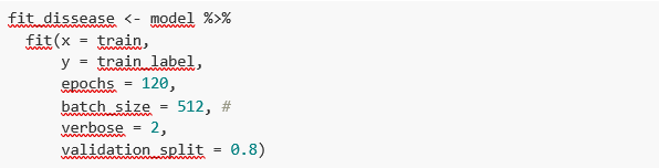
The first steps that we will find going through the Jupyter notebook are the activities prior to the image analysis itself. As in all data analysis processes, it is necessary to prepare the work environment and load the necessary libraries (dependencies) to execute the different analysis functions. The most representative R package of this set of dependencies is Keras. In this article we have already commented on the use of Keras as a Deep Learning framework. Additionally, the following packages are also required: htr; tidyverse; reshape2; patchwork.
Then we have to download to our environment the set of images (data) we are going to work with. As we have previously commented, the images are in remote storage and we only download them to Colab at the time we analyse them. After executing the code sections that download and unzip the work files containing the medical images, we will find two folders (No-finding and Pneumothorax) that contain the work data.

Once we have the work data in Colab, we must load them into the memory of the execution environment. To this end, we have created a function that you will see in the notebook called process_pix(). This function will search for the images in the previous folders and load them into the memory, in addition to converting them to grayscale and normalising them all to a size of 100x100 pixels. In order not to exceed the resources that Google Colab provides us with for free, we limit the number of images that we load into memory to 1000 units. In other words, the algorithm will be trained with 1000 images, including those that it will use for training and those that it will use for subsequent validation.
Once we have the images perfectly classified, formatted and loaded into memory, we carry out a quick visualisation to verify that they are correct. We obtain the following results:

Self-evidently, in the eyes of a non-expert observer, there are no significant differences that allow us to draw any conclusions. In the steps below we will see how the artificial intelligence model actually has a better clinical eye than we do.
Modelling
Creating the training image set
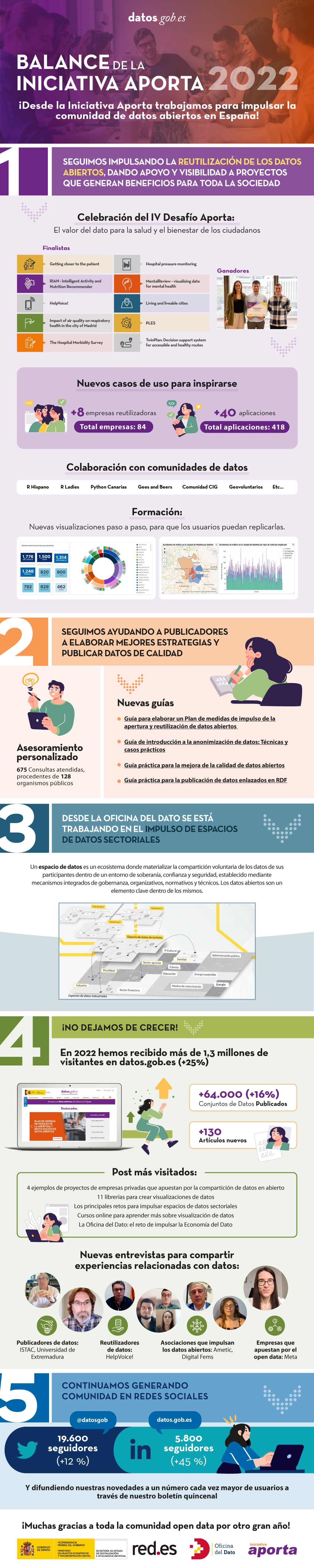
As we mentioned in the previous steps, we have a set of 1000 starting images loaded in the work environment. Until now, we have had classified (by an x-ray specialist) those images of patients with signs of pneumothorax (on the path "./data/Pneumothorax") and those patients who are healthy (on the path "./data/No -Finding")
The aim of this exercise is precisely to demonstrate the capacity of an algorithm to assist the specialist in the classification (or detection of signs of disease in the x-ray image). With this in mind, we have to mix the images to achieve a homogeneous set that the algorithm will have to analyse and classify using only their characteristics. The following code snippet associates an identifier (1 for sick people and 0 for healthy people) so that, later, after the algorithm's classification process, it is possible to verify those that the model has classified correctly or incorrectly.
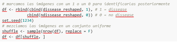
So, now we have a uniform “df” set of 1000 images mixed with healthy and sick patients. Next, we split this original set into two. We are going to use 80% of the original set to train the model. In other words, the algorithm will use the characteristics of the images to create a model that allows us to conclude whether an image matches the identifier 1 or 0. On the other hand, we are going to use the remaining 20% of the homogeneous mixture to check whether the model, once trained, is capable of taking any image and assigning it 1 or 0 (sick, not sick).
Model training
Right, now all we have left to do is to configure the model and train with the previous data set.
Before training, you will see some code snippets which are used to configure the model that we are going to train. The model we are going to train is of the binary classifier type. This means that it is a model that is capable of classifying the data (in our case, images) into two categories (in our case, healthy or sick). The model selected is called CNN or Convolutional Neural Network. Its very name already tells us that it is a neural networks model and thus falls under the Deep Learning discipline. These models are based on layers of data features that get deeper as the complexity of the model increases. We would remind you that the term deep refers precisely to the depth of the number of layers through which these models learn.
Note: the following code snippets are the most technical in the post. Introductory documentation can be found here, whilst all the technical documentation on the model's functions is accessible here.
Finally, after configuring the model, we are ready to train the model. As we mentioned, we train with 80% of the images and validate the result with the remaining 20%.
Training result
Well, now we have trained our model. So what's next? The graphs below provide us with a quick visualisation of how the model behaves on the images that we have reserved for validation. Basically, these figures actually represent (the one in the lower panel) the capability of the model to predict the presence (identifier 1) or absence (identifier 0) of disease (in our case pneumothorax). The conclusion is that when the model trained with the training images (those for which the result 1 or 0 is known) is applied to 20% of the images for which the result is not known, the model is correct approximately 85% (0.87309) of times.

Indeed, when we request the evaluation of the model to know how well it classifies diseases, the result indicates the capability of our newly trained model to correctly classify 0.87309 of the validation images.
Now let’s make some predictions about patient images. In other words, once the model has been trained and validated, we wonder how it is going to classify the images that we are going to give it now. As we know "the truth" (what is called the ground truth) about the images, we compare the result of the prediction with the truth. To check the results of the prediction (which will vary depending on the number of images used in the training) we use that which in data science is called the confusion matrix. The confusion matrix:
- Places in position (1,1) the cases that DID have disease and the model classifies as "with disease"
- Places in position (2,2), the cases that did NOT have disease and the model classifies as "without disease"
In other words, these are the positions in which the model "hits" its classification.
In the opposite positions, in other words, (1,2) and (2,1) are the positions in which the model is "wrong". So, position (1,2) are the results that the model classifies as WITH disease and the reality is that they were healthy patients. Position (2,1), the very opposite.
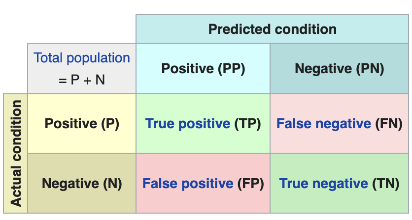
Explanatory example of how the confusion matrix works. Source: Wikipedia https://en.wikipedia.org/wiki/Confusion_matrix
In our exercise, the model gives us the following results:
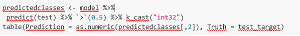

In other words, 81 patients had this disease and the model classifies them correctly. Similarly, 91 patients were healthy and the model also classifies them correctly. However, the model classifies as sick 13 patients who were healthy. Conversely, the model classifies 12 patients who were actually sick as healthy. When we add the hits of the 81+91 model and divide it by the total validation sample, we obtain 87% accuracy of the model.
Conclusions
In this post we have guided you through a didactic exercise consisting of training an artificial intelligence model to carry out chest x-ray imaging classifications with the aim of determining automatically whether someone is sick or healthy. For the sake of simplicity, we have chosen healthy patients and patients with pneumothorax (only two categories) previously diagnosed by a doctor. The journey we have taken gives us an insight into the activities and technologies involved in automated image analysis using artificial intelligence. The result of the training affords us a reasonable classification system for automatic screening with 87% accuracy in its results. Algorithms and advanced image analysis technologies are, and will increasingly be, an indispensable complement in multiple fields and sectors, such as medicine. In the coming years, we will see the consolidation of systems which naturally combine the skills of humans and machines in expensive, complex or dangerous processes. Doctors and other workers will see their capabilities increased and strengthened thanks to artificial intelligence. The joining of forces between machines and humans will allow us to reach levels of precision and efficiency never seen before. We hope that through this exercise we have helped you to understand a little more about how these technologies work. Don't forget to complete your learning with the rest of the materials that accompany this post.
Content prepared by Alejandro Alija, an expert in Digital Transformation.The contents and points of view reflected in this publication are the sole responsibility of its author.
Documentación
We present a new report in the series 'Emerging Technologies and Open Data', by Alejandro Alija. The aim of these reports is to help the reader understand how various technologies work, what is the role of open data in them and what impact they will have on our society. This series includes monographs on data analysis techniques such as natural language analysis and predictive analytics. This new volume of the series analyzes the key aspects of data analysis applied to images and, through this exercise, Artificial Intelligence applied to the identification and classification of diseases by means of medical radio imaging, delves into the more practical side of the monograph.
Image analysis adopts different names and ways of referring to it. Some of the most common are visual analytics, computer vision or image processing. The importance of this type of analysis is of great relevance nowadays, since many of the most modern algorithmic techniques of artificial intelligence have been designed specifically for this purpose. Some of its applications can be seen in our daily lives, such as the identification of license plates to access a parking lot or the digitization of scanned text to be manipulated.
The report introduces the fundamental concepts that allow us to understand how image analysis works, detailing the main application cases in various sectors. After a brief introduction by the author, which will serve as a basis for contextualizing the subject matter, the full report is presented, following the traditional structure of the series:
- Awareness. The Awareness section explains the key concepts of image analysis techniques. Through this section, readers can find answers to questions such as: how are images manipulated as data, how are images classified, and discover some of the most prominent applications in image analysis.
- Inspire. The Inspire section takes a detailed look at some of the main use cases in sectors as diverse as agriculture, industry and real estate. It also includes examples of applications in the field of medicine, where the author shows some particularly important challenges in this area.
- Action: In this case, the Action section has been published in notebook format, separately from the theoretical report. It shows a practical example of Artificial Intelligence applied to the identification and classification of diseases using medical radio imaging. This post includes a step-by-step explanation of the exercise. The source code is available so that readers can learn and experiment by themselves the intelligent analysis of images.
Below, you can download the report - Awareness and Inspire sections - in pdf and word (reusable version).
Noticia
The last few months of the year are always accompanied by numerous innovations in the open data ecosystem. It is the time chosen by many organisations to stage conferences and events to show the latest trends in the field and to demonstrate their progress.
New functionalities and partnerships
Public bodies have continued to make progress in their open data strategies, incorporating new functionalities and data sets at their open data platforms. Examples include:
- On 11 November, the Ministry for the Ecological Transition and the Demographic Challenge and The Information Lab Spain presented the SIDAMUN platform (Integrated Municipal Data System). It is a data visualisation tool with interactive dashboards which show detailed information about the current status of the territory.
- The Ministry of Agriculture, Food and Fisheries has published four interactive reports to exploit more than 500 million data elements and thus provide information in a simple way about the status and evolution of the Spanish primary sector.
- The Open Data Portal of the Regional Government of Andalusia has been updated in order to promote the reuse of information, expanding the possibilities of access through APIs in a more efficient, automated way.
- The National Geographic Institute has updated the information on green routes (reconditioned railway lines) which are already available for download in KML, GPX and SHP.
- The Institute for Statistics and Cartography of Andalusia has published data on the Natural Movement of the Population for 2021, which provides information on births, marriages and deaths.
We have also seen advances made from a strategic perspective and in terms of partnerships. The Regional Ministry of Participation and Transparency of the Valencian Regional Government set in motion a participatory process to design the first action plan of the 'OGP Local' programme of the Open Government Partnership. In turn, the Government of the Canary Islands has applied for admission to the International Open Government Partnership and it will strengthen collaboration with the local entities of the islands, thereby mainstreaming the Open Government policies.
In addition, various organisations have announced news for the coming months. This is the case of Cordoba City Council which is set to launch in the near future a new portal with open data, or of Torrejon City Council which has included in its local action plan the creation of an Open data portal, as well as the promotion of the use of big data in institutions.
Open data tenders, a showcase for finding talent and new use cases
During the autumn, the winners of various contests were announced which sought to promote the reuse of open data. Thanks to these tenders, we have also learned of numerous cases of reuse which demonstrate open data's capacity to generate social and economic benefits.
- At the end of October we met the winners of our “Aporta” Challenge. First prize went to HelpVoice!, a service that seeks to help the elderly using speech recognition techniques based on automatic learning. A web environment to facilitate the analysis and interactive visualisation of microdata from the Hospital Morbidity Survey and an app to promote healthy habits won second and third prizes, respectively.
- The winners of the ideas and applications tender of Open Data Euskadi were also announced. The winners include a smart assistant for energy saving and an app to locate free parking spaces.
- Aragon Open Data, the open data portal of the Government of Aragon, celebrated its tenth anniversary with a face-to-face datathon to prototype services that help people through portal data. The award for the most innovative solution with the greatest impact went to Certifica-Tec, a website that allows you to geographically view the status of energy efficiency certificates.
- The Biscay Open Data Datathon set out to transform Biscay based on its open data. At the end of November, the final event of the Datathon was held. The winner was Argilum, followed by Datoston.
- UniversiData launched its first datathon, whose winning projects have just been announced.
In addition, in the last few months other initiatives related with the reuse of data have been announced such as:
- Researchers from Technical University of Madrid have carried out a study where they use artificial intelligence algorithms to analyse clinical data on lung cancer patients, scientific publications and open data. The aim is to obtain statistical patterns that allow the treatments to be improved.
- The Research Report 2021 that the University of Extremadura has just published was generated automatically from the open data portal. It is a document containing more than 1,200 pages which includes the investigations of all the departments of the centre.
- F4map is a 3D map that has been produced thanks to the open data of the OpenStreetMap collaborative community. Hence, and alternating visualisation in 2D and 3D, it offers a detailed view of different cities, buildings and monuments from all around the world.
Dissemination of open data and their use cases through events
One thing autumn has stood out for has been for the staging of events focused on the world of data, many of which were recorded and can be viewed again online. Examples include:
- The Ministry of Justice and the University of Salamanca organised the symposium Justice and Law in Data: The role of Data as an enabler and engine for change for the transformation of Justice and Law”. During the event reflections were made on data as a public asset. All the presentations are available on the Youtube channel of the University.
- In October Madrid hosted a new edition of the Data Management Summit Spain. The day before there was a prior session, organised in collaboration with DAMA España and the Data Office, aimed exclusively at representatives of the public administration and focused on open data and the exchange of information between administrations. This can be seen on Youtube too.
- The Barcelona Provincial Council, the Castellon Provincial Council and the Government of Aragon organised the National Open Data Meeting, with the aim of making clear the importance of the latter in territorial cohesion.
- The Iberian Conference on Spatial Data Infrastructure was held in Seville, where geographic information trends were discussed.
- A recording of the Associationism Seminars 2030, organised by the Government of the Canary Islands, can also be viewed. As regards the presentations, we would highlight the one related with the ‘Map of Associationism in the Canary Islands' which makes this type of data visible in an interactive way.
- ASEDIE organised the 14th edition of its International Conference on the reuse of public sector Information which featured various round tables, including one on 'The Data Economy: rights, obligations, opportunities and barriers'.
Guides and courses
During these months, guides have also been published which seek to help publishers and reusers in their work with open data. From datos.gob.es we have published documents on How to prepare a Plan of measures to promote the opening and reuse of open data, the guide to Introduction to data anonymisation: Techniques and practical cases and the Practical guide for improving the quality of open data. In addition, other organisations have also published help documents such as:
- The Regional Government of Valencia has published a guide that compiles transparency obligations established by the Valencian law for public sector entities.
- The Spanish Data Protection Agency (AEPD) has translated the Singapore Data Protection Authority’s Guide to Basic Anonymisation, in view of its educational value and special interest to data protection officers. The guide is complemented by a free data anonymisation tool, which the AEPD makes available to organisations
- The NETWORK of Local Entities for Transparency and Citizen Participation of the FEMP has just presented the Data visualisation guide for Local Entities, a document with good practices and recommendations. The document refers to a previous work of the City Council of L'Hospitalet.
International news
During this period, we have also seen developments at European level. Some of the ones we are highlighting are:
- In October the final of the EUdatathon 2022. The finalist teams were previously selected from a total of 156 initial proposals.
- The European Data Portal has launched the initiative Use Case Observatory to measure the impact of open data by monitoring 30 use cases over 3 years.
- A group of scientists from the Dutch Institute for Fundamental Energy Research has created a database of 31,618 molecules thanks to algorithms trained with artificial intelligence.
- The World Bank has developed a new food and nutrition security dashboard which offers the latest global and national data.
These are just a few examples of what the open data ecosystem has produced in recent months. If you would like to share with us any other news, leave us a comment or send us an e-mail to dinamizacion@datos.gob.es
Noticia
Effective equality between men and women is a common goal to be achieved as a society. This is stated by the United Nations (UN), which includes "Achieve gender equality and empower all women and girls" as one of the Sustainable Development Goals to be achieved by 2030.
For this, it is essential to have quality data that show us the reality and the situations of risk and vulnerability that women face. This is the only way to design effective policies that are more equitable and informed, in areas such as violence against women or the fight to break glass ceilings. This has led to an increasing number of organisations opening up data related to gender inequality. However, according to the UN itself, less than half of the data needed to monitor gender inequality is currently available.
What data are needed?
In order to understand the real situation of women and girls in the world, it is necessary to systematically include a gender analysis in all stages of the production of statistics. This implies from using gender-sensitive concepts to broadening the sources of information in order to highlight phenomena that are currently not being measured.
Gender data does not only refer to sex-disaggregated data. Data also need to be based on concepts and definitions that adequately reflect the diversity of women and men, capturing all aspects of their lives and especially those areas that are most susceptible to inequalities. In addition, data collection methods need to take into account stereotypes and social and cultural factors that may induce gender bias in the data.
Resources for gender mainstreaming in data
From datos.gob.es we have already addressed this issue in other contents, providing some initial clues on the creation of datasets with a gender perspective, but more and more organisations are becoming involved in this area, producing materials that can help to alleviate this issue.
The UN Statistics Division produced the report “Integrating a Gender Perspective into Statistics” to provide the methodological and analytical information needed to improve the availability, quality and use of gender statistics. The report focuses on 10 themes: education; work; poverty; environment; food security; power and decision-making; population, households and families; health; migration, displaced persons and refugees; and violence against women. For each theme, the report details the gender issues to be addressed, the data needed to address them, data sources to be considered, and specific conceptual and measurement issues. The report also discusses in a cross-cutting manner how to generate surveys, conduct data analysis or generate appropriate visualisations.
UN agencies are also working on this issue in their various areas of action. For example, Unicef has also developed guides of interest such as “Gender statistics and administrative data systems”, which compiles resources such as conceptual and strategic frameworks, practical tools and use cases, among others.
Another example is the World Bank. This organisation has a gender-sensitive data portal, where it offers indicators and statistics on various aspects such as health, education, violence or employment. The data can be downloaded in CSV or Excel, but it is also displayed through narratives and visualisations, which make it easier to understand. In addition, they can be accessed through an API. This portal also includes a section where tools and guidelines are compiled to improve data collection, use and dissemination of gender statistics. These materials are focused on specific sectors, such as agri-food or domestic work. It also has a section on courses, where we can find, among others, training on how to communicate and use gender statistics.
Initiatives in Spain
If we focus on our country, we also find very interesting initiatives. We have already talked about GenderDataLab.org, a repository of open data with a gender perspective. Its website also includes guides on how to generate and share these datasets. If you want to know more about this project, we invite you to watch this interview with Thais Ruiz de Alda, founder and CEO of Digital Fems, one of the entities behind this initiative.
In addition, an increasing number of agencies are implementing mechanisms to publish gender-sensitive datasets. The Government of the Canary Islands has created the web tool “Canary Islands in perspective” to bring together different statistical sources and provide a scorecard with data disaggregated by sex, which is continuously updated. Another project worth mentioning is the “Women and Men in the Canary Islands” website, the result of a statistical operation designed by the Canary Islands Statistics Institute (ISTAC) in collaboration with the Canary Islands Institute for Equality. It compiles information from different statistical operations and analyses it from a gender perspective.
The Government of Catalonia has also included this issue in its Government Plan. In the report "Prioritisation of open data relating to gender inequality for the Government of Catalonia" they compile bibliography and local and international experiences that can serve as inspiration for both the publication and use of this type of datasets. The report also proposes a series of indicators to be taken into account and details some datasets that need to be opened up.
These are just a few examples that show the commitment of civil associations and public bodies in this area. A field we must continue to work in order to get the necessary data to be able to assess the real situation of women in the world and thus design political solutions that will enable a fairer world for all.
Evento
The first National Open Data Meeting will take place in Barcelona on 21 November. It is an initiative promoted and co-organised by Barcelona Provincial Council, Government of Aragon and Provincial Council of Castellón, with the aim of identifying and developing specific proposals to promote the reuse of open data.
This first meeting will focus on the role of open data in developing territorial cohesion policies that contribute to overcoming the demographic challenge.
Agenda
The day will begin at 9:00 am and will last until 18:00 pm.
After the opening, which will be given by Marc Verdaguer, Deputy for Innovation, Local Governments and Territorial Cohesion of the Barcelona Provincial Council, there will be a keynote speech, where Carles Ramió, Vice-Rector for Institutional Planning and Evaluation at Pompeu Fabra University, will present the context of the subject.
Then, the event will be divided into four sessions where the following topics will be discussed:
- 10:30 a.m. State of art: lights and some shadows of opening and reusing data.
- 12:30 p.m. What does society need and expect from public administrations' open data portals?
- 15:00. Local commitment to fight against depopulation through open data
- 4:30 p.m. What can Public Administrations do using their data to jointly fight depopulation?
Experts linked to various open data initiatives, public organisations and business associations will participate in the conference. Specifically, the Aporta Initiative will participate in the first session, where the challenges and opportunities of the use of open data will be discussed.
The importance of addressing the demographic challenge
The conference will address how the ageing of the population, the geographical isolation that hinders access to health, administrative and educational centres and the loss of economic activity affect the smaller municipalities, both rural and urban. A situation with great repercussions on the sustainability and supply of the whole country, as well as on the preservation of culture and diversity.
Entrevista
A few months ago, Facebook surprised us all with a name change: it became Meta. This change alludes to the concept of "metaverse" that the brand wants to develop, uniting the real and virtual worlds, connecting people and communities.
Among the initiatives within Meta is Data for Good, which focuses on sharing data while preserving people's privacy. Helene Verbrugghe, Public Policy Manager for Spain and Portugal at Meta spoke to datos.gob.es to tell us more about data sharing and its usefulness for the advancement of the economy and society.
Full interview:
1. What types of data are provided through the Data for Good Initiative?
Meta's Data For Good team offers a range of tools including maps, surveys and data to support our 600 or so partners around the world, ranging from large UN institutions such as UNICEF and the World Health Organization, to local universities in Spain such as the Universitat Poliècnica de Catalunya and the University of Valencia.
To support the international response to COVID-19, data such as those included in our Range of Motion Maps have been used extensively to measure the effectiveness of stay-at-home measures, and in our COVID-19 Trends and Impact Survey to understand issues such as reluctance to vaccinate and inform outreach campaigns. Other tools, such as our high-resolution population density maps, have been used to develop rural electrification plans and five-year water and sanitation investments in places such as Rwanda and Zambia. We also have AI-based poverty maps that have helped extend social protection in Togo and an international social connectivity index that has been useful for understanding cross-border trade and financial flows. Finally, we have recently worked to support groups such as the International Federation of the Red Cross and the International Organization for Migration in their response to the Ukraine crisis, providing aggregated information on the volumes of people leaving the country and arriving in places such as Poland, Germany and the Czech Republic.
Privacy is built into all our products by default; we aggregate and de-identify information from Meta platforms, and we do not share anyone's personal information.
2. What is the value for citizens and businesses? Why is it important for private companies to share their data?
Decision-making, especially in public policy, requires information that is as accurate as possible. As more people connect and share content online, Meta provides a unique window into the world. The reach of Facebook's platform across billions of people worldwide allows us to help fill key data gaps. For example, Meta is uniquely positioned to understand what people need in the first hours of a disaster or in the public conversation around a health crisis - information that is crucial for decision-making but was previously unavailable or too expensive to collect in time.
For example, to support the response to the crisis in Ukraine, we can provide up-to-date information on population changes in neighbouring countries in near real-time, faster than other estimates. We can also collect data at scale by promoting Facebook surveys such as our COVID-19 Trends and Impact Survey, which has been used to better understand how mask-wearing behaviour will affect transmission in 200 countries and territories around the world.
3. The information shared through Data for Good is anonymised, but what is the process like? How is the security and privacy of user data guaranteed?
Data For Good respects the choices of Facebook users. For example, all Data For Good surveys are completely voluntary. For location data used for Data For Good maps, users can choose whether they want to share that information from their location history settings.
We also strive to share how we protect privacy by publishing blogs about our methods and approaches. For example, you can read about our differential privacy approach to protecting mobility data used in the response to COVID-19 here.
4. What other challenges have you encountered in setting up an initiative of this kind and how have you overcome them?
When we started Data For Good, the vast majority of our datasets were only available through a licensing agreement, which was a cumbersome process for some partners and unfeasible for many governments. However, at the onset of the COVID-19 pandemic, we realised that, in order to operate at scale, we would need to make more of our work publicly available, while incorporating stringent measures, such as differential privacy, to ensure security. In recent years, most of our datasets have been made public on platforms such as the Humanitarian Data Exchange, and through this tool and other APIs, our public tools have been queried more than 55 million times in the past year. We are proud of the move towards open source sharing, which has helped us overcome early difficulties in scaling up and meeting the demand for our data from partners around the world.
5. What are Meta's future plans for Data for Good?
Our goal is to continue to help our partners get the most out of our tools, while continuing to evolve and create new ways to help solve real-world problems. In the past year, we have focused on growing our toolkit to respond to issues such as climate change through initiatives such as our Climate Change Opinion Survey, which will be expanded this year; as well as evolving our knowledge of cross-border population flows, which is proving critical in supporting the response to the crisis in Ukraine.
Blog
Spanish universities have numerous quality data that have great economic and social potential. For this reason, for some time now we have been witnessing a data opening movement by universities in our country, with the aim of promoting the use and reuse of the information they generate, as well as improving its transparency, among others.
As a result of this openness movement, open data portals linked to universities have emerged, many of which are federated with datos.gob.es, such as the University of Cantabria, the University of Extremadura or Pablo de Olavide University, although there are many more. There have even been collaborative initiatives such as UniversityDATA, which seeks to promote open data in the higher education sector in a harmonized way. UniversiData currently brings together 6 universities, but its intention is to continue growing and act as a single access point where the different universities can share their data in a simple way. Also noteworthy is the role of the Ministry of Universities, which currently offers thus 1,000 datasets through datos.gob.es.
Between the datasets shared by universities we find administrative data, on the profile of the students or the different academic itineraries, although they also have a relevant role in the publication of the data of their research groups.
But the role of universities in the open data ecosystem goes far beyond mere publishers, but also has a prominent role in promoting the opening of more data and its reuse.
Examples of open data groups linked to universities
The field of data in general, and that of open data in particular, has more and more weight and importance within the university environment, in academic matters but also in the area of dissemination. As a consequence, today we find various examples of groups, chairs or professionals linked to higher education focused on promoting the use and reuse of academic data.
Next, we analyze some groups of open data linked to the field of higher education in our country:
Chair of Transparency and Open Data – Valencian Observatory of Open Data and Transparency
What is it and what is its purpose?
This organization has been created by the Valencian Generalitat and the Polytechnic University of Valencia, through its Higher School of Computer Engineering and the University Master's Degree in Information Management, to carry out activities related to transparency, participation and citizen access to public information in the Valencian Community.
What functions does it carry out?
The chair organizes and develops a series of activities related to the field of transparency and open data that can be classified into three different categories:
- Training activities: The chair collaborates in teaching activities, such as the Official University Master's Degree in Information Management; in the implementation of permanent training programs aimed at officials, local entities and associations; or the creation of scholarships and prizes for the best degree projects in the field of transparency for UPV students.
- Technical, technological and artistic dissemination activities: Through workshops, conferences and conferences, it seeks to promote both the publication and reuse of open data. They also develop work spaces together with the administration's technical staff, computer programmers and public managers.
- Research and development activities: From the chair they work on different lines of research, especially in the field of open data from the web GVAObert of the Generalitat. They also promote innovative technological solutions in terms of transparency, participation and access to public information.
Next steps
In addition to the Datathon, they also plan to hold an international conference with the collaboration of Open Knowledge Foundation, a series of news verification workshops through open data together with Newtral, various dissemination and training sessions with several business federations, or a workshop on open data from a gender perspective. Among his plans is also to create a directory of reusers of the Valencian Community.
Although work is being done on them, these events still do not have an official agenda and calendar.
Cajasiete Chair of Big Data, Open Data and Blockchain, University of La Laguna
What is it and what is its purpose?
The University of La Laguna and Cajasiete create last year the Big Data, Open Data and Blockchain Chair with the purpose of contributing to digital transformation and the development of a competitive economy in the Canary Islands, through research, training and dissemination in fields such as Big Data, Open Data or Blockchain. This Chair has in its Advisory Council a group of representatives of public and private entities of the archipelago, which are key players when it comes to promoting digital transformation and the development of public-private business models in the Canary Islands.
What functions does it carry out?
One of their most outstanding projects has been "Mapa BOB", where they analyzed in detail the situation of the Canarian entities in terms of digitization to take concrete actions that help fulfill their mission. After this analysis, from the chair they have focused on various initiatives with the aim of raising the level of digitization in the archipelago, many of which have been focused on open data:
- BOB Webinars: They have developed online seminars on specific topics to learn about and disseminate good practices in the field of technology and data.
- Meetings of Public Administrations: They have also set up spaces so that different AA.PP. Canary Islands can share experiences on specific issues related to data. In the last face-to-face edition there was a discussion table dedicated to the analysis of open data.
- Projects: Among the projects they have carried out, it stands out “Practical application of open data: update and prediction”. This is a Final Degree Project whose objective was based on defining a quality indicator to, based on open data related to COVID-19, make predictions of the evolution of the accumulated incidence.
- Training courses: Within the field of open data, it has organized different training courses, such as:
- Course on the CKAN platform for the Cabildo de Lanzarote.
- Masterclass on Open Data and Big Data for business students at the University of La Laguna.
- Open Data courses for Public Administrations within the initiative "Elements to modernize the Administration and improve the provision of public services in the current context" of the University of La Laguna.
- Python course, whose final project consisted of analyzing open tourism data on the island of Tenerife.
Next steps
Currently, the BOB Chair is collaborating in the initiative "DIGINNOVA”, a training program to train unemployed people in digitization matters specific to the needs of the islands. With regard to 2022, various dissemination, training and research activities have been planned with which they hope to continue growing and adding value, although at the moment none of them have been officially presented yet.
Hablando en data
What is it and what is its purpose?
It is a dissemination channel aimed at sharing information and knowledge of interest with the community of data scientists. In this space we can find interviews, review concepts, news or events on Data Science and Artificial Intelligence. In this case we are not talking about a project linked to a university, but to its professionals. This channel has been created by Abilio Romero Ramos and Ivan Robles Acute, two data scientists with extensive experience in the sector who dedicate part of their professional time to teaching subjects related to the field of data in different master's degrees at higher education centers such as the European University and CEU San Pablo University.
What functions does it carry out?
Their YouTube channel has become the central axis of its dissemination project. Through it they try to approach and explain in an entertaining and simple way various concepts necessary to take advantage of the value that is hidden in the data, especially in those that are available to the public.
On the other hand, in his web page they centralize and collect a multitude of content related to data science. In it we can identify some of the functions that this initiative carries out, such as:
- Divulgation: They have a section dedicated to the dissemination of blogs, websites and channels that have information of interest on this subject.
- Training: On its website we can find a section dedicated to disseminating training materials of interest on data science, either through free books, documentaries or online courses.
- Data science for school: an initiative that tries to bring data to the entire population, especially students. Here they share useful and fun resources to help young people get into the world of data science.
The collaboration that this initiative carries out with SoGoodData, an NGO that helps and supports social projects thanks to the combination of public information and that shared by collaborating companies.
Next steps
The closest future plans for this initiative are to continue disseminating knowledge about data science among its community and to continue taking advantage of the possibilities that this field offers. They will continue to spread the use and reuse of public data, not only from their YouTube channel but also from the masters in which they teach and through initiatives such as SoGoodData.
As we have seen, university entities and their professionals have acquired a relevant role in the open data sector in our country, as publishers, disseminators and reusers, although that is for another article.
Do you know of any other initiative for the dissemination of open data in the university field? Leave us a comment or write us an email at dinamizacion@datos.gob.es and tell us. We will be happy to read you.
Noticia
The promotion of the Data Economy is one of the priorities of the European Union and of our country. Among the EU's goals is to become a leader in a data-driven society, relying on a digital single market where data is shared freely between member countries. To this end, he launched the European Data Strategy, between whose pillars it's found:
- The development of a governance framework for multisectoral data access and use.
- The promotion of public-private collaboration.
- The empowerment of citizens and companies through training and investment.
As a result of this strategy, work is being done, among other things, on a Data Law (Data Act), continuation of the Proposal for a Regulation on data governance.
With this, the EU estimates that the Data Economy will reach a value of 829,000 million euros in 2025 for the 27 member countries and will employ almost 11 million workers.
The strategic context of Spain to promote the Data Economy
Aligned with the European framework, the Data Economy is included as one of the main axes of Digital Spain 2025, the plan designed to promote digital transformation in our country. Among other issues, the document addresses the need to make Spain a benchmark in the transformation towards a Data Economy, also taking advantage of the opportunities offered by new technologies, such as Artificial Intelligence or cloud services.
One of the measures to achieve these objectives is the start-up of a Data Office, responsible for designing and proposing strategies that promote the sharing, management and use of data throughout all productive sectors of the economy and society, guaranteeing good governance and security.
What are the functions of the Data Office?
Dependent on the Secretary of State for Digitization and Artificial Intelligence, the Data Office seeks to address the main challenges that exist today in the Data Economy, defining the legal and political frameworks for data sharing and governance. In this sense, toIt covers aspects of technology, standards, good practices, governance, encryption, security and privacy related to various fields of action. These domains, although conceptually separate, are very directly interrelated, and materialized within the concept of data space:
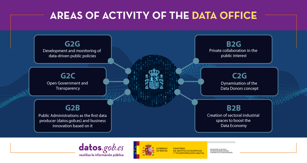
Among other issues, the Data Office is responsible fordesign, coordinate and monitor the "architectural reference model to promote the collection, management and exchange of data". To do this, it is based on the extensive experience already existing in the Administration, optimizing the use of existing resources.
At the head of the Data Office is Alberto Palomo, Chief Data Officer of Spain.
Where to follow the news of the Data Office
Since January, you can follow the news related to the Data Office from the Twitter account data.gob.es - Data Office. It offers news and trends related to innovation based on data and open data: news, information about events, use cases, guides and reports, etc.
In addition, from datos.gob.es we will continue to report news and expand content related to the Data Economy.
Blog
As our lives become more and more digitized, activities as face-to-face as “tourism” are also being pushed towards a transformation as profound as that of other sectors and activities. In this digitization process, both the data and the technologies associated with artificial intelligence are essential and this was highlighted, for example, by the 2020 European Tourism Convention.
The importance of tourism for the Spanish economy is enormous (12.4% of GDP and 12.7% of employment in 2019). The number of visitors we receive in our country, even despite the break caused by the pandemic, is still among the highest in the world. Therefore, in all the strategies and plans that are developed in our country, the weight of the tourism industry is reflected. For example, with the deployment of the Spanish Hub of Gaia-X, whose objective is to make it easier for sectorial industries of all sizes to create community and promote innovation based on data and Artificial Intelligence, Spain aspires to become the first country to lead a data space in the tourism industry. Bearing in mind that the hubs must facilitate and support the creation of European data spaces and are representatives of the regional economy, significant efforts will be made in Spain to develop data spaces that are relevant or specific to the Spanish economy, as is the case of the tourism industry.
As visitors or tourists we all have the expectation of enjoying an increasingly personalized experience, not only during the pre-planning process, but also during the time we are traveling or carrying out the activity. In this sense, open data plays a central role, both to help us select activities or attractions and to obtain relevant recommendations in real time that help us enjoy the experience more. For this reason, a multitude of cities and regions have been betting on publishing data sets and, in some cases, applications specifically aimed at visitors. Serve as an example the almost 3,000 data sets that can be found in the tourism category of the datos.gob.es portal, and which come both from the state administration and from different local and regional administrations.
Construction of aggregate datasets
However, as in other sectors of activity, to develop more sophisticated use cases related to tourism, taking advantage of the advanced use of data and artificial intelligence, data sets that transcend local spheres are necessary. Open data on tourism, as it happens in other domains, is distributed through different websites and in different formats or data structures. In this sense, there are some examples of transnational projects such as Tourpedia what prentend to build and maintain open data sets of high potential value for the development of new use cases and that are now only within the reach of large tour operators.
Tourpedia, which has been developed within the framework of a European project in which Spain, France and Italy participate, lays the foundations for building a single access point for all Italian, French and Spanish open data on tourist accommodation, points of interest and attractions. It also offers a simple mechanism for the integration of new open data sources, with the aim of aggregating open data provided by the public sector from anywhere in the world.
The case of Tourpedia, although it has not reached its full potential, is frequently cited and has been the subject of some scientific articles such as “Open data for tourism: the case of Tourpedia”, where the high impact of creating useful aggregate data sets for tourism is highlighted.
In this sense, in France we find Data Tourism, a less ambitious initiative in terms of its geographical scope, but perhaps more consistent in terms of its implementation. The central idea of DataTourisme, the open data portal for tourism of the French government, is equivalent: to centralize the data collected by local and regional tourism authorities, standardize the formats and make the information freely available for reuse. Data producers gain visibility, while companies and public authorities can integrate data of different types and from different sources into applications and algorithms.
DataTourisme currently covers 96 French departments in 14 regions different that have published as open data more than 385,000 points of interest and events. For the aggregation and publication of data, the portal is committed to using linked data and proposes the DataTourism ontology.
In Spain we have Dataestur, a Segittur initiative that contains a selection of the most relevant data on tourism in Spain. The data added in Dataestur come from sources as diverse as INE, Renfe or Segittur itself and are grouped into five categories for download, consultation and study. It also highlights the fact of publishing an API for developers and reusers with a set of methods that allow automating the download of a large part of the portal's data.
Recommender systems
At present, there are not too many aggregate data sets on tourism and much less those published as linked open data, but there is abundant scientific literature that supports this line of action. In this sense, a meta-analysis of 126 scientific articles, selected for their impact, concludes that the use of linked open data to address location-based recommendation and react in real time to the needs of tourists is widespread in the field of tourism.
One of these scientific articles, a 2020 investigation demonstrates that combining a user's location with open data on TripAdvisor ratings, destination closing time, or traffic can greatly increase the quality and accuracy of recommendations. In total, we find six types of jobs, classified according to the use case they focus on:
- Independent Point Location Recommendations. Recommend to the user a point of interest around the current location based on their own preferences.
- Travel route recommendations. Provide the user with the recommended route and travel itinerary.
- Recommendations based on GPS track. They provide recommendations based on past behavior and travel patterns recorded in the form of GPS tracks.
- Recommendations based on geotagged media data. They generate recommendations based on the extraction of multimedia data from texts or photos to discover places, context information and user profiles.
- Recommendations based on ontologies. They collect datasets and create tourism ontologies for the different recommended purposes, such as a list of points of interest, popularity of locations, travel itinerary and route planning.
- Location-based friend recommendations. They aim to use the user's social connections to recommend places based on the preferences of friends.
It seems that we are beginning to see what could be a second great wave of innovation when it comes to the use of data in the tourism industry. Thanks to the generation of aggregate data sets, the use of linked data and the application of artificial intelligence and machine learning techniques, increasingly sophisticated use cases are being generated for the benefit of the tourist experience and the promotion and discovery of destinations Undoubtedly, the new initiatives that have arisen through the national digitization plans and the support of European funds will accelerate the adoption of many innovations that at the moment we see only in the scientific literature.
Content prepared by Jose Luis Marín, Senior Consultant in Data, Strategy, Innovation & Digitalization.
The contents and points of view reflected in this publication are the sole responsibility of its author.