Blog
Open data is a valuable tool for making informed decisions that encourage the success of a process and enhance its effectiveness. From a sectorial perspective, open data provides relevant information about the legal, educational, or health sectors. All of these, along with many other areas, utilize open sources to measure improvement compliance or develop tools that streamline work for professionals.
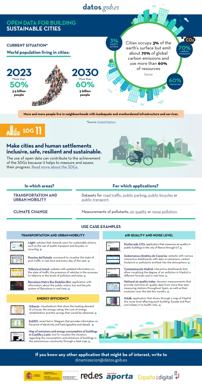
The benefits of using open data are extensive, and their variety goes hand in hand with technological innovation: every day, more opportunities arise to employ open data in the development of innovative solutions. An example of this can be seen in urban development aligned with the sustainability values advocated by the United Nations (UN).
Cities cover only 3% of the Earth's surface; however, they emit 70% of carbon emissions and consume over 60% of the world's resources, according to the UN. In 2023, more than half of the global population lives in cities, and this figure is projected to keep growing. By 2030, it is estimated that over 5 billion people would live in cities, meaning more than 60% of the world's population.
Despite this trend, infrastructures and neighborhoods do not meet the appropriate conditions for sustainable development, and the goal is to "Make cities and human settlements inclusive, safe, resilient, and sustainable," as recognized in Sustainable Development Goal (SDG) number 11. Proper planning and management of urban resources are significant factors in creating and maintaining sustainability-based communities. In this context, open data plays a crucial role in measuring compliance with this SDG and thus achieving the goal of sustainable cities.
In conclusion, open data stands as a fundamental tool for the strengthening and progress of sustainable city development.
In this infographic, we have gathered use cases that utilize sets of open data to monitor and/or enhance energy efficiency, transportation and urban mobility, air quality, and noise levels. Issues that contribute to the proper functioning of urban centers.
Click on the infographic to view it in full size.
Blog
The humanitarian crisis following the earthquake in Haiti in 2010 was the starting point for a voluntary initiative to create maps to identify the level of damage and vulnerability by areas, and thus to coordinate emergency teams. Since then, the collaborative mapping project known as Hot OSM (OpenStreetMap) has played a key role in crisis situations and natural disasters.
Now, the organisation has evolved into a global network of volunteers who contribute their online mapping skills to help in crisis situations around the world. The initiative is an example of data-driven collaboration to solve societal problems, a theme we explore in this data.gob.es report.
Hot OSM works to accelerate data-driven collaboration with humanitarian and governmental organisations, as well as local communities and volunteers around the world, to provide accurate and detailed maps of areas affected by natural disasters or humanitarian crises. These maps are used to help coordinate emergency response, identify needs and plan for recovery.
In its work, Hot OSM prioritises collaboration and empowerment of local communities. The organisation works to ensure that people living in affected areas have a voice and power in the mapping process. This means that Hot OSM works closely with local communities to ensure that areas important to them are mapped. In this way, the needs of communities are considered when planning emergency response and recovery.
Hot OSM's educational work
In addition to its work in crisis situations, Hot OSM is dedicated to promoting access to free and open geospatial data, and works in collaboration with other organisations to build tools and technologies that enable communities around the world to harness the power of collaborative mapping.
Through its online platform, Hot OSM provides free access to a wide range of tools and resources to help volunteers learn and participate in collaborative mapping. The organisation also offers training for those interested in contributing to its work.
One example of a HOT project is the work the organisation carried out in the context of Ebola in West Africa. In 2014, an Ebola outbreak affected several West African countries, including Sierra Leone, Liberia and Guinea. The lack of accurate and detailed maps in these areas made it difficult to coordinate the emergency response.
In response to this need, HOT initiated a collaborative mapping project involving more than 3,000 volunteers worldwide. Volunteers used online tools to map Ebola-affected areas, including roads, villages and treatment centres.
This mapping allowed humanitarian workers to better coordinate the emergency response, identify high-risk areas and prioritize resource allocation. In addition, the project also helped local communities to better understand the situation and participate in the emergency response.
This case in West Africa is just one example of HOT's work around the world to assist in humanitarian crisis situations. The organisation has worked in a variety of contexts, including earthquakes, floods and armed conflict, and has helped provide accurate and detailed maps for emergency response in each of these contexts.
On the other hand, the platform is also involved in areas where there is no map coverage, such as in many African countries. In these areas, humanitarian aid projects are often very challenging in the early stages, as it is very difficult to quantify what population is living in an area and where they are located. Having the location of these people and showing access routes "puts them on the map" and allows them to gain access to resources.
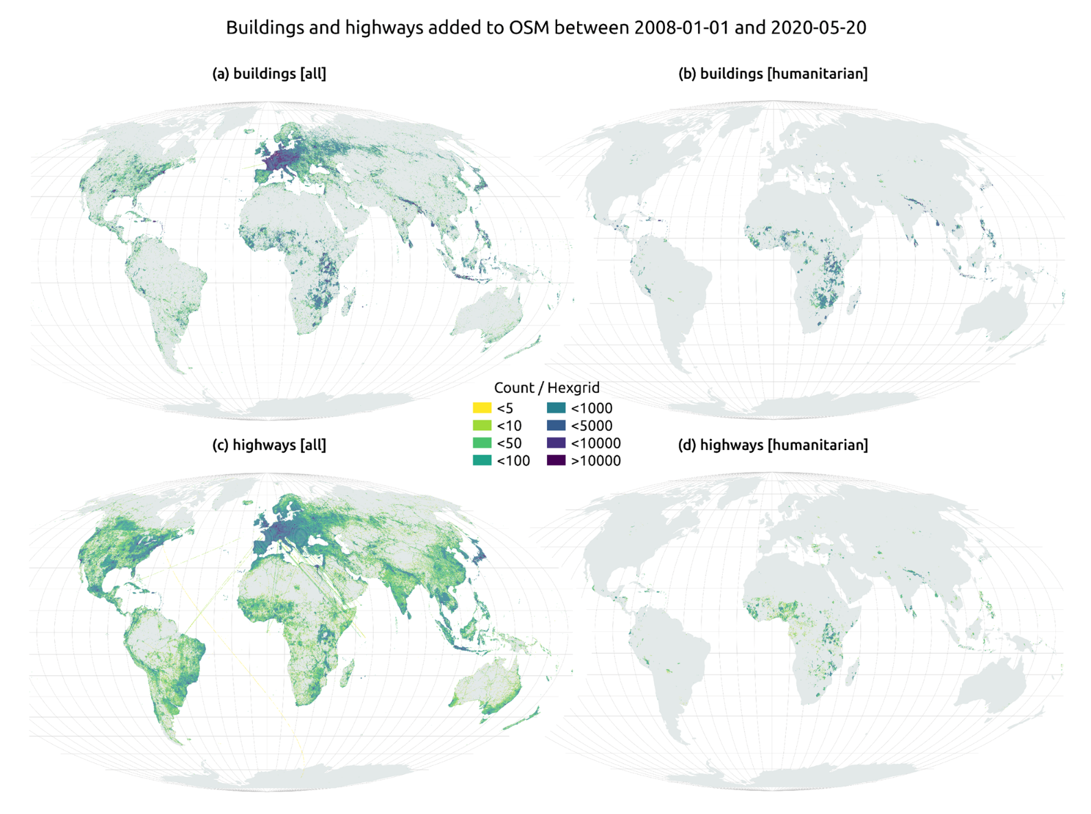
In this article The evolution of humanitarian mapping within the OpenStreetMap community by Nature, we can see graphically some of the achievements of the platform.
How to collaborate
It is easy to start collaborating with Hot OSM, just go to https://tasks.hotosm.org/explore and see the open projects that need collaboration.
This screen allows us a lot of options when searching for projects, selected by level of difficulty, organisation, location or interests among others.
To participate, simply click on the Register button.
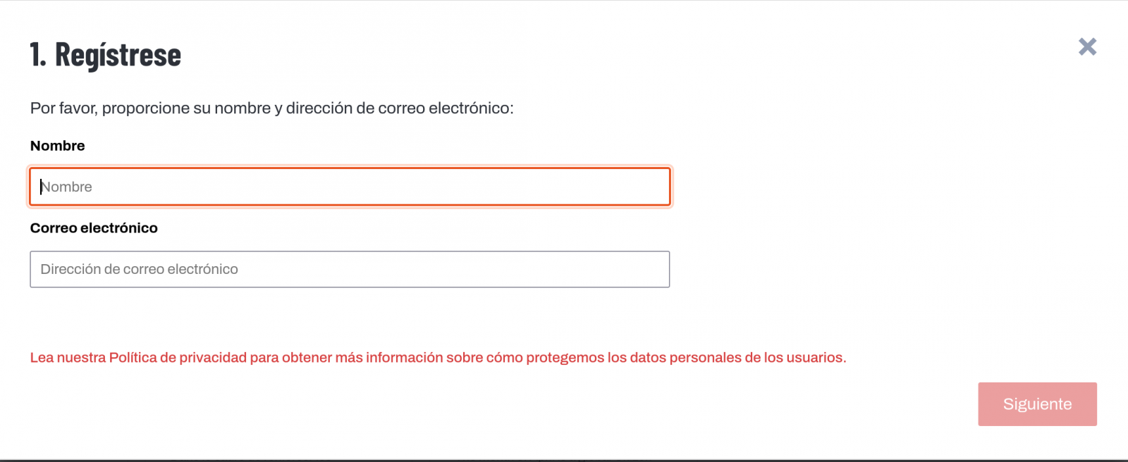
Give a name and an e-mail adress on the next screen:
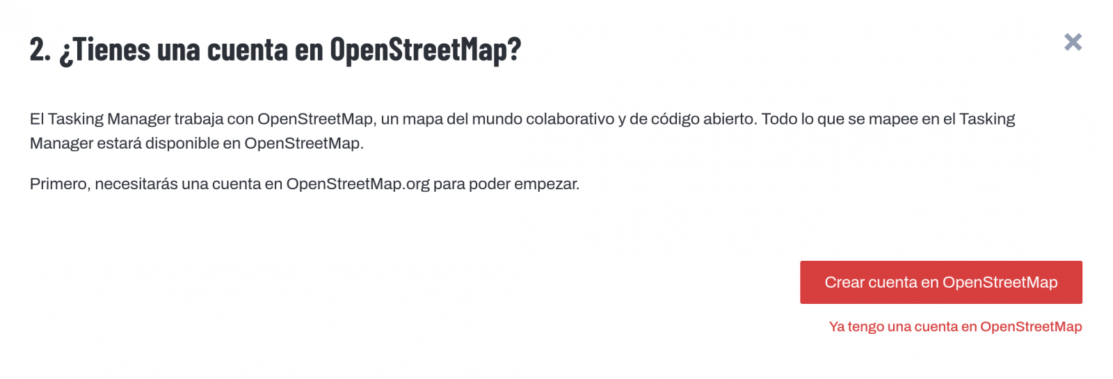
It will ask us if we have already created an account in Open Street Maps or if we want to create one.
If we want to see the process in more detail, this website makes it very easy.
Once the user has been created, on the learning page we find help on how to participate in the project.
It is important to note that the contributions of the volunteers are reviewed and validated and there is a second level of volunteers, the validators, who validate the work of the beginners. During the development of the tool, the HOT team has taken great care to make it a user-friendly application so as not to limit its use to people with computer skills.
In addition, organisations such as the Red Cross and the United Nations regularly organise mapathons to bring together groups of people for specific projects or to teach new volunteers how to use the tool. These meetings serve, above all, to remove the new users' fear of "breaking something" and to allow them to see how their voluntary work serves concrete purposes and helps other people.
Another of the project's great strengths is that it is based on free software and allows for its reuse. In the MissingMaps project's Github repository we can find the code and if we want to create a community based on the software, the Missing Maps organisation facilitates the process and gives visibility to our group.
In short, Hot OSM is a citizen science and data altruism project that contributes to bringing benefits to society through the development of collaborative maps that are very useful in emergency situations. This type of initiative is aligned with the European concept of data governance that seeks to encourage altruism to voluntarily facilitate the use of data for the common good.
Content by Santiago Mota, senior data scientist.
The contents and views reflected in this publication are the sole responsibility of the author.
Documentación
1. Introduction
Visualizations are graphical representations of data that allow the information linked to them to be communicated in a simple and effective way. The visualization possibilities are very wide, from basic representations, such as a line chart, bars or sectors, to visualizations configured on dashboards or interactive dashboards.
In this "Step-by-Step Visualizations" section we are regularly presenting practical exercises of open data visualizations available on datos.gob.es or similar catalogs. They address and describe in a simple way the stages necessary to obtain the data, perform the transformations and analysis that are relevant to and finally, the creation of interactive visualizations; from which we can extract information summarized in final conclusions. In each of these practical exercises, simple and well-documented code developments are used, as well as free to use tools. All generated material is available for reuse in GitHub's Data Lab repository.
Run the data pre-processing code on top of Google Colab.
Below, you can access the material that we will use in the exercise and that we will explain and develop in the following sections of this post.
Access the data lab repository on Github.
Run the data pre-processing code on top of Google Colab.
2. Objective
The main objective of this exercise is to make an analysis of the meteorological data collected in several stations during the last years. To perform this analysis, we will use different visualizations generated by the "ggplot2" library of the programming language "R".
Of all the Spanish weather stations, we have decided to analyze two of them, one in the coldest province of the country (Burgos) and another in the warmest province of the country (Córdoba), according to data from the AEMET. Patterns and trends in the different records between 1990 and 2020 will be sought to understand the meteorological evolution suffered in this period of time.
Once the data has been analyzed, we can answer questions such as those shown below:
- What is the trend in the evolution of temperatures in recent years?
- What is the trend in the evolution of rainfall in recent years?
- Which weather station (Burgos or Córdoba) presents a greater variation of climatological data in recent years?
- What degree of correlation is there between the different climatological variables recorded?
These, and many other questions can be solved by using tools such as ggplot2 that facilitate the interpretation of data through interactive visualizations.
3. Resources
3.1. Datasets
The datasets contain different meteorological information of interest for the two stations in question broken down by year. Within the AEMET download center, we can download them, upon request of the API key, in the section "monthly / annual climatologies". From the existing weather stations, we have selected two of which we will obtain the data: Burgos airport (2331) and Córdoba airport (5402)
It should be noted that, along with the datasets, we can also download their metadata, which are of special importance when identifying the different variables registered in the datasets.
These datasets are also available in the Github repository.
3.2. Tools
To carry out the data preprocessing tasks, the R programming language written on a Jupyter Notebook hosted in the Google Colab cloud service has been used.
"Google Colab" or, also called Google Colaboratory, is a cloud service from Google Research that allows you to program, execute and share code written in Python or R on a Jupyter Notebook from your browser, so it does not require configuration. This service is free of charge.
For the creation of the visualizations, the ggplot2 library has been used.
"ggplot2" is a data visualization package for the R programming language. It focuses on the construction of graphics from layers of aesthetic, geometric and statistical elements. ggplot2 offers a wide range of high-quality statistical charts, including bar charts, line charts, scatter plots, box and whisker charts, and many others.
If you want to know more about tools that can help you in the treatment and visualization of data, you can use the report "Data processing and visualization tools".
4. Data processing or preparation
The processes that we describe below you will find them commented in the Notebook that you can also run from Google Colab.
Before embarking on building an effective visualization, we must carry out a prior treatment of the data, paying special attention to obtaining them and validating their content, ensuring that they are in the appropriate and consistent format for processing and that they do not contain errors.
As a first step of the process, once the necessary libraries have been imported and the datasets loaded, it is necessary to perform an exploratory analysis of the data (EDA) in order to properly interpret the starting data, detect anomalies, missing data or errors that could affect the quality of the subsequent processes and results. If you want to know more about this process, you can resort to the Practical Guide of Introduction to Exploratory Data Analysis.
The next step is to generate the preprocessed data tables that we will use in the visualizations. To do this, we will filter the initial data sets and calculate the values that are necessary and of interest for the analysis carried out in this exercise.
Once the preprocessing is finished, we will obtain the data tables "datos_graficas_C" and "datos_graficas_B" which we will use in the next section of the Notebook to generate the visualizations.
The structure of the Notebook in which the steps previously described are carried out together with explanatory comments of each of them, is as follows:
- Installation and loading of libraries.
- Loading datasets
- Exploratory Data Analysis (EDA)
- Preparing the data tables
- Views
- Saving graphics
You will be able to reproduce this analysis, as the source code is available in our GitHub account. The way to provide the code is through a document made on a Jupyter Notebook that once loaded into the development environment you can run or modify easily. Due to the informative nature of this post and in order to favor the understanding of non-specialized readers, the code is not intended to be the most efficient but to facilitate its understanding so you will possibly come up with many ways to optimize the proposed code to achieve similar purposes. We encourage you to do so!
5. Visualizations
Various types of visualizations and graphs have been made to extract information on the tables of preprocessed data and answer the initial questions posed in this exercise. As mentioned previously, the R "ggplot2" package has been used to perform the visualizations.
The "ggplot2" package is a data visualization library in the R programming language. It was developed by Hadley Wickham and is part of the "tidyverse" package toolkit. The "ggplot2" package is built around the concept of "graph grammar", which is a theoretical framework for building graphs by combining basic elements of data visualization such as layers, scales, legends, annotations, and themes. This allows you to create complex, custom data visualizations with cleaner, more structured code.
If you want to have a summary view of the possibilities of visualizations with ggplot2, see the following "cheatsheet". You can also get more detailed information in the following "user manual".
5.1. Line charts
Line charts are a graphical representation of data that uses points connected by lines to show the evolution of a variable in a continuous dimension, such as time. The values of the variable are represented on the vertical axis and the continuous dimension on the horizontal axis. Line charts are useful for visualizing trends, comparing evolutions, and detecting patterns.
Next, we can visualize several line graphs with the temporal evolution of the values of average, minimum and maximum temperatures of the two meteorological stations analyzed (Córdoba and Burgos). On these graphs, we have introduced trend lines to be able to observe their evolution in a visual and simple way.


To compare the evolutions, not only visually through the graphed trend lines, but also numerically, we obtain the slope coefficients of the trend line, that is, the change in the response variable (tm_ month, tm_min, tm_max) for each unit of change in the predictor variable (year).
- Average temperature slope coefficient Córdoba: 0.036
- Average temperature slope coefficient Burgos: 0.025
- Coefficient of slope minimum temperature Córdoba: 0.020
- Coefficient of slope minimum temperature Burgos: 0.020
- Slope coefficient maximum temperature Córdoba: 0.051
- Slope coefficient maximum temperature Burgos: 0.030
We can interpret that the higher this value, the more abrupt the average temperature rise in each observed period.
Finally, we have created a line graph for each weather station, in which we jointly visualize the evolution of average, minimum and maximum temperatures over the years.


The main conclusions obtained from the visualizations of this section are:
- The average, minimum and maximum annual temperatures recorded in Córdoba and Burgos have an increasing trend.
- The most significant increase is observed in the evolution of the maximum temperatures of Córdoba (slope coefficient = 0.051)
- The slightest increase is observed in the evolution of the minimum temperatures, both in Córdoba and Burgos (slope coefficient = 0.020)
5.2. Bar charts
Bar charts are a graphical representation of data that uses rectangular bars to show the magnitude of a variable in different categories or groups. The height or length of the bars represents the amount or frequency of the variable, and the categories are represented on the horizontal axis. Bar charts are useful for comparing the magnitude of different categories and for visualizing differences between them.
We have generated two bar graphs with the data corresponding to the total accumulated precipitation per year for the different weather stations.


As in the previous section, we plot the trend line and calculate the slope coefficient.
- Slope coefficient for accumulated rainfall Córdoba: -2.97
- Slope coefficient for accumulated rainfall Burgos: -0.36
The main conclusions obtained from the visualizations of this section are:
- The annual accumulated rainfall has a decreasing trend for both Córdoba and Burgos.
- The downward trend is greater for Córdoba (coefficient = -2.97), being more moderate for Burgos (coefficient = -0.36)
5.3. Histograms
Histograms are a graphical representation of a frequency distribution of numeric data in a range of values. The horizontal axis represents the values of the data divided into intervals, called "bin", and the vertical axis represents the frequency or amount of data found in each "bin". Histograms are useful for identifying patterns in data, such as distribution, dispersion, symmetry, or bias.
We have generated two histograms with the distributions of the data corresponding to the total accumulated precipitation per year for the different meteorological stations, being the chosen intervals of 50 mm3.


The main conclusions obtained from the visualizations of this section are:
- The records of annual accumulated precipitation in Burgos present a distribution close to a normal and symmetrical distribution.
- The records of annual accumulated precipitation in Córdoba do not present a symmetrical distribution.
5.4. Box and whisker diagrams
Box and whisker diagrams are a graphical representation of the distribution of a set of numerical data. These graphs represent the median, interquartile range, and minimum and maximum values of the data. The chart box represents the interquartile range, that is, the range between the first and third quartiles of the data. Out-of-the-box points, called outliers, can indicate extreme values or anomalous data. Box plots are useful for comparing distributions and detecting extreme values in your data.
We have generated a graph with the box diagrams corresponding to the accumulated rainfall data from the weather stations.
To understand the graph, the following points should be highlighted:
- The boundaries of the box indicate the first and third quartiles (Q1 and Q3), which leave below each, 25% and 75% of the data respectively.
- The horizontal line inside the box is the median (equivalent to the second quartile Q2), which leaves half of the data below.
- The whisker limits are the extreme values, that is, the minimum value and the maximum value of the data series.
- The points outside the whiskers are the outliers.

The main conclusions obtained from the visualization of this section are:
- Both distributions present 3 extreme values, being significant those of Córdoba with values greater than 1000 mm3.
- The records of Córdoba have a greater variability than those of Burgos, which are more stable
5.5. Pie charts
A pie chart is a type of pie chart that represents proportions or percentages of a whole. It consists of several sections or sectors, where each sector represents a proportion of the whole set. The size of the sector is determined based on the proportion it represents, and is expressed in the form of an angle or percentage. It is a useful tool for visualizing the relative distribution of the different parts of a set and facilitates the visual comparison of the proportions between the different groups.
We have generated two graphs of (polar) sectors. The first of them with the number of days that the values exceed 30º in Córdoba and the second of them with the number of days that the values fall below 0º in Burgos.
For the realization of these graphs, we have grouped the sum of the number of days described above into six groups, corresponding to periods of 5 years from 1990 to 2020.


The main conclusions obtained from the visualizations of this section are:
- There is an increase of 31.9% in the total number of annual days with temperatures above 30º in Córdoba for the period between 2015-2020 compared to the period 1990-1995.
- There is an increase of 33.5% in the total number of annual days with temperatures above 30º in Burgos for the period between 2015-2020 compared to the period 1990-1995.
5.6. Scatter plots
Scatter plots are a data visualization tool that represent the relationship between two numerical variables by locating points on a Cartesian plane. Each dot represents a pair of values of the two variables and its position on the graph indicates how they relate to each other. Scatter plots are commonly used to identify patterns and trends in data, as well as to detect any possible correlation between variables. These charts can also help identify outliers or data that doesn't fit the overall trend.
We have generated two scattering plots in which the values of maximum average temperatures and minimum averages are compared, looking for correlation trends between them for the values of each weather station.


To analyze the correlations, not only visually through graphs, but also numerically, we obtain Pearson's correlation coefficients. This coefficient is a statistical measure that indicates the degree of linear association between two quantitative variables. It is used to assess whether there is a positive linear relationship (both variables increase or decrease simultaneously at a constant rate), negative (the values of both variables vary oppositely) or null (no relationship) between two variables and the strength of such a relationship, the closer to +1, the higher their association.
- Pearson coefficient (Average temperature max VS min) Córdoba: 0.15
- Pearson coefficient (Average temperature max VS min) Burgos: 0.61
In the image we observe that while in Córdoba a greater dispersion is appreciated, in Burgos a greater correlation is observed.
Next, we will modify the previous scatter plots so that they provide us with more information visually. To do this, we divide the space by colored sectors (red with higher temperature values / blue lower temperature values) and show in the different bubbles the label with the corresponding year. It should be noted that the color change limits of the quadrants correspond to the average values of each of the variables.


The main conclusions obtained from the visualizations of this section are:
- There is a positive linear relationship between the average maximum and minimum temperature in both Córdoba and Burgos, this correlation being greater in the Burgos data.
- The years with the highest values of maximum and minimum temperatures in Burgos are (2003, 2006 and 2020)
- The years with the highest values of maximum and minimum temperatures in Córdoba are (1995, 2006 and 2020)
5.7. Correlation matrix
The correlation matrix is a table that shows the correlations between all variables in a dataset. It is a square matrix that shows the correlation between each pair of variables on a scale ranging from -1 to 1. A value of -1 indicates a perfect negative correlation, a value of 0 indicates no correlation, and a value of 1 indicates a perfect positive correlation. The correlation matrix is commonly used to identify patterns and relationships between variables in a dataset, which can help to better understand the factors that influence a phenomenon or outcome.
We have generated two heat maps with the correlation matrix data for both weather stations.


The main conclusions obtained from the visualizations of this section are:
- There is a strong negative correlation (-0.42) for Córdoba and (-0.45) for Burgos between the number of annual days with temperatures above 30º and accumulated rainfall. This means that as the number of days with temperatures above 30º increases, precipitation decreases significantly.
6. Conclusions of the exercise
Data visualization is one of the most powerful mechanisms for exploiting and analyzing the implicit meaning of data. As we have seen in this exercise, "ggplot2" is a powerful library capable of representing a wide variety of graphics with a high degree of customization that allows you to adjust numerous characteristics of each graph.
After analyzing the previous visualizations, we can conclude that both for the weather station of Burgos, as well as that of Córdoba, temperatures (minimum, average, maximum) have suffered a considerable increase, days with extreme heat (temperature > 30º) have also suffered and rainfall has decreased in the period of time analyzed, from 1990 to 2020.
We hope that this step-by-step visualization has been useful for learning some very common techniques in the treatment, representation and interpretation of open data. We will be back to show you new reuses. See you soon!
Noticia
Updated: 21/03/2024
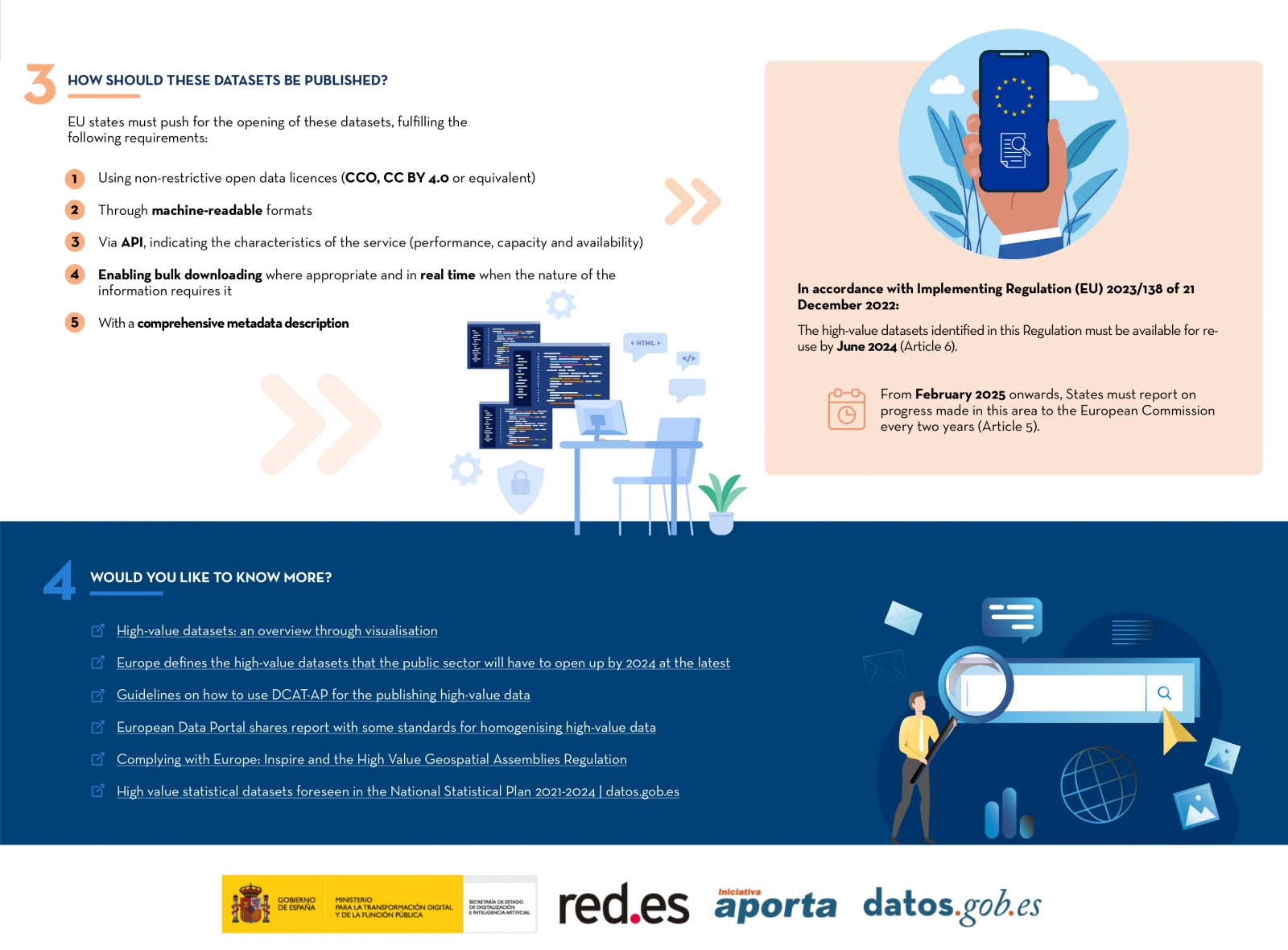
On January 2023, the European Commission published a list of high-value datasets that public sector bodies must make available to the public within a maximum of 16 months. The main objective of establishing the list of high-value datasets was to ensure that public data with the highest socio-economic potential are made available for re-use with minimal legal and technical restriction, and at no cost. Among these public sector datasets, some, such as meteorological or air quality data, are particularly interesting for developers and creators of services such as apps or websites, which bring added value and important benefits for society, the environment or the economy.
The publication of the Regulation has been accompanied by frequently asked questions to help public bodies understand the benefit of HVDS (High Value Datasets) for society and the economy, as well as to explain some aspects of the obligatory nature of HVDS (High Value Datasets) and the support for publication.
In line with this proposal, Executive Vice-President for a Digitally Ready Europe, Margrethe Vestager, stated the following in the press release issued by the European Commission:
"Making high-value datasets available to the public will benefit both the economy and society, for example by helping to combat climate change, reducing urban air pollution and improving transport infrastructure. This is a practical step towards the success of the Digital Decade and building a more prosperous digital future".
In parallel, Internal Market Commissioner Thierry Breton also added the following words on the announcement of the list of high-value data: "Data is a cornerstone of our industrial competitiveness in the EU. With the new list of high-value datasets we are unlocking a wealth of public data for the benefit of all”. Start-ups and SMEs will be able to use this to develop new innovative products and solutions to improve the lives of citizens in the EU and around the world.
Six categories to bring together new high-value datasets
The regulation is thus created under the umbrella of the European Open Data Directive, which defines six categories to differentiate the new high-value datasets requested:
- Geospatial
- Earth observation and environmental
- Meteorological
- Statistical
- Business
- Mobility
However, as stated in the European Commission's press release, this thematic range could be extended at a later stage depending on technological and market developments. Thus, the datasets will be available in machine-readable format, via an application programming interface (API) and, if relevant, also with a bulk download option.
In addition, the reuse of datasets such as mobility or building geolocation data can expand the business opportunities available for sectors such as logistics or transport. In parallel, weather observation, radar, air quality or soil pollution data can also support research and digital innovation, as well as policy making in the fight against climate change.
Ultimately, greater availability of data, especially high-value data, has the potential to boost entrepreneurship as these datasets can be an important resource for SMEs to develop new digital products and services, which in turn can also attract new investors.
Find out more in this infographic:

Access the accessible version on two pages.
Empresa reutilizadora
Digital Earth Solutions is a technology company whose aim is to contribute to the conservation of marine ecosystems through innovative ocean modelling solutions.
Based on more than 20 years of CSIC studies in ocean dynamics, Digital Solutions has developed a unique software capable of predicting in a few minutes and with high precision the geographical evolution of any spill or floating body (plastics, people, algae...), forecasting its trajectory in the sea for the following days or its origin by analysing its movement back in time.
Thanks to this technology, it is possible to minimise the impact of oil and other waste spills on coasts, seas and oceans.
Blog
As in other industries, digital transformation is helping to change the way the agriculture and forestry sector operates. Combining technologies such as geolocation or artificial intelligence and using open datasets to develop new precision tools is transforming agriculture into an increasingly technological and analytical activity.
Along these lines, the administrations are also making progress to improve management and decision-making in the face of the challenges we are facing. Thus, the Ministry of Agriculture, Fisheries and Food and the Ministry for Ecological Transition and the Demographic Challenge have designed two digital tools that use open data: Fruktia (crop forecasting related to fruit trees) and Arbaria (fire management), respectively.
Predicting harvests to better manage crises
Fruktia is a predictive tool developed by the Ministry of Agriculture to foresee oversupply situations in the stone fruit and citrus fruit sector before the traditional systems of knowledge of forecasts or gauges. After the price crises suffered in 2017 in stone fruit and in 2019 in citrus fruit due to a supervening oversupply, it became clear that decision-making to manage these crises based on traditional forecasting systems came too late and that it was necessary to anticipate in order to adopt more effective measures by the administration and even by the sector itself that would prevent prices from falling.
In response to this critical situation, the Ministry of Agriculture decided to develop a tool capable of predicting harvests based on weather and production data from previous years. This tool would be used internally by the Ministry and its analysis would be seen at the working tables with the sector, but would not be public under any circumstances, thus avoiding its possible influence on the markets in a way that could not be controlled.
Fruktia exists thanks to the fact that the Ministry has managed to combine information from two main sources: open data and the knowledge of sector experts. These data sources are collected by Artificial Intelligence which, using Machine Learning and Deep Learning technology, analyses the information to make specific forecasts.
The open datasets used come from:
- Information from weather stations of the Spanish Meteorological Agency (AEMET).
- Information from agro-climatic stations.
With the above data and statistical data from crop estimates of past campaigns (Production Advances and Yearbooks of the Ministry of Agriculture, Fisheries and Food) together with sector-specific information, Fruktia makes two types of crop predictions: at regional level (province model) and at farm level (enclosure model).
The provincial model is used to make predictions at provincial level (as its name suggests) and to analyse the results of previous harvests in order to:
- Anticipate excess production.
- Anticipate crises in the sector, improving decision-making to manage them.
- Study the evolution of each product by province.
This model, although already developed, continues to be improved to achieve the best adaptation to reality regardless of the weather conditions.
On the other hand, the model of enclosures (still under development) aims to:
- Production forecasts with a greater level of detail and for more products (for example, it will be possible to know production forecasts for stone fruit crops such as paraguayo or platerina for which we currently do not have information from statistical sources yet).
- Knowing how crops are affected by specific weather phenomena in different regions.
The model of enclosures is still being designed, and when it is fully operational it will also contribute to:
- Improve marketing planning.
- Anticipate excess production at a more local level or for a specific type of product.
- Predict crises before they occur in order to anticipate their effects and avoid a situation of falling prices.
- Locate areas or precincts with problems in specific campaigns.
In other words, the ultimate aim of Fruktia is to achieve the simulation of different types of scenarios that serve to anticipate the problems of each harvest long before they occur in order to adopt the appropriate decisions from the administrations.
Arbaria: data science to prevent forest fires
A year before the birth of Fruktia, in 2019, the Ministry of Agriculture, Fisheries and Food designed a digital tool for the prediction of forest fires which, in turn, is coordinated from the forestry point of view by the Ministry for Ecological Transition and the Demographic Challenge.
Under the name of Arbaria, this initiative of the Executive seeks to analyse and predict the risk of fires occurring in specific temporal and territorial areas of the Spanish territory. In particular, thanks to the analysis of the data used, it is able to analyse the socio-economic influence on the occurrence of forest fires at the municipal level and anticipate the risk of fire in the summer season at the provincial level, thus improving access to the resources needed to tackle it.
The tool uses historical data from open information sources such as the AEMET or the INE, and the records of the General Forest Fire Statistics (EGIF). To do so, Artificial Intelligence techniques related to Deep and Machine Learning are used, as well as Amazon Web Services cloud technology.
However, the level of precision offered by a tool such as Arbaria is not only due to the technology with which it has been designed, but also to the quality of the open data selected.
Considering the demographic reality of each municipality as another variable to be taken into account is important when determining fire risk. In other words, knowing the number of companies based in a locality, the economic activity carried out there, the number of inhabitants registered or the number of agricultural or livestock farms present is relevant to be able to anticipate the risk and create preventive campaigns aimed at specific sectors.
In addition, the historical data on forest fires gathered in the General Forest Fire Statistics is one of the most complete in the world. There is a general register of fires since 1968 and another particularly exhaustive one from the 1990s to the present day, which includes data such as the location and characteristics of the surface of the fire, means used to extinguish it, extinguishing time, causes of the fire or damage to the area, among others.
Initiatives such as Fruktia or Arbaria serve to demonstrate the economic and social potential that can be extracted from open datasets. Being able to predict, for example, the amount of peaches that fruit trees in a municipality in Almeria will yield helps not only to plan job creation in an area, but also to ensure that sales and consumption in an area remain stable.
Likewise, being able to predict the risk of fires provides the tools for better fire prevention and extinction planning.
Content written by the datos.gob.es team
Evento
The first National Open Data Meeting will take place in Barcelona on 21 November. It is an initiative promoted and co-organised by Barcelona Provincial Council, Government of Aragon and Provincial Council of Castellón, with the aim of identifying and developing specific proposals to promote the reuse of open data.
This first meeting will focus on the role of open data in developing territorial cohesion policies that contribute to overcoming the demographic challenge.
Agenda
The day will begin at 9:00 am and will last until 18:00 pm.
After the opening, which will be given by Marc Verdaguer, Deputy for Innovation, Local Governments and Territorial Cohesion of the Barcelona Provincial Council, there will be a keynote speech, where Carles Ramió, Vice-Rector for Institutional Planning and Evaluation at Pompeu Fabra University, will present the context of the subject.
Then, the event will be divided into four sessions where the following topics will be discussed:
- 10:30 a.m. State of art: lights and some shadows of opening and reusing data.
- 12:30 p.m. What does society need and expect from public administrations' open data portals?
- 15:00. Local commitment to fight against depopulation through open data
- 4:30 p.m. What can Public Administrations do using their data to jointly fight depopulation?
Experts linked to various open data initiatives, public organisations and business associations will participate in the conference. Specifically, the Aporta Initiative will participate in the first session, where the challenges and opportunities of the use of open data will be discussed.
The importance of addressing the demographic challenge
The conference will address how the ageing of the population, the geographical isolation that hinders access to health, administrative and educational centres and the loss of economic activity affect the smaller municipalities, both rural and urban. A situation with great repercussions on the sustainability and supply of the whole country, as well as on the preservation of culture and diversity.
Documentación
1. Introduction
Visualizations are graphical representations of data that allow the information linked to them to be communicated in a simple and effective way. The visualization possibilities are very broad, from basic representations such as line, bar or pie chart, to visualizations configured on control panels or interactive dashboards. Visualizations play a fundamental role in drawing conclusions from visual information, allowing detection of patterns, trends, anomalous data or projection of predictions, among many other functions.
Before starting to build an effective visualization, a prior data treatment must be performed, paying special attention to their collection and validation of their content, ensuring that they are in a proper and consistent format for processing and free of errors. The previous data treatment is essential to carry out any task related to data analysis and realization of effective visualizations.
In the section “Visualizations step-by-step” we are periodically presenting practical exercises on open data visualizations that are available in datos.gob.es catalogue and other similar catalogues. In there, we approach and describe in a simple way the necessary steps to obtain data, perform transformations and analysis that are relevant to creation of interactive visualizations from which we may extract information in the form of final conclusions.
In this practical exercise we have performed a simple code development which is conveniently documented, relying on free tools.
Access the Data Lab repository on Github.
Run the data pre-processing code on Google Colab.
2. Objetives
The main objective of this post is to learn how to make an interactive visualization using open data. For this practical exercise we have chosen datasets containing relevant information on national reservoirs. Based on that, we will analyse their state and time evolution within the last years.
3. Resources
3.1. Datasets
For this case study we have selected datasets published by Ministry for the Ecological Transition and Demographic Challenge, which in its hydrological bulletin collects time series data on the volume of water stored in the recent years in all the national reservoirs with capacity greater than 5hm3. Historical data on the volume of stored water are available at:
Furthermore, a geospatial dataset has been selected. During the search, two possible input data files have been found, one that contains geographical areas corresponding to the reservoirs in Spain and one that contains dams, including their geopositioning as a geographic point. Even though they are not the same thing, reservoirs and dams are related and to simplify this practical exercise, we choose to use the file containing the list of dams in Spain. Inventory of dams is available at: https://www.mapama.gob.es/ide/metadatos/index.html?srv=metadata.show&uuid=4f218701-1004-4b15-93b1-298551ae9446
This dataset contains geolocation (Latitude, Longitude) of dams throughout Spain, regardless of their ownership. A dam is defined as an artificial structure that limits entirely or partially a contour of an enclosure nestled in terrain and is destined to store water within it.
To generate geographic points of interest, a processing has been executed with the usage of QGIS tool. The steps are the following: download ZIP file, upload it to QGIS and save it as CSV, including the geometry of each element as two fields specifying its position as a geographic point (Latitude, Longitude).
Also, a filtering has been performed, in order to extract the data related to dams of reservoirs with capacity greater than 5hm3.
3.2. Tools
To perform data pre-processing, we have used Python programming language in the Google Colab cloud service, which allows the execution of JNotebooks de Jupyter.
Google Colab, also called Google Colaboratory, is a free service in the Google Research cloud which allows to program, execute and share a code written in Python or R through the browser, as it does not require installation of any tool or configuration.
Google Data Studio tool has been used for the creation of the interactive visualization.
Google Data Studio in an online tool which allows to create charts, maps or tables that can be embedded on websites or exported as files. This tool is easy to use and permits multiple customization options.
If you want to know more about tools that can help you with data treatment and visualization, see the report “Data processing and visualization tools”.
4. Enriquecimiento de los datos
In order to provide more information about each of the dams in the geospatial dataset, a process of data enrichment is carried out, as explained below.
To do this, we will focus on OpenRefine, which is a useful tool for this type of tasks. This open source tool allows to perform multiple data pre-processing actions, although at that point we will use it to conduct enrichment of our data by incorporation of context, automatically linking information that resides in a popular knowledge repository, Wikidata.
Once the tool is installed and launched on computer, a web application will open in the browser. In case this doesn´t happen, the application may be accessed by typing http://localhost:3333 in the browser´s search bar.
Steps to follow:
- Step 1: Upload of CSV to the system (Figure 1).

Figure 1 – Upload of a CSV file to OpenRefine
- Step 2: Creation of a project from uploaded CSV (Figure 2). OpenRefine is managed through projects (each uploaded CSV will become a project) that are saved for possible later use on a computer where OpenRefine is running. At this stage it´s required to name the project and some other data, such as the column separator, though the latter settings are usually filled in automatically.

Figure 2 – Creation of a project in OpenRefine
- Step 3: Linkage (or reconciliation, according to the OpenRefine nomenclature) with external sources. OpenRefine allows to link the CSV resources with external sources, such as Wikidata. For this purpose, the following actions need to be taken (steps 3.1 to 3.3):
- Step 3.1: Identification of the columns to be linked. This step is commonly based on analyst´s experience and knowledge of the data present in Wikidata. A tip: usually, it is feasible to reconcile or link the columns containing information of global or general character, such as names of countries, streets, districts, etc. and it´s not possible to link columns with geographic coordinates, numerical values or closed taxonomies (e.g. street types). In this example, we have found a NAME column containing name of each reservoir that can serve as a unique identifier for each item and may be a good candidate for linking
- Step 3.2: Start of reconciliation. As indicated in figure 3, start reconciliation and select the only available source: Wikidata(en). After clicking Start Reconciling, the tool will automatically start searching for the most suitable vocabulary class on Wikidata, based on the values from the selected column.

Figure 3 – Start of the reconciliation process for the NAME column in OpenRefine
- Step 3.3: Selection of the Wikidata class. In this step reconciliation values will be obtained. In this case, as the most probable value, select property “reservoir”, which description may be found at https://www.wikidata.org/wiki/Q131681 and it corresponds to the description of an “artificial lake to accumulate water”. It´s necessary to click again on Start Reconciling.
OpenRefine offers a possibility of improving the reconciliation process by adding some features that allow to target the information enrichment with higher precision. For that purpose, adjust property P4568, which description matches the identifier of a reservoir in Spain within SNCZI-IPE, as it may be seen in the figure 4.

Figure 4 – Selection of a Wikidata class that best represents the values on NAME column
- Step 4: Generation of a column with reconciled or linked values. To do that, click on the NAME column and go to “Edit column → Add column based in this column”. A window will open where a name of the new column must be specified (in this case, WIKIDATA_RESERVOIR). In the expression box introduce: “http://www.wikidata.org/entity/”+cell.recon.match.id, so the values will be displayed as it´s previewed in figure 6. “http://www.wikidata.org/entity/” is a fixed text string that represents Wikidata entities, while the reconciled value of each of the values we obtain through the command cell.recon.match.id, that is, cell.recon.match.id(“ALMODOVAR”) = Q5369429.
Launching described operation will result in generation of a new column with those values. Its correctness may be confirmed by clicking on one of the new column cells, as it should redirect to a Wikidata web page containing information about reconciled value.
Repeat the process to add other type of enriched information as a reference for Google and OpenStreetMap.

Figure 5 – Generation of Wikidata entities through a reconciliation within a new column.
- Step 5: Download of enriched CSV. Go to the function Export → Custom tabular exporter placed in the upper right part of the screen and select the features indicated in Figure 6.

Figure 6 – Options of CSV file download via OpenRefine
5. Data pre-processing
During the pre-processing it´s necessary to perform an exploratory data analysis (EDA) in order to interpret properly the input data, detect anomalies, missing data and errors that could affect the quality of subsequent processes and results, in addition to realization of the transformation tasks and preparation of the necessary variables. Data pre-processing is essential to ensure the reliability and consistency of analysis or visualizations that are created afterwards. To learn more about this process, see A Practical Introductory Guide to Exploratory Data Analysis.
The steps involved in this pre-processing phase are the following:
- Installation and import of libraries
- Import of source data files
- Modification and adjustment of variables
- Prevention and treatment of missing data (NAs)
- Generation of new variables
- Creation of a table for visualization “Historical evolution of water reserve between the years 2012-2022”
- Creation of a table for visualization “Water reserve (hm3) between the years 2012-2022”
- Creation of a table for visualization “Water reserve (%) between the years 2012-2022”
- Creation of a table for visualization “Monthly evolution of water reserve (hm3) for different time series”
- Saving the tables with pre-processed data
You may reproduce this analysis, as the source code is available in the GitHub repository. The way to provide the code is through a document made on Jupyter Notebook which once loaded to the development environment may be easily run or modified. Due to the informative nature of this post and its purpose to support learning of non-specialist readers, the code is not intended to be the most efficient but rather to be understandable. Therefore, it´s possible that you will think of many ways of optimising the proposed code to achieve a similar purpose. We encourage you to do it!
You may follow the steps and run the source code on this notebook in Google Colab.
6. Data visualization
Once the data pre-processing is done, we may move on to interactive visualizations. For this purpose, we have used Google Data Studio. As it´s an online tool, it´s not necessary to install software to interact or generate a visualization, but it´s required to structure adequately provided data tables.
In order to approach the process of designing the set of data visual representations, the first step is to raise the questions that we want to solve. We suggest the following:
-
What is the location of reservoirs within the national territory?
-
Which reservoirs have the largest and the smallest volume of water (water reserve in hm3) stored in the whole country?
-
Which reservoirs have the highest and the lowest filling percentage (water reserve in %)?
-
What is the trend of the water reserve evolution within the last years?
Let´s find the answers by looking at the data!
6.1. Geographic location and main information on each reservoir
This visual representation has been created with consideration of geographic location of reservoirs and distinct information associated with each one of them. For this task, a table “geo.csv” has been generated during the data pre-processing.
Location of reservoirs in the national territory is shown on a map of geographic points.
Once the map is obtained, you may access additional information about each reservoir by clicking on it. The information will display in the table below. Furthermore, an option of filtering by hydrographic demarcation and by reservoir is available through the drop-down tabs.
View the visualization in full screen
6.2. Water reserve between the years 2012-2022
This visual representation has been made with consideration of water reserve (hm3) per reservoir between the years 2012 (inclusive) and 2022. For this purpose, a table “volumen.csv” has been created during the data pre-processing.
A rectangular hierarchy chart displays intuitively the importance of each reservoir in terms of volumn stored within the national total for the time period indicated above.
Ones the chart is obtained, an option of filtering by hydrographic demarcation and by reservoir is available through the drop-down tabs.
View the visualization in full screen
6.3. Water reserve (%) between the years 2012-2022
This visual representation has been made with consideration of water reserve (%) per reservoir between the years 2012 (inclusive) and 2022. For this task, a table “porcentaje.csv” has been generated during the data pre-processing.
The percentage of each reservoir filling for the time period indicated above is intuitively displayed in a bar chart.
Ones the chart is obtained, an option of filtering by hydrographic demarcation and by reservoir is available through the drop-down tabs.
View the visualization in ful screen
6.4. Historical evolution of water reserve between the years 2012-2022
This visual representation has been made with consideration of water reserve historical data (hm3 and %) per reservoir between the years 2012 (inclusive) and 2022. For this purpose, a table “lineas.csv” has been created during the data pre-processing.
Line charts and their trend lines show the time evolution of the water reserve (hm3 and %).
Ones the chart is obtained, modification of time series, as well as filtering by hydrographic demarcation and by reservoir is possible through the drop-down tabs.
View the visualization in full screen
6.5. Monthly evolution of water reserve (hm3) for different time series
This visual representation has been made with consideration of water reserve (hm3) from distinct reservoirs broken down by months for different time series (each year from 2012 to 2022). For this purpose, a table “lineas_mensual.csv” has been created during the data pre-processing.
Line chart shows the water reserve month by month for each time series.
Ones the chart is obtained, filtering by hydrographic demarcation and by reservoir is possible through the drop-down tabs. Additionally, there is an option to choose time series (each year from 2012 to 2022) that we want to visualize through the icon appearing in the top right part of the chart.
View the visualization in full screen
7. Conclusions
Data visualization is one of the most powerful mechanisms for exploiting and analysing the implicit meaning of data, independently from the data type and the user´s level of the technological knowledge. Visualizations permit to create meaningful data and narratives based on a graphical representation. In the set of implemented graphical representations the following may be observed:
-
A significant trend in decreasing the volume of water stored in the reservoirs throughout the country between the years 2012-2022.
-
2017 is the year with the lowest percentage values of the total reservoirs filling, reaching less than 45% at certain times of the year.
-
2013 is the year with the highest percentage values of the total reservoirs filling, reaching more than 80% at certain times of the year.
It should be noted that visualizations have an option of filtering by hydrographic demarcation and by reservoir. We encourage you to do it in order to draw more specific conclusions from hydrographic demarcation and reservoirs of your interest.
Hopefully, this step-by-step visualization has been useful for the learning of some common techniques of open data processing and presentation. We will be back to present you new reuses. See you soon!
Documentación
This report published by the European Data Portal (EDP) aims to help open data users in harnessing the potential of the data generated by the Copernicus program.
The Copernicus project generates high-value satellite data, generating a large amount of Earth observation data, this is in line with the European Data Portal's objective of increasing the accessibility and value of open data.
The report addresses the following questions, What can I do with Copernicus data? How can I access the data?, and What tools do I need to use the data? using the information found in the European Data Portal, specialized catalogues and examining practical examples of applications using Copernicus data.
This report is available at this link: "Copernicus data for the open data community"
Blog
The favorable regime of access to environmental information
Environmental legislation has traditionally been characterized by establishing a more beneficial legal regime than that which has inspired the general rules on access to information held by the public sector. Indeed, the Aarhus Convention, adopted in 1998, was an important milestone in recognizing the right of access to environmental information under very advanced legal conditions, imposing relevant obligations on public authorities. Specifically, the Convention starts from an inescapable premise: in order for society to enjoy the right to a healthy environment and fulfill its duty to respect and protect it, it must have relevant access to environmental information. To this end, on the one hand, the right to obtain information held by public authorities was recognized and, on the other, an obligation was established for the latter to make certain information public without prior request.
In execution of said international treaty and, specifically, of the obligations assumed by the European Union through Directive 2003/4/EC of the European Parliament and of the Council, of January 28, 2003, on public access to environmental information, Law 27/2006, of July 18, regulating the rights of access to information, public participation and access to justice in environmental matters, was approved. Unlike the general regime contemplated in Law 19/2013, of December 9, on transparency, access to public information and good governance, Law 27/2006 does not contain any reference to open and reusable formats. However, it does include the following developments:
- establishes the obligation to provide the information even when, without having generated it directly in the exercise of its functions, it is in the possession of the entity from which it is requested;
- requires that the grounds for refusal of the request for access be interpreted in a restrictive manner, so that in case of doubt when interpreting the exceptions provided by law, access to information must be favored;
- for those cases in which the request is not resolved and notified within the established period, the rule of positive silence is applied and, therefore, access will be understood to be granted.
The impact of regulations on open data and reuse of public sector information
As in the previous regulation, Directive (EU) 1024/2019 excludes its application in those cases in which the corresponding regulation of the Member States limits access. This would not be, therefore, the case of the environment sector, since, apart from the cases in which access is not applicable, in general the availability of the information is especially assured. Consequently, except for the legal exceptions to the obligation to provide environmental information, there are no specific restrictions that would be an obstacle to facilitating its reuse.
On the other hand, one of the main novelties of European legislation is a measure that ultimately obliges the Member States to adapt their regulations regarding access to environmental information. Indeed, Chapter V of the Directive establishes a unique regime for the so-called high-value datasets, which, in general, will be available free of charge, machine-readable, provided through APIs and, where appropriate, provided in the form of bulk download. Precisely, this very favorable legal regime is envisaged, among others, for the field of Earth Observation and Environment, although the specific datasets to which it will apply are still pending a decision by the European Commission after the elaboration of an extensive impact analysis whose final result is yet to be finalized.
On the other hand, following the European regulatory model, among the novelties that Royal Decree-Law 24/2021, of November 2, has incorporated into Spanish legislation on the reuse of public sector information, one that stands out is one referring to high-value data. Specifically, Article 3.ter of Law 37/2007 contemplates the possibility that, in addition to the datasets established by the European Commission, others may be added at the national level by the Ministry of Economic Affairs and Digital Transformation, taking into account the selection made by the Data Office Division, so that those specifically referring to the environment could be extended, where appropriate.
The potential for high-value environmental data
As the European regulation itself points out, the reuse of high-value datasets is seen as a tool to facilitate, among other objectives, the creation and dynamization of value-added digital applications and services that have the potential to generate considerable benefits for society, the environment and the economy. Thus, in this area, open data can play an important role in tackling technological innovation to address challenges of enormous relevance such as climate change, deforestation and, in general, the challenges posed by environmental conservation.
On the other hand, the development of digital applications and services can serve to revitalize rural areas and promote tourism models that value the knowledge and protection of natural resources, especially taking into account the rich and varied natural heritage existing in Spain, for which it is essential to have specific datasets, particularly with regard to natural areas.
Ultimately, from the perspective and demands of Open Government, the accessibility of environmental information, according to the standards of high-value data in accordance with the provisions of the regulations on the reuse of public sector information, could have a significant reinforcement by facilitating social control regarding the decisions of public entities and citizen participation. However, for this it is essential to overcome the model on which the regulatory framework on access to environmental information has traditionally been based, since, although at the time it represented a significant advance, the fact is that the 2006 regulation does not include any reference to the possibilities of technological innovation based on open data.
In short, it seems that the time has come to raise a debate about an eventual update of the sectorial regulation on access to environmental information in order to comply with the requirements of the legal regime contemplated in Directive (EU) 1024/2019.
Content prepared by Julián Valero, Professor at the University of Murcia and Coordinator of the Research Group "Innovation, Law and Technology" (iDerTec).
The contents and points of view reflected in this publication are the sole responsibility of its author.