5 posts found
Data visualization: the best charts for representing comparisons
Data is a valuable source of knowledge for society. Public commitment to achieving data openness, public-private collaboration on data, and the development of applications with open data are actions that are part of the data economy, which seeks the innovative, ethical, and practical use of data to…

The second edition of Asedie's top 3, available in seven autonomous communities
The Multisectorial Association of Information (ASEDIE), which brings together the infomediary companies of our country, once again includes among its annual objectives the promotion of the reuse of public and private information. Thus, and almost in parallel to the beginning of the new year, last De…

How to choose the right chart to visualise open data
A statistical graph is a visual representation designed to contain a series of data whose objective is to highlight a specific part of the reality. However, organising a set of data in an informative way is not an easy task, especially, if we want to capture the viewer’s attention and to present the…

Google as a reuse of open data
The bet of the technological giant Google with open data it has been evident in various initiatives carried out in recent years. On the one hand, they launched the search engine Google Dataset Search, that facilitates the location of open data published in hundreds of repositories of international i…

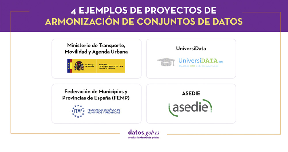
4 examples of harmonisation of datasets
In any project related to data, it is common to have different sources of information. Data is key for companies and public administrations, in decision making or as a basis for the implementation of projects, services or products. But if these data sources display information in a heterogeneous way…