4 posts found
Open Data Editor: discover the free and open source tool for processing data
How many times have you had a dataset in your hands that you needed to analyze, but you've run into errors, inconsistencies, or formatting issues that have caused you to lose hours of work? The reality is that, although we have more data available every day, we do not always have the necessary tools…
Data visualization: the best charts for representing comparisons
Data is a valuable source of knowledge for society. Public commitment to achieving data openness, public-private collaboration on data, and the development of applications with open data are actions that are part of the data economy, which seeks the innovative, ethical, and practical use of data to…

How to choose the right chart to visualise open data
A statistical graph is a visual representation designed to contain a series of data whose objective is to highlight a specific part of the reality. However, organising a set of data in an informative way is not an easy task, especially, if we want to capture the viewer’s attention and to present the…

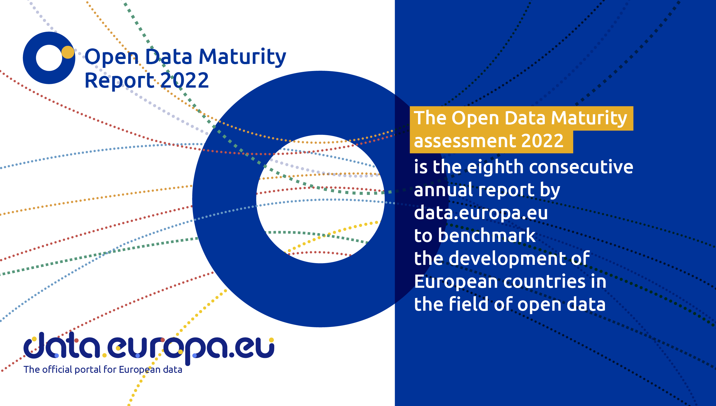
Spain, one of countries that is an open data trendsetter
Like every other year, the EU Open Data Portal has just published the results of its report Open Data Maturity 2022. It is a study that assesses the maturity of European countries in the field of open data and it provides an overview of the good practices followed in Eu…