11 documents found
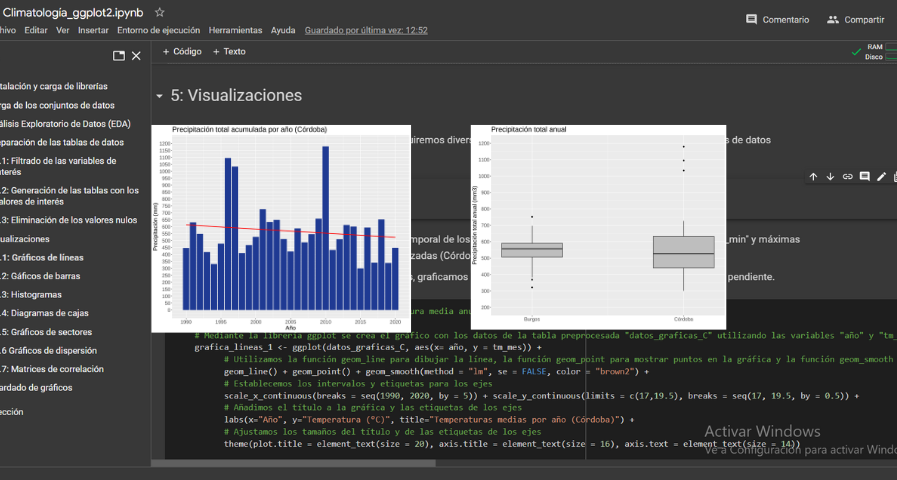
Analysis of meteorological data using the "ggplot2" library
1. Introduction
Visualizations are graphical representations of data that allow the information linked to them to be communicated in a simple and effective way. The visualization possibilities are very wide, from basic representations, such as a line chart, bars or sectors, to visualizations…
- Data exercises
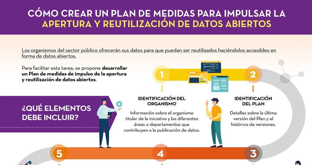
How to develop a plan of measures to promote openness and reuse of open data
Public sector bodies must make their data available for re-use, making it accessible in the form of open data, as referred to in Spain's legislative framework. The first step for this is that each entity, at local, regional and state level, as well as bodies, entities and trading companies…
- Guides
Introduction to data anonymisation: Techniques and case studies
Data anonymization defines the methodology and set of best practices and techniques that reduce the risk of identifying individuals, the irreversibility of the anonymization process, and the auditing of the exploitation of anonymized data by monitoring who, when, and for what purpose they are used…
- Guides

Practical guide for improving the quality of open data
When publishing open data, it is essential to ensure its quality. If data is well documented and of the required quality, it will be easier to reuse, as there will be less additional work for cleaning and processing. In addition, poor data quality can be costly for publishers, who may spend more…
- Guides

Features for the creation of data spaces
A data space is an ecosystem where, on a voluntary basis, the data of its participants (public sector, large and small technology or business companies, individuals, research organizations, etc.) are pooled. Thus, under a context of sovereignty, trust and security, products or services can be…
- Guides

Characteristics of the Spanish University students and most demanded degrees
1. Introduction
Visualizations are graphical representations of data that allow to transmit in a simple and effective way the information linked to them. The visualization potential is very wide, from basic representations, such as a graph of lines, bars or sectors, to visualizations configured on…
- Data exercises

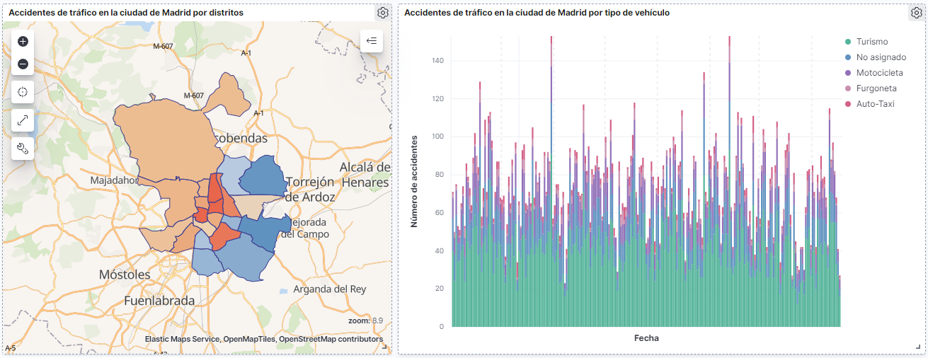
How many accidents occur in the city of Madrid?
1. Introduction
Data visualization is a task linked to data analysis that aims to graphically represent underlying data information. Visualizations play a fundamental role in the communication function that data possess, since they allow to drawn conclusions in a visual and understandable way,…
- Data exercises
Infographics: Aporta Challenges
The Aporta Challenges are awards for new ideas and prototypes that, making use of open data, lead to efficiency improvements in a specific sector of activity. In this section you will find infographics with information about the different editions carried out.
I Aporta challenge: The value of the…
- Infographics

Characterization of the employment demand and registered contracting in Spain
1. Introduction
Data visualization is a task linked to data analysis that aims to represent graphically the underlying information. Visualizations play a fundamental role in data communication, since they allow to draw conclusions in a visual and understandable way, also allowing detection of…
- Data exercises

How to generate value from data: formats, techniques and tools to analyse open data
In the digital world, data becomes a fundamental asset for companies. Thanks to them, they can better understand their environment, business and competition, and make convenient decisions at the right time.
In this context, it is not surprising that an increasing number of companies are looking for…
- Reports and studies
