30 documents found
Design and visualize road accident rates using D3.js
Introduction
Every year there are tens of thousands of accidents in Spain, in which thousands of people are injured of varying degrees, and which occur in very different circumstances, both in terms of the type of road and the type of accident.
Many of the statistics related to these parameters are…
- Data exercises

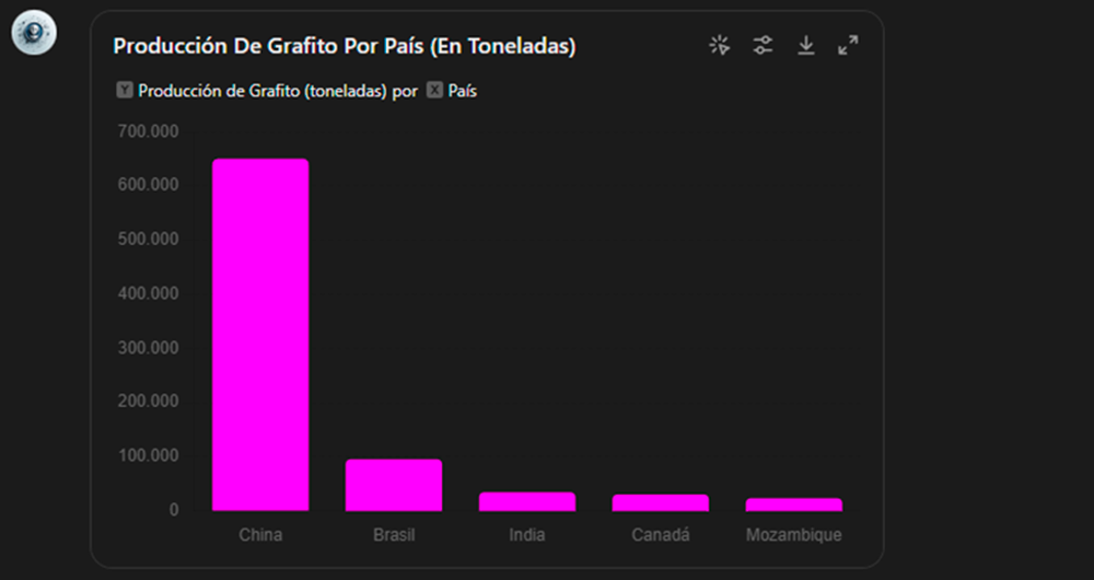
How to Create an Expert Assistant with Open Data: Building GPT to Answer the Critical Minerals Challenge
1. Introduction
In the information age, artificial intelligence has proven to be an invaluable tool for a variety of applications. One of the most incredible manifestations of this technology is GPT (Generative Pre-trained Transformer), developed by OpenAI. GPT is a natural language model…
- Data exercises
Data Visualisation Guide for Local Authorities
The FEMP's Network of Local Entities for Transparency and Citizen Participation has just presented a guide focused on data visualisation. The document, which takes as a reference the Guide to data visualisation developed by the City Council of L'Hospitalet, has been prepared based on the search for…
- Guides
Infographics: Aporta Challenges
The Aporta Challenges are awards for new ideas and prototypes that, making use of open data, lead to efficiency improvements in a specific sector of activity. In this section you will find infographics with information about the different editions carried out.
I Aporta challenge: The value of the…
- Infographics

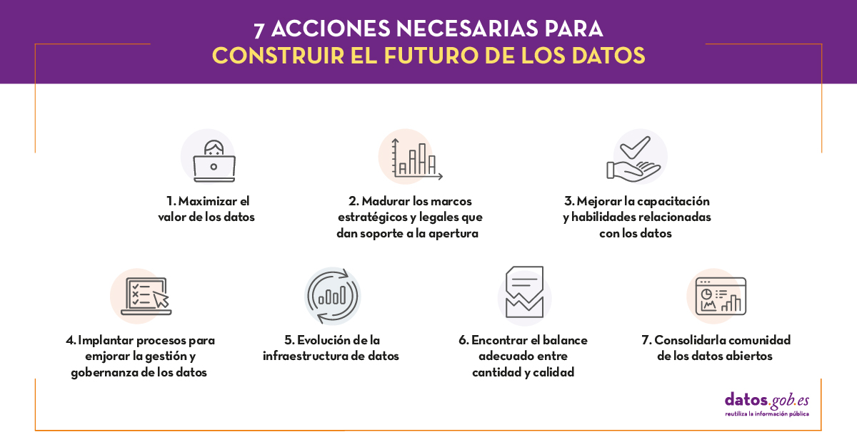
The future of open data
"Information and data are more valuable when they are shared and the opening of government data could allow [...] to examine and use public information in a more transparent, collaborative, efficient and productive way". This was, in general terms, the idea that revolutionized more than ten years…
- Reports and studies
Data processing and visualization tools
Visualization is critical for data analysis. It provides a first line of attack, revealing intricate structures in data that cannot be absorbed otherwise. We discover unimaginable effects and question those that have been imagined."
William S. Cleveland (de Visualizing Data, Hobart Press)
Over the…
- Reports and studies
Data-driven education technology to improve learning in the classroom and at home
The pandemic that originated last year has brought about a significant change in the way we see the world and how we relate to it. As far as the education sector is concerned, students and teachers at all levels have been forced to change the face-to-face teaching and learning methodology for a…
- Reports and studies

How to integrate a visualization tool into a data platform
The saying "a picture is worth a thousand words" is a clear example of popular wisdom based on science. 90% of the information we process is visual, thanks to a million nerve fibers that link the eye to the brain and more than 20,000 million neurons that perform the processing of the impulses…
- Guides

From the Infomediary Sector to the Data Economy. Study of Characterization of the Infomediate Sector. Edition 2020.
Infomediary activity is not classified as such in the CNAE. Therefore, the census of companies must be updated through indirect and ad hoc actions. Periodically, the National Observatory of Telecommunications and the Information Society (ONTSI) analyzes the state of this sector and collects the…
- Reports and studies

Open data beyond the public sector
From its origins, the open data movement has been focused on opening up public sector data, and even the original statement of open data principles itself refers only to data from public administrations (open government data - OGD). However, this perception has evolved and today it is more common…
- Reports and studies