Blog
The combination and integration of open data with artificial intelligence (AI) is an area of work that has the potential to achieve significant advances in multiple fields and bring improvements to various aspects of our lives. The most frequently mentioned area of synergy is the use of open data as input for training the algorithms used by AI since these systems require large amounts of data to fuel their operations. This makes open data an essential element for AI development and utilizing it as input brings additional advantages such as increased equality of access to technology and improved transparency regarding algorithmic functioning.
Today, we can find open data powering algorithms for AI applications in diverse areas such as crime prevention, public transportation development, gender equality, environmental protection, healthcare improvement, and the creation of more friendly and liveable cities. All of these objectives are more easily attainable through the appropriate combination of these technological trends.
However, as we will see next, when envisioning the joint future of open data and AI, the combined use of both concepts can also lead to many other improvements in how we currently work with open data throughout its entire lifecycle. Let's review step by step how artificial intelligence can enrich a project with open data.
Utilizing AI to Discover Sources and Prepare Data Sets
Artificial intelligence can assist right from the initial steps of our data projects by supporting the discovery and integration of various data sources, making it easier for organizations to find and use relevant open data for their applications. Furthermore, future trends may involve the development of common data standards, metadata frameworks, and APIs to facilitate the integration of open data with AI technologies, further expanding the possibilities of automating the combination of data from diverse sources.
In addition to automating the guided search for data sources, AI-driven automated processes can be helpful, at least in part, in the data cleaning and preparation process. This can improve the quality of open data by identifying and correcting errors, filling gaps in the data, and enhancing its completeness. This would free scientists and data analysts from certain basic and repetitive tasks, allowing them to focus on more strategic activities such as developing new ideas and making predictions.
Innovative Techniques for Data Analysis with AI
One characteristic of AI models is their ability to detect patterns and knowledge in large amounts of data. AI techniques such as machine learning, natural language processing, and computer vision can easily be used to extract new perspectives, patterns, and knowledge from open data. Moreover, as technological development continues to advance, we can expect the emergence of even more sophisticated AI techniques specifically tailored for open data analysis, enabling organizations to extract even more value from it.
Simultaneously, AI technologies can help us go a step further in data analysis by facilitating and assisting in collaborative data analysis. Through this process, multiple stakeholders can work together on complex problems and find answers through open data. This would also lead to increased collaboration among researchers, policymakers, and civil society communities in harnessing the full potential of open data to address social challenges. Additionally, this type of collaborative analysis would contribute to improving transparency and inclusivity in decision-making processes.
The Synergy of AI and Open Data
In summary, AI can also be used to automate many tasks involved in data presentation, such as creating interactive visualizations simply by providing instructions in natural language or a description of the desired visualization.
On the other hand, open data enables the development of applications that, combined with artificial intelligence, can provide innovative solutions. The development of new applications driven by open data and artificial intelligence can contribute to various sectors such as healthcare, finance, transportation, or education, among others. For example, chatbots are being used to provide customer service, algorithms for investment decisions, or autonomous vehicles, all powered by AI. By using open data as the primary data source for these services, we would achieve higher
Finally, AI can also be used to analyze large volumes of open data and identify new patterns and trends that would be difficult to detect through human intuition alone. This information can then be used to make better decisions, such as what policies to pursue in each area to bring about the desired changes.
These are just some of the possible future trends at the intersection of open data and artificial intelligence, a future full of opportunities but at the same time not without risks. As AI continues to develop, we can expect to see even more innovative and transformative applications of this technology. This will also require closer collaboration between artificial intelligence researchers and the open data community in opening up new datasets and developing new tools to exploit them. This collaboration is essential in order to shape the future of open data and AI together and ensure that the benefits of AI are available to all in a fair and equitable way.
Content prepared by Carlos Iglesias, Open data Researcher and consultant, World Wide Web Foundation.
The contents and views reflected in this publication are the sole responsibility of the author.
Blog
Open data is a highly valuable source of knowledge for our society. Thanks to it, applications can be created that contribute to social development and solutions that help shape Europe's digital future and achieve the Sustainable Development Goals (SDGs).
The European Open Data portal (data.europe.eu) organizes online events to showcase projects that have been carried out using open data sources and have helped address some of the challenges our society faces: from combating climate change and boosting the economy to strengthening European democracy and digital transformation.
In the current year, 2023, four seminars have been held to analyze the positive impact of open data on each of the mentioned themes. All the material presented at these events is published on the European data portal, and recordings are available on their YouTube channel, accessible to any interested user.
In this post, we take a first look at the showcased use cases related to boosting the economy and democracy, as well as the open data sets used for their development.
Solutions Driving the European Economy and Lifestyle
In a rapidly evolving world where economic challenges and aspirations for a prosperous lifestyle converge, the European Union has demonstrated an unparalleled ability to forge innovative solutions that not only drive its own economy but also elevate the standard of living for its citizens. In this context, open data has played a pivotal role in the development of applications that address current challenges and lay the groundwork for a prosperous and promising future. Two of these projects were presented in the second webinar of the series "Stories of Use Cases”, an event focused on "Open Data to Foster the European Economy and Lifestyle": UNA Women and YouthPOP.
The first project focuses on tackling one of the most relevant challenges we must overcome to achieve a just society: gender inequality. Closing the gender gap is a complex social and economic issue. According to estimates from the World Economic Forum, it will take 132 years to achieve full gender parity in Europe. The UNA Women application aims to reduce that figure by providing guidance to young women so they can make better decisions regarding their education and early career steps. In this use case, the company ITER IDEA has used over 6 million lines of processed data from various sources, such as data.europa.eu, Eurostat, Censis, Istat (Italy's National Institute of Statistics), and NUMBEO.
The second presented use case also targets the young population. This is the YouthPOP application (Youth Public Open Procurement), a tool that encourages young people to participate in public procurement processes. For the development of this app, data from data.europa.eu, Eurostat, and ESCO, among others, have been used. YouthPOP aims to improve youth employment and contribute to the proper functioning of democracy in Europe.
Open Data for Boosting and Strengthening European Democracy
In this regard, the use of open data also contributes to strengthening and consolidating European democracy. Open data plays a crucial role in our democracies through the following avenues:
- Providing citizens with reliable information.
- Promoting transparency in governments and public institutions.
- Combating misinformation and fake news.
The theme of the third webinar organized by data.europe.eu on use cases is "Open Data and a New Impetus for European Democracy". This event presented two innovative solutions: EU Integrity Watch and the EU Institute for Freedom of Information.
Firstly, EU Integrity Watch is a platform that provides online tools for citizens, journalists, and civil society to monitor the integrity of decisions made by politicians in the European Union. This website offers visualizations to understand the information and provides access to collected and analyzed data. The analyzed data is used in scientific disclosures, journalistic investigations, and other areas, contributing to a more open and transparent government. This tool processes and offers data from the Transparency Register.
The second initiative presented in the democracy-focused webinar with open data is the EU Institute for Freedom of Information (IDFI), a Georgian non-governmental organization that focuses on monitoring and supervising government actions, revealing infractions, and keeping citizens informed.
The main activities of the IDFI include requesting public information from relevant bodies, creating rankings of public bodies, monitoring the websites of these bodies, and advocating for improved access to public information, legislative standards, and related practices. This project obtains, analyzes, and presents open data sets from national public institutions.
In conclusion, open data makes it possible to develop applications that reduce the gender wage gap, boost youth employment, or monitor government actions. These are just a few examples of the value that open data can offer to society.

Learn more about these applications in their seminars -> Recordings here.
Documentación
1. Introduction
Visualizations are graphical representations of data that allow the information linked to them to be communicated in a simple and effective way. The visualization possibilities are very wide, from basic representations, such as line, bar or sector graphs, to visualizations configured on interactive dashboards.
In this "Step-by-Step Visualizations" section we are regularly presenting practical exercises of open data visualizations available in datos.gob.es or other similar catalogs. They address and describe in a simple way the stages necessary to obtain the data, perform the transformations and analyses that are relevant to, finally, enable the creation of interactive visualizations that allow us to obtain final conclusions as a summary of said information. In each of these practical exercises, simple and well-documented code developments are used, as well as tools that are free to use. All generated material is available for reuse in the GitHub Data Lab repository.
Then, as a complement to the explanation that you will find below, you can access the code that we will use in the exercise and that we will explain and develop in the following sections of this post.
Access the data lab repository on Github.
Run the data pre-processing code on top of Google Colab.
2. Objetive
The main objective of this exercise is to show how to generate an interactive dashboard that, based on open data, shows us relevant information on the food consumption of Spanish households based on open data. To do this, we will pre-process the open data to obtain the tables that we will use in the visualization generating tool to create the interactive dashboard.
Dashboards are tools that allow you to present information in a visual and easily understandable way. Also known by the term "dashboards", they are used to monitor, analyze and communicate data and indicators. Your content typically includes charts, tables, indicators, maps, and other visuals that represent relevant data and metrics. These visualizations help users quickly understand a situation, identify trends, spot patterns, and make informed decisions.
Once the data has been analyzed, through this visualization we will be able to answer questions such as those posed below:
- What is the trend in recent years regarding spending and per capita consumption in the different foods that make up the basic basket?
- What foods are the most and least consumed in recent years?
- In which Autonomous Communities is there a greater expenditure and consumption in food?
- Has the increase in the cost of certain foods in recent years meant a reduction in their consumption?
These, and many other questions can be solved through the dashboard that will show information in an orderly and easy to interpret way.
3. Resources
3.1. Datasets
The open datasets used in this exercise contain different information on per capita consumption and per capita expenditure of the main food groups broken down by Autonomous Community. The open datasets used, belonging to the Ministry of Agriculture, Fisheries and Food (MAPA), are provided in annual series (we will use the annual series from 2010 to 2021)
Annual series data on household food consumption
These datasets are also available for download from the following Github repository.
These datasets are also available for download from the following Github repository.
3.2. Tools
To carry out the data preprocessing tasks, the Python programming language written on a Jupyter Notebook hosted in the Google Colab cloud service has been used.
"Google Colab" or, also called Google Colaboratory, is a cloud service from Google Research that allows you to program, execute and share code written in Python or R on a Jupyter Notebook from your browser, so it does not require configuration. This service is free of charge.
For the creation of the dashboard, the Looker Studio tool has been used.
"Looker Studio" formerly known as Google Data Studio, is an online tool that allows you to create interactive dashboards that can be inserted into websites or exported as files. This tool is simple to use and allows multiple customization options.
If you want to know more about tools that can help you in the treatment and visualization of data, you can use the report "Data processing and visualization tools".
4. Processing or preparation of data
The processes that we describe below you will find commented in the following Notebook that you can run from Google Colab.
Before embarking on building an effective visualization, we must carry out a prior treatment of the data, paying special attention to its obtaining and the validation of its content, making sure that it is in the appropriate and consistent format for processing and that it does not contain errors.
As a first step of the process, once the initial data sets are loaded, it is necessary to perform an exploratory data analysis (EDA) to properly interpret the starting data, detect anomalies, missing data or errors that could affect the quality of subsequent processes and results. If you want to know more about this process, you can resort to the Practical Guide of Introduction to Exploratory Data Analysis.
The next step is to generate the pre-processed data table that we will use to feed the visualization tool (Looker Studio). To do this, we will modify, filter and join the data according to our needs.
The steps followed in this data preprocessing, explained in the following Google Colab Notebook, are as follows:
- Installation of libraries and loading of datasets
- Exploratory Data Analysis (EDA)
- Generating preprocessed tables
You will be able to reproduce this analysis with the source code that is available in our GitHub account. The way to provide the code is through a document made on a Jupyter Notebook that once loaded into the development environment you can run or modify easily. Due to the informative nature of this post and to favor the understanding of non-specialized readers, the code is not intended to be the most efficient, but to facilitate its understanding so you will possibly come up with many ways to optimize the proposed code to achieve similar purposes. We encourage you to do so!
5. Displaying the interactive dashboard
Once we have done the preprocessing of the data, we go with the generation of the dashboard. A scorecard is a visual tool that provides a summary view of key data and metrics. It is useful for monitoring, decision-making and effective communication, by providing a clear and concise view of relevant information.
For the realization of the interactive visualizations that make up the dashboard, the Looker Studio tool has been used. Being an online tool, it is not necessary to have software installed to interact or generate any visualization, but it is necessary that the data table that we provide is properly structured, which is why we have carried out the previous steps related to the preprocessing of the data. If you want to know more about how to use Looker Studio, in the following link you can access training on the use of the tool.
Below is the dashboard, which can be opened in a new tab in the following link. In the following sections we will break down each of the components that make it up.
5.1. Filters
Filters in a dashboard are selection options that allow you to visualize and analyze specific data by applying various filtering criteria to the datasets presented in the dashboard. They help you focus on relevant information and get a more accurate view of your data.

The filters included in the generated dashboard allow you to choose the type of analysis to be displayed, the territory or Autonomous Community, the category of food and the years of the sample.
It also incorporates various buttons to facilitate the deletion of the chosen filters, download the dashboard as a report in PDF format and access the raw data with which this dashboard has been prepared.
5.2. Interactive visualizations
The dashboard is composed of various types of interactive visualizations, which are graphical representations of data that allow users to actively explore and manipulate information.
Unlike static visualizations, interactive visualizations provide the ability to interact with data, allowing users to perform different and interesting actions such as clicking on elements, dragging them, zooming or reducing focus, filtering data, changing parameters and viewing results in real time.
This interaction is especially useful when working with large and complex data sets, as it makes it easier for users to examine different aspects of the data as well as discover patterns, trends and relationships in a more intuitive way.
To define each type of visualization, we have based ourselves on the data visualization guide for local entities presented by the NETWORK of Local Entities for Transparency and Citizen Participation of the FEMP.
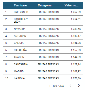
5.2.1 Data tables
Data tables allow the presentation of a large amount of data in an organized and clear way, with a high space/information performance.
However, they can make it difficult to present patterns or interpretations with respect to other visual objects of a more graphic nature.
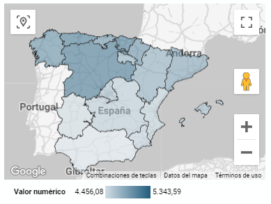
5.2.2 Map of chloropetas
t is a map in which numerical data are shown by territories marking with intensity of different colours the different areas. For its elaboration it requires a measure or numerical data, a categorical data for the territory and a geographical data to delimit the area of each territory.
5.2.3 Pie chart
It is a graph that shows the data from polar axes in which the angle of each sector marks the proportion of a category with respect to the total. Its functionality is to show the different proportions of each category with respect to a total using pie charts.
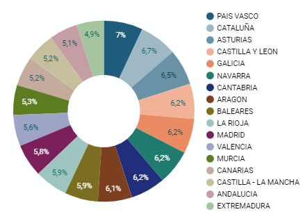
Figure 4. Dashboard pie chart
5.2.4 Line chart
It is a graph that shows the relationship between two or more measurements of a series of values on two Cartesian axes, reflecting on the X axis a temporal dimension, and a numerical measure on the Y axis. These charts are ideal for representing time data series with a large number of data points or observations.
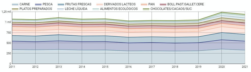
Figure 5. Dashboard line chart
5.2.5 Bar chart
It is a graph of the most used for the clarity and simplicity of preparation. It makes it easier to read values from the ratio of the length of the bars. The chart displays the data using an axis that represents the quantitative values and another that includes the qualitative data of the categories or time.
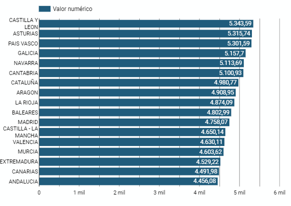
Figure 6. Dashboard bar chart
5.2.6 Hierarchy chart
It is a graph formed by different rectangles that represent categories, and that allows hierarchical groupings of the sectors of each category. The dimension of each rectangle and its placement varies depending on the value of the measurement of each of the categories shown with respect to the total value of the sample.
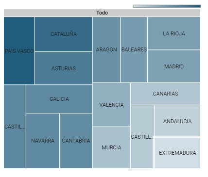
Figure 7. Dashboard Hierarchy chart
6. Conclusions
Dashboards are one of the most powerful mechanisms for exploiting and analyzing the meaning of data. It should be noted the importance they offer us when it comes to monitoring, analyzing and communicating data and indicators in a clear, simple and effective way.
As a result, we have been able to answer the questions originally posed:
- The trend in per capita consumption has been declining since 2013, when it peaked, with a small rebound in 2020 and 2021.
- The trend of per capita expenditure has remained stable since 2011 until in 2020 it has suffered a rise of 17.7%, going from being the average annual expenditure of 1052 euros to 1239 euros, producing a slight decrease of 4.4% from the data of 2020 to those of 2021.
- The three most consumed foods during all the years analyzed are: fresh fruits, liquid milk and meat (values in kgs)
- The Autonomous Communities where per capita spending is highest are the Basque Country, Catalonia and Asturias, while Castilla la Mancha, Andalusia and Extremadura have the lowest spending.
- The Autonomous Communities where a higher per capita consumption occurs are Castilla y León, Asturias and the Basque Country, while in those with the lowest are Extremadura, the Canary Islands and Andalusia.
We have also been able to observe certain interesting patterns, such as a 17.33% increase in alcohol consumption (beers, wine and spirits) in the years 2019 and 2020.
You can use the different filters to find out and look for more trends or patterns in the data based on your interests and concerns.
We hope that this step-by-step visualization has been useful for learning some very common techniques in the treatment and representation of open data. We will be back to show you new reuses. See you soon!
Blog
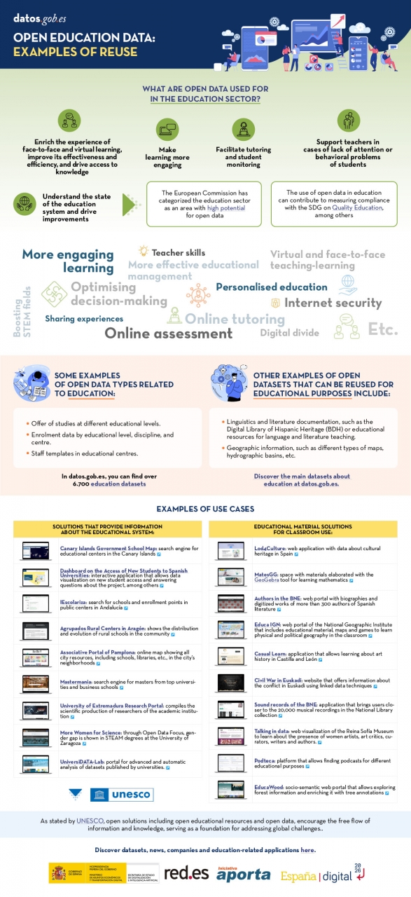
Open solutions, including Open Educational Resources (OER), Open Access to Scientific Information (OA), Free and Open-Source Software (FOSS), and open data, encourage the free flow of information and knowledge, serving as a foundation for addressing global challenges, as reminded by UNESCO.
The United Nations Educational, Scientific and Cultural Organization (UNESCO) recognizes the value of open data in the educational field and believes that its use can contribute to measuring the compliance of the Sustainable Development Goals, especially Goal 4 of Quality Education. Other international organizations also recognize the potential of open data in education. For example, the European Commission has classified the education sector as an area with high potential for open data.
Open data can be used as a tool for education and training in different ways. They can be used to develop new educational materials and to collect and analyze information about the state of the educational system, which can be used to drive improvement.
The global pandemic marked a milestone in the education field, as the use of new technologies became essential in the teaching and learning process, which became entirely virtual for months. Although the benefits of incorporating ICT and open solutions into education, a trend known as Edtech, had been talked about for years, COVID-19 accelerated this process.
Benefits of Using Open Data in the Classroom
In the following infographic, we summarize the benefits of utilizing open data in education and training, from the perspective of both students and educators, as well as administrators of the education system.
There are many datasets that can be used for developing educational solutions. At datos.gob.es, there are more than 6,700 datasets available, which can be supplemented by others used for educational purposes in different fields, such as literature, geography, history, etc.
Many solutions have been developed using open data for these purposes. We gather some of them based on their purpose: firstly, solutions that provide information on the education system to understand its situation and plan new measures, and secondly, those that offer educational material to use in the classroom.
In essence, open data is a key tool for the strengthening and progress of education, and we must not forget that education is a universal right and one of the main tools for the progress of humanity.
Documentación
1. Introduction
Visualizations are graphical representations of data that allow the information linked to them to be communicated in a simple and effective way. The visualization possibilities are very wide, from basic representations, such as a line chart, bars or sectors, to visualizations configured on dashboards or interactive dashboards.
In this "Step-by-Step Visualizations" section we are regularly presenting practical exercises of open data visualizations available on datos.gob.es or similar catalogs. They address and describe in a simple way the stages necessary to obtain the data, perform the transformations and analysis that are relevant to and finally, the creation of interactive visualizations; from which we can extract information summarized in final conclusions. In each of these practical exercises, simple and well-documented code developments are used, as well as free to use tools. All generated material is available for reuse in GitHub's Data Lab repository.
Run the data pre-processing code on top of Google Colab.
Below, you can access the material that we will use in the exercise and that we will explain and develop in the following sections of this post.
Access the data lab repository on Github.
Run the data pre-processing code on top of Google Colab.
2. Objective
The main objective of this exercise is to make an analysis of the meteorological data collected in several stations during the last years. To perform this analysis, we will use different visualizations generated by the "ggplot2" library of the programming language "R".
Of all the Spanish weather stations, we have decided to analyze two of them, one in the coldest province of the country (Burgos) and another in the warmest province of the country (Córdoba), according to data from the AEMET. Patterns and trends in the different records between 1990 and 2020 will be sought to understand the meteorological evolution suffered in this period of time.
Once the data has been analyzed, we can answer questions such as those shown below:
- What is the trend in the evolution of temperatures in recent years?
- What is the trend in the evolution of rainfall in recent years?
- Which weather station (Burgos or Córdoba) presents a greater variation of climatological data in recent years?
- What degree of correlation is there between the different climatological variables recorded?
These, and many other questions can be solved by using tools such as ggplot2 that facilitate the interpretation of data through interactive visualizations.
3. Resources
3.1. Datasets
The datasets contain different meteorological information of interest for the two stations in question broken down by year. Within the AEMET download center, we can download them, upon request of the API key, in the section "monthly / annual climatologies". From the existing weather stations, we have selected two of which we will obtain the data: Burgos airport (2331) and Córdoba airport (5402)
It should be noted that, along with the datasets, we can also download their metadata, which are of special importance when identifying the different variables registered in the datasets.
These datasets are also available in the Github repository.
3.2. Tools
To carry out the data preprocessing tasks, the R programming language written on a Jupyter Notebook hosted in the Google Colab cloud service has been used.
"Google Colab" or, also called Google Colaboratory, is a cloud service from Google Research that allows you to program, execute and share code written in Python or R on a Jupyter Notebook from your browser, so it does not require configuration. This service is free of charge.
For the creation of the visualizations, the ggplot2 library has been used.
"ggplot2" is a data visualization package for the R programming language. It focuses on the construction of graphics from layers of aesthetic, geometric and statistical elements. ggplot2 offers a wide range of high-quality statistical charts, including bar charts, line charts, scatter plots, box and whisker charts, and many others.
If you want to know more about tools that can help you in the treatment and visualization of data, you can use the report "Data processing and visualization tools".
4. Data processing or preparation
The processes that we describe below you will find them commented in the Notebook that you can also run from Google Colab.
Before embarking on building an effective visualization, we must carry out a prior treatment of the data, paying special attention to obtaining them and validating their content, ensuring that they are in the appropriate and consistent format for processing and that they do not contain errors.
As a first step of the process, once the necessary libraries have been imported and the datasets loaded, it is necessary to perform an exploratory analysis of the data (EDA) in order to properly interpret the starting data, detect anomalies, missing data or errors that could affect the quality of the subsequent processes and results. If you want to know more about this process, you can resort to the Practical Guide of Introduction to Exploratory Data Analysis.
The next step is to generate the preprocessed data tables that we will use in the visualizations. To do this, we will filter the initial data sets and calculate the values that are necessary and of interest for the analysis carried out in this exercise.
Once the preprocessing is finished, we will obtain the data tables "datos_graficas_C" and "datos_graficas_B" which we will use in the next section of the Notebook to generate the visualizations.
The structure of the Notebook in which the steps previously described are carried out together with explanatory comments of each of them, is as follows:
- Installation and loading of libraries.
- Loading datasets
- Exploratory Data Analysis (EDA)
- Preparing the data tables
- Views
- Saving graphics
You will be able to reproduce this analysis, as the source code is available in our GitHub account. The way to provide the code is through a document made on a Jupyter Notebook that once loaded into the development environment you can run or modify easily. Due to the informative nature of this post and in order to favor the understanding of non-specialized readers, the code is not intended to be the most efficient but to facilitate its understanding so you will possibly come up with many ways to optimize the proposed code to achieve similar purposes. We encourage you to do so!
5. Visualizations
Various types of visualizations and graphs have been made to extract information on the tables of preprocessed data and answer the initial questions posed in this exercise. As mentioned previously, the R "ggplot2" package has been used to perform the visualizations.
The "ggplot2" package is a data visualization library in the R programming language. It was developed by Hadley Wickham and is part of the "tidyverse" package toolkit. The "ggplot2" package is built around the concept of "graph grammar", which is a theoretical framework for building graphs by combining basic elements of data visualization such as layers, scales, legends, annotations, and themes. This allows you to create complex, custom data visualizations with cleaner, more structured code.
If you want to have a summary view of the possibilities of visualizations with ggplot2, see the following "cheatsheet". You can also get more detailed information in the following "user manual".
5.1. Line charts
Line charts are a graphical representation of data that uses points connected by lines to show the evolution of a variable in a continuous dimension, such as time. The values of the variable are represented on the vertical axis and the continuous dimension on the horizontal axis. Line charts are useful for visualizing trends, comparing evolutions, and detecting patterns.
Next, we can visualize several line graphs with the temporal evolution of the values of average, minimum and maximum temperatures of the two meteorological stations analyzed (Córdoba and Burgos). On these graphs, we have introduced trend lines to be able to observe their evolution in a visual and simple way.


To compare the evolutions, not only visually through the graphed trend lines, but also numerically, we obtain the slope coefficients of the trend line, that is, the change in the response variable (tm_ month, tm_min, tm_max) for each unit of change in the predictor variable (year).
- Average temperature slope coefficient Córdoba: 0.036
- Average temperature slope coefficient Burgos: 0.025
- Coefficient of slope minimum temperature Córdoba: 0.020
- Coefficient of slope minimum temperature Burgos: 0.020
- Slope coefficient maximum temperature Córdoba: 0.051
- Slope coefficient maximum temperature Burgos: 0.030
We can interpret that the higher this value, the more abrupt the average temperature rise in each observed period.
Finally, we have created a line graph for each weather station, in which we jointly visualize the evolution of average, minimum and maximum temperatures over the years.
