Noticia
Last November, Red.es, in collaboration with the Secretary of State for Digitalisation and Artificial Intelligence launched the 4th edition of the Aporta Challenge. Under the slogan "The value of data for health and well-being of citizens", the competition seeks to identify new services and solutions, based on open data, that drive improvements in this field.
The challenge is divided into two phases: an ideas competition, followed by a second phase where finalists have to develop and present a prototype. We are now at the halfway point of the competition. Phase I has come to an end and it is time to find out who are the 10 finalists who will move on to phase II.
After analysing the diverse and high-quality proposals submitted, the jury has determined a series of finalists, as reflected the resolution published on the Red.es website.
Let us look at each candidacy in detail:
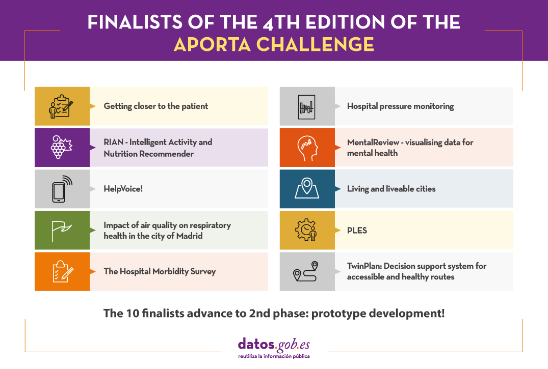
Getting closer to the patient
- Team:
SialSIG aporta, composed of Laura García and María del Mar Gimeno.
- What does it consist of?
A platform will be built to reduce rescue time and optimise medical care in the event of an emergency. Parameters will be analysed to categorise areas by defining the risk of mortality and identifying the best places for aerial rescue vehicles to land. This information will also make available which areas are the most isolated and vulnerable to medical emergencies, information of great value for defining strategies for action that will lead to an improvement in the management and resources to be used.
- Data
The platform seeks to integrate information from all the autonomous communities, including population data (census, age, sex, etc.), hospital and heliport data, land use and crop data, etc. Specifically, data will be obtained from the municipal census of the National Statistics Institute (INE), the boundaries of provinces and municipalities, the land use classification of the National Geographic Institute (IGN) and data from the SIGPAC (MAPA), among others.
Hospital pressure monitoring
- Team:
DSLAB, data science research group at Rey Juan Carlos University, composed of Isaac Martín, Alberto Fernández, Marina Cuesta and María del Carmen Lancho.
- What does it consist of?
With the aim of improving hospital management, the DSLAB proposes an interactive and user-friendly dashboard that allows:
- Monitor hospital pressure
- Evaluate the actual load and saturation of healthcare centres
- Forecast the evolution of this pressure
This will enable better resource planning, anticipate decision making and avoid possible collapses.
- Data
To realise the tool's potential, the prototype will be created with open data relating to COVID in the Autonomous Community of Castilla y León, such as bed occupancy or the epidemiological situation by hospital and province. However, the solution is scalable and can be extrapolated to any other territory with similar data.
RIAN - Intelligent Activity and Nutrition Recommender
- Team:
RIAN Open Data Team, composed of Jesús Noguera y Raúl Micharet.
- What does it consist of?
RIAN was created to promote healthy habits and combat overweight, obesity, sedentary lifestyles and poor nutrition among children and adolescents. It is an application for mobile devices that uses gamification techniques, as well as augmented reality and artificial intelligence algorithms to make recommendations. Users have to solve personalised challenges, individually or collectively, linked to nutritional aspects and physical activities, such as gymkhanas or games in public green spaces.
- Data
The pilot uses data relating to green areas, points of interest, greenways, activities and events from the cities of Málaga, Madrid, Zaragoza and Barcelona. These data are combined with nutritional recommendations (food data and nutritional values and branded food products) and data for food image recognition from Tensorflow or Kaggle, among others.
MentalReview - visualising data for mental health
- Team:
Kairos Digital Analytics and Big Data Solutions S.L.
- What does it consist of?
MentalReview is a mental health monitoring tool to support health and social care management and planning, enabling institutions to improve citizen care services. The tool will allow the analysis of information extracted from open databases, the calculation of indicators and, finally, the visualisation of the information through graphs and an interactive map. This will allow us to know the current state of mental health in the Spanish population, identify trends or make a study of its evolution.
- Data
For its development, data from the INE, the Sociological Research Centre, the Mental Health Services of the different autonomous regions, the Spanish Agency for Medicines and Health Products or EUROSTAT, among others, will be used. Some specific examples of datasets to be used are: anxiety problems in young people, the suicide mortality rate by autonomous community, age, sex and period or the consumption of anxiolytics.
HelpVoice!
- Team:
Data Express, composed of Sandra García, Antonio Ríos and Alberto Berenguer.
- What does it consist of?
HelpVoice! is a service that helps our elderly through voice recognition techniques based on automatic learning. In an emergency situation, the user only need to click on a device that can be an emergency button, a mobile phone or home automation tools and tell about their symptoms. The system will send a report with the transcript and predictions to the nearest hospital, speeding up the response of the healthcare workers. In parallel, HelpVoice! will also recommend to the patient what to do while waiting for the emergency services.
- Data
Among other open data, the map of hospitals in Spain will be used. Speech and sentiment recognition data will also be used in the text.
Living and liveable cities: creating high-resolution shadow maps to help cities adapt to climate change
- Team:
Living Cities, composed of Francisco Rodríguez-Sánchez and Jesús Sánchez-Dávila.
- What does it consist of?
In the current context of rising temperatures, the Living Cities team proposes to develop open software to promote the adaptation of cities to climate change, facilitating the planning of urban shading. Using spatial analysis, remote sensing and modelling techniques, this software will allow to know the level of insolation (or shading) with high spatio-temporal resolution (every hour of the day at every square metre of land) for any municipality in Spain. The team will particularly analyse the shading situation in the city of Seville, offering its results publicly through a web application that will allow consultation of the insolation maps and to obtain shade routes between different points in the city.
- Data
Living Cities is based on the use of open remote sensing data (LiDAR) from the National Aerial Orthophotography Programme (PNOA), the Seville city trees and spatial data from OpenStreetMap.
Impact of air quality on respiratory health in the city of Madrid
- Team:
So Good Data, composed of Ana Belén Laguna, Manuel López, Vicente Lorenzo, Javier Maestre and Iván Robles.
- What does it consist of?
So Good Data is proposing a study to analyse the impact of air pollution on the number of hospital admissions for respiratory diseases. It will also determine which pollutant particles are likely to be most harmful. With this information, it would be possible to predict the number of admissions a hospital will face depending on air pollution on a given date, in order to take the necessary measures in advance and reduce mortality.
- Data
Among other datasets, hospitalisations due to respiratory diseases, air quality, tobacco sales or atmospheric pollen in the Community of Madrid will be used for the study.
PLES
- Team:
BOLT, composed of Víctor José Montiel, Núria Foguet, Borja Macías, Alejandro Pelegero and José Luis Álvarez.
- What does it consist of?
The BOLT team will create a web application that allows the user to obtain an estimate of the average waiting time for consultations, tests or interventions in the public health system of Catalonia. The time series prediction models will be developed using Python with statistical and machine learning techniques. The user only need to indicate the hospital and the type of consultation, operation or test for which he/she is waiting. In addition to improving transparency with patients, the website can also be used by healthcare professionals to better manage their resources.
- Datos
The Project will use data from the public waiting lists in Catalonia published by CatSalut on a monthly basis. Specifically, monthly data on waiting lists for surgery, specialised outpatient consultations and diagnostic tests will be used from at least 2019 to the present. In the future, the idea could be adapted to other Autonomous Communities.
The Hospital Morbidity Survey: Proposal for the development of a MERN+Python web environment for its analysis and graphical visualisation.
- Team:
Marc Coca Moreno
- What does it consist of?
This is a web environment based on MERN, Python and Pentaho tools for the analysis and interactive visualisation of the Hospital Morbidity Survey microdata. The entire project will be developed with open source and free tools. Both the code and the final product will be openly accessible.
Specifically, it offers 3 major analyses with the aim of improving health planning:
o Descriptive: hospital discharge counts and time series.
o KPIs: standardised rates and indicators for comparison and benchmarking of provinces and communities.
o Flows: count and analysis of discharges from a hospital region and patient origin.
All data will be filterable according to dataset variables (age, sex, diagnoses, circumstance of admission and discharge, etc.).
- Data
In addition to the microdata from the INE's Hospital Morbidity Survey, it will also integrate Statistics from the Continuous Register (also from the INE), data from the Ministry of Health's catalogues of ICD10 diagnoses and from the catalogues and indicators of the Agency for Healthcare Research and Quality (AHRQ) and of the Autonomous Communities, such as Catalonia: catalogues and stratification tools.
TWINPLAN: Decision support system for accessible and healthy routes
- Team:
TWINPLAN, composed of Ivan Araquistain, Josu Ansola and Iñaki Prieto
- What does it consist of?
This is a web App to facilitate accessibility for people with mobility problems and promote healthy exercise for all citizens. The tool assesses whether your route is affected by any incidents in public lifts and, if so, proposes an alternative accessible route, also indicating the level of traffic (noise) in the area, air quality and cardioprotection points. It also provides contact details for nearby means of transport.
This web App can also be used by public administrations to monitor the use and planning of new accessible infrastructures.
- Data
The prototype will be developed using data from the Digital Twin of Ermua's public lifts, although the model is scalable to other territories. This data is complemented with other public data from Ermua such as the network of environmental sensors, traffic and LurData, among other sources.
These 10 proposals now have several months to develop their proposals, which will be presented on 18 October. The three prototypes best valued by the jury will receive €5,000, €4,000 and €3,000, respectively.
Good luck to all the finalists!
(You can download the accessible version in word here)
Blog
Digital life has arrived to become part of our daily lives and with it new communication and information consumption habits. Concepts such as augmented reality are actively participating in this process of change in which an increasing number of companies and organisations are involved.
Differences between augmented and virtual reality
Although the nomenclature of these concepts is somewhat similar, in practice, we are talking about different scenarios:
- Virtual reality: This is a digital experience that allows the user to immerse themselves in an artificial world where they can experience sensory nuances isolated from what is happening outside.
- Augmented reality: This is a data visualisation alternative that enhances the user experience by incorporating digital elements into tangible reality. In other words, it allows visual aspects to be added to the environment around us. This makes it especially interesting in the world of data visualisation, as it allows graphic elements to be superimposed on our reality. To achieve this, it is most common to use specialised glasses. At the same time, augmented reality can also be developed without the need for external gadgets. Using the camera of our mobile phone, some applications are capable of combining the visualisation of real elements present around us with other digitally processed elements that allow us to interact with tangible reality.
In this article we are going to focus on augmented reality, which is presented as an effective formula for sharing, presenting and disseminating the information contained in datasets.
Challenges and opportunities
The use of augmented reality tools is particularly useful when distributing and disseminating knowledge online. In this way, instead of sharing a set of data through text and graphic representations, augmented reality allows us to explore ways of disseminating information that facilitate understanding from the point of view of the user experience.
These are some of the opportunities associated with its use:
- Through 3D visualisations, augmented reality allows the user to have an immersive experience that facilitates contact with and internalisation of this type of information.
- It allows information to be consulted in real time and to interact with the environment. Augmented reality allows the user to interact with data in remote locations. Data can be adapted, even in spatial terms, to the needs and characteristics of the environment. This is particularly useful in field work, allowing operators repairing breakdowns or farmers in the middle of their crops to access the up-to-date information they need, in a highly visual way, combined with the environment.
- A higher density of data can be displayed at the same time, which facilitates the cognitive processing of information. In this way, augmented reality helps to speed up comprehension processes and thus our ability to conceive new realities.
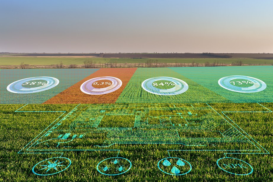
Example of visualisation of agricultural data on the environment
Despite these advantages, the market is still developing and faces challenges such as implementation costs, lack of common standards and user concerns about security.
Use cases
Beyond the challenges, opportunities and strengths, augmented reality becomes even more relevant when organisations incorporate it into their innovation area to improve user experience or process efficiency. Thus, through the use cases, we can better understand the universe of usefulness that lies behind augmented reality.
One field where they represent a great opportunity is tourism. One example is Gijón in a click, a free mobile application that makes 3 routes available to visitors. During the tours, plaques have been installed on the ground from where tourists can launch augmented reality recreations with their own mobile phone.
From the point of view of hardware companies, we can highlight the example, among a long list, of the smart helmet prototype designed by the company Aegis Rider, which allows information to be obtained without taking your eyes off the road. This helmet uses augmented reality to project a series of indicators at eye level to help minimise the risk of an accident.
The projected data includes information from open data sources such as road conditions, road layout and maximum speed. In addition, using a system based on object recognition and deep learning, the Aegis Rider helmet also detects objects, animals, pedestrians or other vehicles on the road that could pose an accident risk when they are in the same path.
In addition to road safety, but continuing with the possibilities offered by augmented reality, Accuvein uses augmented reality to prevent chronic patients, such as cancer patients, from having to suffer failed needlesticks when receiving their medication. To do this, Accuvein has designed a handheld scanner that projects the exact location of the various veins on the patient's skin. According to its developers, the level of accuracy is 3.5 times higher than that of a traditional needle stick.
On the other hand, ordinary citizens can also find augmented reality as supporting material for news and reports. Media such as The New York Times are increasingly offering information that uses augmented reality to visualise datasets and make them easier to understand.
Tools for generating visualisations with augmented reality
As we have seen, augmented reality can also be used to create data visualisations that facilitate the understanding of sets of information that, a priori, may seem abstract. To create these visualisations there are different tools, such as Flow, whose function is to facilitate the work of programmers and developers. This platform, which displays datasets through the API of the WebXR device, allows these types of professionals to load data, create visualisations and add steps for the transition between them. Other tools include 3Data or Virtualitics. Companies such as IBM are also entering the sector.
For all these reasons, and in line with the evidence provided by the previous use cases, augmented reality is positioned as one of the data visualisation and transmission technologies that have arrived to further expand the limits of the knowledge society in which we are immersed.
Content prepared by the datos.gob.es team.
Noticia
Spring, in addition to the arrival of good weather, has brought a great deal of news related to the open data ecosystem and data sharing. Over the last three months, European-driven developments have continued, with two initiatives that are currently in the public consultation phase standing out:
- Progress on data spaces. The first regulatory initiative for a data space has been launched. This first proposal focuses on health sector data and seeks to establish a uniform legal framework, facilitate patients' electronic access to their own data and encourage its re-use for other secondary purposes. It is currently under public consultation until 28 July.
- Boosting high-value data. The concept of high-value data, set out in Directive 2019/1024, refers to data whose re-use brings considerable benefits to society, the environment and the economy. Although this directive included a proposal for initial thematic categories to be considered, an initiative is currently underway to create a more concrete list. This list has already been made public and any citizen can add comment until 24 June. In the addition, the European Commission has also launched a series of grants to support public administrations at local, regional and national level to boost the availability, quality and usability of high-value data.
These two initiatives are helping to boost an ecosystem that is growing steadily in Spain, as shown in these examples of news we have collected over the last few months.
Examples of open data re-use
This season we have also learned about different projects that highlight the advantages of using data:
- Thanks to the use of Linked Open Data, a professor from the University of Valladolid has created the web application LOD4Culture. This app allows to explore the world's cultural heritage from the semantic databases of dbpedia and wikidata.
- The University of Zaragoza has launched sensoriZAR to monitor air quality and reduce energy consumption in its spaces. Built on IoT, open data and open science, the solution is focused on data-driven decision-making.
- Villalba Hospital has created a map of cardiovascular risk in the Sierra de Madrid thanks to Big Data. The map collects clinical and demographic data of patients to inform about the likelihood of developing such a disease in the future.
- The Open Government Lab of Aragon has recently presented "RADAR", an application that provides geo-referenced information on initiatives in rural areas.
Agreements to boost open data
The commitment of public bodies to open data is evident in a number of agreements and plans that have been launched in recent months:
- On 13 April, the mayors of Madrid and Malaga signed two collaboration agreements to jointly boost digital transformation and tourism growth in both cities. Thanks to these agreements, it will be possible to adopt policies on security and data protection, open data and Big Data, among others.
- The Government of the Balearic Islands and Asedie will collaborate to implement open data measures, transparency and reuse of public data. This is set out in an agreement that seeks to promote public-private collaboration and the development of commercial solutions, among others.
- The Generalitat Valenciana has signed an agreement with the Universitat Politècnica de València through which it will allocate €70,000 to carry out activities focused on the openness and reuse of data during the 2022 financial year.
- Madrid City Council has also initiated the process for the elaboration of the III Open Government Action Plan for the city, for which it launched a public consultation.
In addition, open data platforms continue to be enriched with new datasets and tools aimed at facilitating access to and use of information. Some examples are:
- Aragón Open Data has presented its virtual assistant to bring the portal's data closer to users in a simple and user-friendly way. The solution has been developed by Itainnova together with the Government of Aragon.
- Cartociudad, which belongs to the Ministry of Transport, Mobility and Urban Agenda, has a new viewer to locate postal addresses. It has been developed from a search engine based on REST services and has been created with API-CNIG.
- Madrid City Council has also launched a new open data viewer. Interactive dashboards with data on energy, weather, parking, libraries, etc. can be consulted.
- The Department of Ecological Transition of the Government of the Canary Islands has launched a new search engine for energy certificates by cadastral reference, with information from the Canary Islands Open Data portal.
- The Segovia City Council has renewed its website to host all the pages of the municipal areas, including the Open Data Portal, under the umbrella of the Smart Digital Segovia project.
- The University of Navarra has published a new dataset through GBIF, showing 10 years of observations on the natural succession of vascular plants in abandoned crops.
- The Castellón Provincial Council has published on its open data portal a dataset listing the 52 municipalities in which the installation of ATMs to combat depopulation has been promoted.
Boom in events, trainings and reports
Spring is one of the most prolific times for events and presentations. Some of the activities that have taken place during these months are:
- Asedie presented the 10th edition of its Report on the state of the infomediary sector, this time focusing on the data economy. The report highlights that this sector has a turnover of more than 2,000 million euros per year and employs almost 23,000 professionals. On the Asedie website you can access the video of the presentation of the report, with the participation of the Data Office.
- During this season, the results of the Gobal Data Barometer were also presented. This report reflects examples of the use and impact of open data, but also highlights the many barriers that prevent access and effective use of open data, limiting innovation and problem solving.
- The Social Security Data Conference was held on 26 May. It was recorded on video and can be viewed at this link. They showed the main strategic lines of the Social Security IT Management (GISS) in this area.
- The recording of the conference "Public Strategies for the Development of Data Spaces", organised by AIR4S (Digital Innovation Hub in AI and Robotics for the Sustainable Development Goals) and the Madrid City Council, is also available. During the event, public policies and initiatives based on the use and exploitation of data were presented.
- Another video available is the presentation of Oscar Corcho, Professor at the Polytechnic University of Madrid (UPM), co-director of the Ontological Engineering Group (OEG) and co-founder of LocaliData, talking about the collaborative project Ciudades Abiertas in the webinar "Improving knowledge transfer across organisations by knowledge graphs". You can watch it at this link from minute 15:55 onwards.
- In terms of training, the FEMP's Network of Local Entities for Transparency and Participation approved its Training Plan for this year. It includes topics related to the evaluation of public policies, open data, transparency, public innovation and cybersecurity, among others.
- Alcobendas City Council has launched a podcast section on its website, with the aim of disseminating among citizens issues such as the use of open data in public administrations.
Other news of interest in Europe
We end our review with some of the latest developments in the European data ecosystem:
- The 24 shortlisted teams for the EUDatathon 2022 have been made public. Among them is the Spanish Astur Data Team.
- The European Consortium for Digital and Interconnected Scientific Infrastructures LifeWatch ERIC, based in Seville, has taken on the responsibility of providing technological support to the global open data network on biodiversity.
- The European Commission has recently launched Kohesio. It is a new public online platform that provides data on European cohesion projects. Through the data, it shows the contribution of the policy to the economic, territorial and social cohesion of EU regions, as well as to the ecological and digital transitions.
- The European Open Data Portal has published a new study on how to make its data more reusable. This is the first in a series of reports focusing on the sustainability of open data portal infrastructures.
This is just a selection of news among all the developments in the open data ecosystem over the last three months. If you would like to make a contribution, you can leave us a message in the comments or write to dinamizacion@datos.gob.es.
Documentación
This report published by the European Data Portal (EDP) aims to help open data users in harnessing the potential of the data generated by the Copernicus program.
The Copernicus project generates high-value satellite data, generating a large amount of Earth observation data, this is in line with the European Data Portal's objective of increasing the accessibility and value of open data.
The report addresses the following questions, What can I do with Copernicus data? How can I access the data?, and What tools do I need to use the data? using the information found in the European Data Portal, specialized catalogues and examining practical examples of applications using Copernicus data.
This report is available at this link: "Copernicus data for the open data community"
Noticia
Who hasn't ever used an app to plan a romantic getaway, a weekend with friends or a family holiday? More and more digital platforms are emerging to help us calculate the best route, find the cheapest petrol station or make recommendations about hotels and restaurants according to our tastes and needs. Many of them have a common denominator, and that is that their operation is based on the use of data coming, for the most part, from public administrations.
It is becoming increasingly easy to find tourism-related data that have been published openly by various public bodies. Tourism is one of the sectors that generates the most revenue in Spain year after year. Therefore, it is not surprising that many organisations choose to open tourism data in exchange for attracting a greater number of visitors to the different areas of our country.
Below, we take a look at some of the datasets on tourism that you can find in the National Catalogue of Open Data in order to reuse them to develop new applications or services that offer improvements in this field.
These are the types of data on tourism that you can find in datos.gob.es
In our portal you can access a wide catalogue of data that is classified by different sectors. The Tourism category currently has 2,600 datasets of different types, including statistics, financial aid, points of interest, accommodation prices, etc.
Of all these datasets, here are some of the most important ones together with the format in which you can consult them:
At the state level
- National Statistics Institute (Ministry of Economic Affairs and Digital Transformation). Average stay, by type of accommodation by Autonomous Communities and Autonomous Cities. CSV, XLSX, XLS, HTML, JSON, PC-Axis.
- State Meteorological Agency (AEMET). Forecast by municipality, 7 days. XML.
- Geological and Mining Institute of Spain (Ministry of Science and Innovation). Spanish Inventory of Places of Geological Interest (IELIG). HTML, JSON, KMZ, XML.
- National Statistics Institute (Ministry of Economic Affairs and Digital Transformation). Rural Tourism Accommodation Price Index (RTAPI): national general index and by tariffs. CSV, HTML, JSON, PC-Axis, CSV
- National Statistics Institute (Ministry of Economic Affairs and Digital Transformation). Holiday Dwellings Price Index (HDPI): national general index and by tariffs. CSV, HTML, JSON, PC-Axis, CSV
- National Statistical Institute (Ministry of Economic Affairs and Digital Transformation). Tourist Campsite Price Index (TCPI): national general index and by tariffs. CSV, HTML, JSON, PC-Axis
At the level of the Autonomous Regions
- Regional Government of Andalusia. Andalusia Tourism Situation Survey. CSV, HTML
- Autonomous Community of the Basque Country. Tourist destinations in the Basque Country: towns, counties, routes, walks and experiences. RSS, API, XLSX, GeoJSON, XML, JSON, KML.
- Autonomous Community of Navarre. Signposting Camino Santiago. CSV, HTML, JSON, ODS, TSV, XLSX, XML.
- Autonomous Community of the Canary Islands. Active Tourism Activities registered in the General Tourism Register. XLS, CSV.
- Autonomous Community of Navarra. Ornithological tourism. CSV, HTML, JSON, ODS, TSV, XLSX, XML.
- Autonomous Community of Aragon. Footpaths of Aragon. XML, JSON, CSV, XLS.
- Cantabrian Institute of Statistics. Directory of Collective Tourist Accommodation (ALOJATUR) of the Canary Islands. JSON, XML, ZIP, CSV.
At the local level
- Valencia City Council. Tourist monuments. CSV, GML, JSON, KML, KMZ, OCTET-STREAM, WFS, WMS.
- Lorca City Council. Itineraries of tourist routes in the city centre. KMZ.
- Almendralejo Town Hall. Restaurants and bars of Almendralejo. XML, TSV, CSV, JSON, XLSX.
- Madrid City Council. Tourist offices of Madrid. HTML, RDF-XML, RSS, XML, CSV, JSON.
- Vigo City Council. Urban Tourism. CSV, JSON, KML, ZIP, XLS, CSV.
Some examples of re-use of tourism-related data
As we indicated at the beginning of this article, the opening up of data by public administrations facilitates the creation of applications and platforms that, by reusing this information, offer a quality service to citizens, improving the experience of travellers, for example, by providing updated information of interest. This is the case of Playas de Mallorca, which informs its users about the state of the island's beaches in real time, or Castilla y León Gurú, a tourist assistant for Telegram, with information about restaurants, monuments, tourist offices, etc. We can also find applications that make saving money easier (Geogasolineras) or that help people with disabilities to get around the destination (Ruta Accesible - How to get there in a wheelchair).
Public administrations can also take advantage of this information to get to know tourists better. For example, Madrid en Bici, thanks to the data provided by the city's portal, is able to draw up an X-ray of the real use of bicycles in the capital. This makes it possible to make decisions related to this service.
In our impact section, in addition to applications, you can also find numerous companies related to the tourism sector that use public data to offer and improve their services. This is the case of Smartvel or Bloowatch.
Do you know of any company that uses tourism data or an application based on it? Then don't hesitate to leave us a comment with all the information or send us an email to contacto@datos.gob.es. We will be happy to read it!
Blog
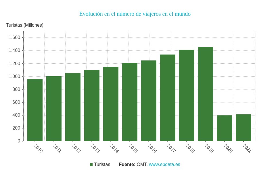
Today's tourism industry has a major challenge in managing the concentration of people visiting both open and closed spaces. This issue was already very important in 2019, when, according to the World Tourism Organisation, the number of travellers worldwide exceeded 1.4 billion. The aim was to minimise the negative impact of mass tourism on the environment, local communities and the tourist attractions themselves. But also, to ensure the quality of the experience for visitors who will prefer to schedule their visits in situations where the total occupancy of the area they intend to visit is lower.
The restrictions associated with the pandemic drastically reduced visitor numbers, which in 2020 and 2021 were less than a third of the number recorded in 2019, but made it much more important to manage visitor flows, even if this was for public health reasons.
We are now in an intermediate situation between restrictions that seem to be in their final phase and a steady growth in visitor numbers, making cities more sensitive than ever to use data-driven solutions to promote tourism and at the same time control visitor flows.
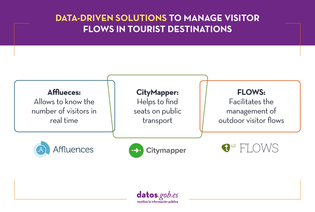
Know the number of visitors in real time with Afflueces
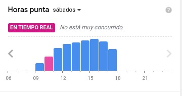
Among the occupancy management applications that help tourists avoid queues and crowds indoors is Affluences, a French-born solution that allows tourists to monitor the occupancy of museums, libraries, swimming pools and shops in real time.

The proposal of this solution consists of measuring the influx of visitors in closed spaces using people counting systems and then analysing and communicating it to the user, providing data such as waiting time and occupancy rate.
In some cases, Affluences installs sensors in the institutions or uses existing sensors to measure in real time the number of people present in the institution. In other cases, it uses the real-time occupancy data provided by the facilities as open data, as in the case of the swimming pools of the city of Strasbourg.
The data measured in real time are enriched with other sources of information such as attendance history, opening calendar, etc. and are processed by predictive analytics algorithms every 5 minutes. This approach makes it possible to provide the user with much more accurate information than can be obtained, for example, via Google Maps, based on the analysis of location data captured via mobile phones.
Find a seat on public transport with CityMapper
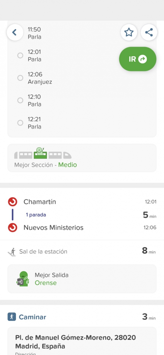
CityMapper is probably the best known urban mobility app in major European cities and one of the most popular worldwide. It was founded in London, but is already present in 71 European cities in 31 countries and aggregates 368 different modes of transport. Among these cities are of course Madrid and Barcelona, but also a number of large cities in Spain such as Valencia, Seville, Zaragoza or Malaga.
CityMapper allows you to calculate multimodal routes by combining a large number of modes of transport: metros and buses together with bicycles, scooters and even mopeds where available. If we choose, for example, the bicycle as a means of transport, the application provides the user with granular data such as how many bicycles are available at the pick-up point and how many empty parking spaces are available at the destination.
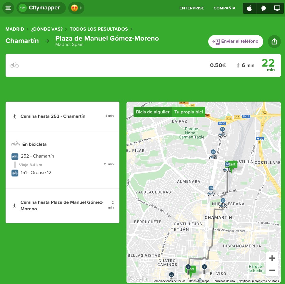
But the differentiating factor of CityMapper and probably the one that has had the greatest influence on its great success of adoption is the clever way in which it uses a combination of open and private data and artificial intelligence to provide users with highly accurate estimates of waiting times, journey times and even traffic disruptions.
For example, CityMapper is even able to provide information about the occupancy of some of the modes of transport it suggests on routes so that the user can for example choose the least congested carriage on the train they are waiting for. The application even suggests where the user should be positioned to optimise the journey by specifying which entrances and exits to use.
Outdoor visitor flows with FLOWS
The management of outdoor visitor flows introduces new elements of difficulty both in measuring occupancy and in establishing stable predictive models that are useful for visitors and for those responsible for planning security measures. This requires new data sources and special attention to the privacy of the users whose data is analysed.
FLOWS is a project that is working to help cities and tourism establishments prepare for peak tourism periods and redirect visitors to less congested areas. To achieve this ambitious goal, it combines anonymised data from various sources such as traffic control sensors, data from open Wi-Fi networks, data from mobile phone operators, data from tourist records or itinerary and reservation management systems, water and energy consumption data, waste collection or social media posts.
Through a simple user interface it will allow advanced analysis and forecasting of tourist movements showing traffic flows, traffic congestion, seasonal deviations, entries/exits to the destination, movement within the destination, etc. It will be possible to display the analyses in the selected time interval and make predictions based on historical data considering seasonal factors.

These are just a few examples of the many initiatives that are working to address a major challenge facing tourism during the green and digital transition - the management of traffic flows in both indoor and outdoor spaces. The coming years will undoubtedly see breakthroughs that will change the way we experience tourism and make the experience more enjoyable while minimising the impact we have on the environment and local communities.
Content prepared by Jose Luis Marín, Senior Consultant in Data, Strategy, Innovation & Digitalization.
The contents and points of view reflected in this publication are the sole responsibility of its author.
Documentación
1. Introduction
Visualizations are graphical representations of data that allow to transmit in a simple and effective way the information linked to them. The visualization potential is very wide, from basic representations, such as a graph of lines, bars or sectors, to visualizations configured on control panels or interactive dashboards. Visualizations play a fundamental role in drawing conclusions from visual information, also allowing to detect patterns, trends, anomalous data, or project predictions, among many other functions.
Before proceeding to build an effective visualization, we need to perform a previous treatment of the data, paying special attention to obtaining them and validating their content, ensuring that they are in the appropriate and consistent format for processing and do not contain errors. A preliminary treatment of the data is essential to perform any task related to the analysis of data and of performing an effective visualization.
In the \"Visualizations step-by-step\" section, we are periodically presenting practical exercises on open data visualization that are available in the datos.gob.es catalog or other similar catalogs. There we approach and describe in a simple way the necessary steps to obtain the data, perform the transformations and analyzes that are pertinent to, finally, we create interactive visualizations, from which we can extract information that is finally summarized in final conclusions.
In this practical exercise, we have carried out a simple code development that is conveniently documented by relying on tools for free use. All generated material is available for reuse in the GitHub Data Lab repository.
Access the data lab repository on Github.
Run the data pre-processing code on Google Colab.
2. Objetives
The main objective of this post is to learn how to make an interactive visualization based on open data. For this practical exercise we have chosen datasets that contain relevant information about the students of the Spanish university over the last few years. From these data we will observe the characteristics presented by the students of the Spanish university and which are the most demanded studies.
3. Resources
3.1. Datasets
For this practical case, data sets published by the Ministry of Universities have been selected, which collects time series of data with different disaggregations that facilitate the analysis of the characteristics presented by the students of the Spanish university. These data are available in the datos.gob.es catalogue and in the Ministry of Universities' own data catalogue. The specific datasets we will use are:
- Enrolled by type of university modality, area of nationality and field of science, and enrolled by type and modality of university, gender, age group and field of science for PHD students by autonomous community from the academic year 2015-2016 to 2020-2021.
- Enrolled by type of university modality, area of nationality and field of science, and enrolled by type and modality of the university, gender, age group and field of science for master's students by autonomous community from the academic year 2015-2016 to 2020-2021.
- Enrolled by type of university modality, area of nationality and field of science and enrolled by type and modality of the university, gender, age group and field of study for bachelor´s students by autonomous community from the academic year 2015-2016 to 2020-2021.
- Enrolments for each of the degrees taught by Spanish universities that is published in the Statistics section of the official website of the Ministry of Universities. The content of this dataset covers from the academic year 2015-2016 to 2020-2021, although for the latter course the data with provisional.
3.2. Tools
To carry out the pre-processing of the data, the R programming language has been used from the Google Colab cloud service, which allows the execution of Notebooks de Jupyter.
Google Colaboratory also called Google Colab, is a free cloud service from Google Research that allows you to program, execute and share code written in Python or R from your browser, so it does not require the installation of any tool or configuration.
For the creation of the interactive visualization the Datawrapper tool has been used.
Datawrapper is an online tool that allows you to make graphs, maps or tables that can be embedded online or exported as PNG, PDF or SVG. This tool is very simple to use and allows multiple customization options.
If you want to know more about tools that can help you in the treatment and visualization of data, you can use the report \"Data processing and visualization tools\".
4. Data pre-processing
As the first step of the process, it is necessary to perform an exploratory data analysis (EDA) in order to properly interpret the initial data, detect anomalies, missing data or errors that could affect the quality of subsequent processes and results, in addition to performing the tasks of transformation and preparation of the necessary variables. Pre-processing of data is essential to ensure that analyses or visualizations subsequently created from it are reliable and consistent. If you want to know more about this process you can use the Practical Guide to Introduction to Exploratory Data Analysis.
The steps followed in this pre-processing phase are as follows:
- Installation and loading the libraries
- Loading source data files
- Creating work tables
- Renaming some variables
- Grouping several variables into a single one with different factors
- Variables transformation
- Detection and processing of missing data (NAs)
- Creating new calculated variables
- Summary of transformed tables
- Preparing data for visual representation
- Storing files with pre-processed data tables
You'll be able to reproduce this analysis, as the source code is available in this GitHub repository. The way to provide the code is through a document made on a Jupyter Notebook that once loaded into the development environment can be executed or modified easily. Due to the informative nature of this post and in order to facilitate learning of non-specialized readers, the code does not intend to be the most efficient, but rather make it easy to understand, therefore it is likely to come up with many ways to optimize the proposed code to achieve a similar purpose. We encourage you to do so!
You can follow the steps and run the source code on this notebook in Google Colab.
5. Data visualizations
Once the data is pre-processed, we proceed with the visualization. To create this interactive visualization we use the Datawrapper tool in its free version. It is a very simple tool with special application in data journalism that we encourage you to use. Being an online tool, it is not necessary to have software installed to interact or generate any visualization, but it is necessary that the data table that we provide is properly structured.
To address the process of designing the set of visual representations of the data, the first step is to consider the queries we intent to resolve. We propose the following:
- How is the number of men and women being distributed among bachelor´s, master's and PHD students over the last few years?
If we focus on the last academic year 2020-2021:
- What are the most demanded fields of science in Spanish universities? What about degrees?
- Which universities have the highest number of enrolments and where are they located?
- In what age ranges are bachelor´s university students?
- What is the nationality of bachelor´s students from Spanish universities?
Let's find out by looking at the data!
5.1. Distribution of enrolments in Spanish universities from the 2015-2016 academic year to 2020-2021, disaggregated by gender and academic level
We created this visual representation taking into account the bachelor, master and PHD enrolments. Once we have uploaded the data table to Datawrapper (dataset \"Matriculaciones_NivelAcademico\"), we have selected the type of graph to be made, in this case a stacked bar diagram to be able to reflect by each course and gender, the people enrolled in each academic level. In this way we can also see the total number of students enrolled per course. Next, we have selected the type of variable to represent (Enrolments) and the disaggregation variables (Gender and Course). Once the graph is obtained, we can modify the appearance in a very simple way, modifying the colors, the description and the information that each axis shows, among other characteristics.
To answer the following questions, we will focus on bachelor´s students and the 2020-2021 academic year, however, the following visual representations can be replicated for master's and PHD students, and for the different courses.
5.2. Map of georeferenced Spanish universities, showing the number of students enrolled in each of them
To create the map, we have used a list of georeferenced Spanish universities published by the Open Data Portal of Esri Spain. Once the data of the different geographical areas have been downloaded in GeoJSON format, we transform them into Excel, in order to combine the datasets of the georeferenced universities and the dataset that presents the number of enrolled by each university that we have previously pre-processed. For this we have used the Excel VLOOKUP() function that will allow us to locate certain elements in a range of cells in a table
Before uploading the dataset to Datawrapper, we need to select the layer that shows the map of Spain divided into provinces provided by the tool itself. Specifically, we have selected the option \"Spain>>Provinces(2018)\". Then we proceed to incorporate the dataset \"Universities\", previously generated, (this dataset is attached in the GitHub datasets folder for this step-by-step visualization), indicating which columns contain the values of the variables Latitude and Longitude.
From this point, Datawrapper has generated a map showing the locations of each of the universities. Now we can modify the map according to our preferences and settings. In this case, we will set the size and the color of the dots dependent from the number of registrations presented by each university. In addition, for this data to be displayed, in the \"Annotate\" tab, in the \"Tooltips\" section, we have to indicate the variables or text that we want to appear.
5.3. Ranking of enrolments by degree
For this graphic representation, we use the Datawrapper table visual object (Table) and the \"Titulaciones_totales\" dataset to show the number of registrations presented by each of the degrees available during the 2020-2021 academic year. Since the number of degrees is very extensive, the tool offers us the possibility of including a search engine that allows us to filter the results.
5.4. Distribution of enrolments by field of science
For this visual representation, we have used the \"Matriculaciones_Rama_Grado\" dataset and selected sector graphs (Pie Chart), where we have represented the number of enrolments according to sex in each of the field of science in which the degrees in the universities are divided (Social and Legal Sciences, Health Sciences, Arts and Humanities, Engineering and Architecture and Sciences). Just like in the rest of the graphics, we can modify the color of the graph, in this case depending on the branch of teaching.
5.5. Matriculaciones de Grado por edad y nacionalidad
For the realization of these two representations of visual data we use bar charts (Bar Chart), where we show the distribution of enrolments in the first, disaggregated by gender and nationality, we will use the data set \"Matriculaciones_Grado_nacionalidad\" and in the second, disaggregated by gender and age, using the data set \"Matriculaciones_Grado_edad \". Like the previous visuals, the tool easily facilitates the modification of the characteristics presented by the graphics.
6. Conclusions
Data visualization is one of the most powerful mechanisms for exploiting and analyzing the implicit meaning of data, regardless of the type of data and the degree of technological knowledge of the user. Visualizations allow us to extract meaning out of the data and create narratives based on graphical representation. In the set of graphical representations of data that we have just implemented, the following can be observed:
- The number of enrolments increases throughout the academic years regardless of the academic level (bachelor´s, master's or PHD).
- The number of women enrolled is higher than the men in bachelor's and master's degrees, however it is lower in the case of PHD enrollments, except in the 2019-2020 academic year.
- The highest concentration of universities is found in the Community of Madrid, followed by the autonomous community of Catalonia.
- The university that concentrates the highest number of enrollments during the 2020-2021 academic year is the UNED (National University of Distance Education) with 146,208 enrollments, followed by the Complutense University of Madrid with 57,308 registrations and the University of Seville with 52,156.
- The most demanded degree in the 2020-2021 academic year is the Degree in Law with 82,552 students nationwide, followed by the Degree in Psychology with 75,738 students and with hardly any difference, the Degree in Business Administration and Management with 74,284 students.
- The branch of education with the highest concentration of students is Social and Legal Sciences, while the least demanded is the branch of Sciences.
- The nationalities that have the most representation in the Spanish university are from the region of the European Union, followed by the countries of Latin America and the Caribbean, at the expense of the Spanish one.
- The age range between 18 and 21 years is the most represented in the student body of Spanish universities.
We hope that this step-by-step visualization has been useful for learning some very common techniques in the treatment and representation of open data. We will return to show you new reuses. See you soon!
Blog
Spain was the second country in the world that received the most tourists during 2019, with 83.8 million visitors. That year, tourism activity represented 12.4% of GDP, employing more than 2.2 million people (12.7% of the total). It is therefore a fundamental sector for our economy.
These figures have been reduced due to the pandemic, but the sector is expected to recover in the coming months. Open data can help. Up-to-date information can bring benefits to all actors involved in this industry:
- Tourists: Open data helps tourists plan their trips, providing them with the information they need to choose where to stay or what activities to do. The up-to-date information that open data can provide is particularly important in times of COVID. There are several portals that collect information and visualisations of travel restrictions, such as the UN's Humanitarian Data Exchange. This website hosts a daily updated interactive map of travel restrictions by country and airline.
- Businesses. Businesses can generate various applications targeted at travellers, with useful information. In addition, by analysing the data, tourism establishments can detect untapped markets and destinations. They can also personalise their offers and even create recommendation systems that help to promote different activities, with a positive impact on the travellers' experience.
- Public administrations. More and more governments are implementing solutions to capture and analyse data from different sources in real time, in order to better understand the behaviour of their visitors. Examples include Segovia, Mallorca and Gran Canaria. Thanks to these tools, they will be able to define strategies and make informed decisions, for example, aimed at avoiding overcrowding. In this sense, tools such as Affluences allow them to report on the occupation of museums, swimming pools and shops in real time, and to obtain predictions for successive time slots.
The benefits of having quality tourism-related data are such that it is not surprising that the Spanish Government has chosen this sector as a priority when it comes to creating data spaces that allow voluntary data sharing between organisations. In this way, data from different sources can be cross-referenced, enriching the various use cases.
The data used in this field are very diverse: data on consumption, transport, cultural activities, economic trends or even weather forecasts. But in order to make good use of this highly dynamic data, it needs to be available to users in appropriate, up-to-date formats and access needs to be automated through application programming interfaces (APIs).
Many organisations already offer data through APIs. In this infographic you can see several examples linked to our country at national, regional and local level. But in addition to general data portals, we can also find APIs in open data platforms linked exclusively to the tourism sector. In the following infographic you can see several examples:
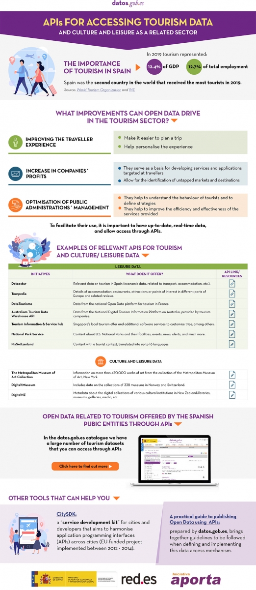
Click here to see the infographic in full size and in its accessible version.
Do you know more examples of APIs or other resources that facilitate access to tourism-related open data? Leave us a comment or write to datos.gob.es!
Content prepared by the datos.gob.es team.
Noticia
The end of winter is approaching and, with the change of season, comes the time to compile the main developments of the last three months.
Autumn ended with the approval of Royal Decree-Law 24/2021, which includes the transposition of the European Directive on open data and re-use of public sector information, and now we end the winter with another regulatory advance, this time at European level: the publication of the draft Regulation on the establishment of harmonised rules on access and fair use of data (Data Act), applicable to all economic sectors and which proposes new rules on who can use and access data generated in the EU and under what conditions.
These regulatory developments have been joined by many others in the area of openness and re-use of data. In this article we highlight some examples.
Public data and disruptive technologies
The relationship between open data and new technologies is increasingly evident through various projects that aim to generate improvements in society. Universities are a major player in this field, with innovative projects such as:
- The Universitat Oberta de Catalunya (UOC) has launched the project "Bots for interacting with open data - Conversational interfaces to facilitate access to public data". Its aim is to help citizens improve their decision-making through access to data, as well as to optimise the return on investment of open data projects.
- The UOC has also launched, together with the Universitat Politècnica de València (UPV) and the Universitat Politècnica de Catalunya (UPC), OptimalSharing@SmartCities, which optimises the use of car sharing in cities through intelligent algorithms capable of processing large amounts of data. They are currently working with data from the Open Data BCN initiative.
- Researchers from the University of Cantabria are participating in the SALTED project, aimed at reusing open data from IoT devices, the web and social networks. The aim is to transform them into "useful" information in fields such as urban management or agriculture.
Public bodies are also increasingly harnessing the potential of open data to implement solutions that optimise resources, boost efficiency and improve the citizen experience. Many of these projects are linked to smart cities.
- The Cordoba Provincial Council's 'Enlaza, Cordoba Smart Municipalities' project seeks to intelligently manage municipal electricity supplies. A proprietary software has been developed and different municipal facilities have been sensorised with the aim of obtaining data to facilitate decision-making. Among other issues, the province's infrastructures will be used to incorporate a platform that favours the use of open data.
- The eCitySevilla and eCityMálaga projects have brought together 90 public and private entities to promote a smart city model at the forefront of innovation and sustainability. Among other issues, they will integrate open data, renewable energies, sustainable transport, efficient buildings and digital infrastructures.
- One area where data-driven solutions have a major impact is in tourism. In this sense, the Segovia Provincial Council has created a digital platform to collect tourism data and adjust its proposals to the demands of visitors. The visualisation of updated data will be obtained in real time and will make it possible to learn more about the tourism behaviour of visitors.
- For its part, the Consell de Mallorca has set up a Sustainable Tourism Observatory that will provide permanently updated information to define strategies and make decisions based on real data.
To boost the use of data analytics in public bodies, the Andalusian Digital Agency has announced the development of a unit to boost Big Data. Its aim is to provide data analytics-related services to different Andalusian government agencies.
Other examples of open data re-use
Open data is also increasingly in demand by journalists for so-called data journalism. This is especially noticeable in election periods, such as the recent elections to the Castilla y León parliament. Re-users such as Maldita or EPData have taken advantage of the open data offered by the Junta to create informative pieces and interactive maps to bring information closer to the citizens.
Public bodies themselves also take advantage of visualisations to bring data to the public in a simple way. As an example, the map of the National Library of Spain with the Spanish authors who died in 1941, whose works become public domain in 2022 and, therefore, can be edited, reproduced or disseminated publicly.
Another example of the reuse of open data can be found in the Fallas of Valencia. In addition to the classic ninot, this festival also has immaterial fallas that combine tradition, technology and scientific dissemination. This year, one of them consists of an interactive game that uses open data from the city to pose various questions.
Open data platforms are constantly being upgraded
During this season we have also seen many public bodies launching new portals and tools to facilitate access to data, and thus its re-use. Likewise, catalogues have been constantly updated and the information offered has been expanded. The following are some examples:
- Sant Boi Town Council has recently launched its digital platform Open Data. It is a space that allows users to explore and download open data from the City Council easily, free of charge and without restrictions.
- As part of its Smart City project, Alcoi City Council has set up a website with open data on traffic and environmental indicators. Here you can consult data on air quality, sound pressure, temperature and humidity in different parts of the city.
- The Castellón Provincial Council has developed an intuitive and easy-to-use tool to facilitate and accompany citizens' requests for access to public information. It has also updated the information on infrastructures and equipment of the municipalities of Castellón on the provincial institution's data portal in geo-referenced formats, which facilitates its reuse.
- The Institute of Statistics and Cartography of Andalusia (IECA) has updated the data tables offered through its BADEA databank. Users can now sort and filter all the information with a single click. In addition, a new section has been created on the website aimed at reusers of statistical information. Its aim is to make the data more accessible and interoperable.
- IDECanarias has published an orthophoto of La Palma after the volcanic eruption. It can be viewed through the GRAFCAN viewer. It should be noted that open data has been of great importance in analysing the damage caused by the lava on the island.
- GRAFCAN has also updated the Territorial Information System of the Canary Islands (SITCAN), incorporating 25 new points of interest. This update facilitates the location of 36,753 points of interest in the archipelago through the portal of the Spatial Data Infrastructure of the Canary Islands (IDECanarias).
- Barcelona Provincial Council offers a new service for downloading open geographic data, with free and open access, through the IDEBarcelona geoportal. This service was presented through a session (in Catalan), which was recorded and is available on Youtube.
- The municipal GIS of the City Council of Cáceres has made available to citizens the free download of the updated cartography of the city of Extremadura in different formats such as DGN, DWG, SHP or KMZ.
New reports, guides, courses and challenges
These three months have also seen the publication and launch of resources and activities aimed at promoting open data:
- The Junta de Castilla y León has published the guide "Smart governance: the challenge of public service management in local government", which includes tools and use cases to boost efficiency and effectiveness through participation and open data.
- The Spanish National Research Council (CSIC) has updated the ranking of open access portals and repositories worldwide in support of Open Science initiatives. This ranking is based on the number of papers indexed in the Google Scholar database.
- The commitment of local councils to open data is also evident in the implementation of training initiatives and internal promotion of open data. In this sense, L'Hospitalet City Council has launched two new internal tools to promote the use and dissemination of data by municipal employees: a data visualisation guide and another on graphic guidelines and data visualisation style.
- Along the same lines, the Spanish Federation of Municipalities and Provinces (FEMP) has launched the Course on Open Data Treatment and Management in Local Entities, which will be held at the end of March (specifically on 22, 24, 29 and 31 March 2022). The course is aimed at technicians without basic knowledge of Local Entities.
Multiple competitions have also been launched, which aim to boost the use of data, especially at university level, for example The Generalitat Valenciana with POLIS, a project in which students from three secondary schools will learn the importance of understanding and analysing public policies using open data available in public bodies.
In addition, the registration period for the IV Aporta Challenge, focused on the field of Health and Wellbeing, ended this winter. Among the proposals received we find predictive models that allow us to know the evolution of diseases or algorithms that cross-reference data and determine healthy habits.
Other news of interest in Europe
In addition to the publication of the Data Act, we have also seen other developments in Europe:
- JoinUp has published the latest version of the metadata application profile specification for open data portals in Europe, DCAT-AP 2.1.
- In line with the European Data Strategy, the European Commission has published a working document with its overview of common European data spaces.
- The Publications Office of the European Union has launched the sixth edition of the EU Datathon. In this competition, participants have to use open data to address one of four proposed challenges.
- The EU Science Hub has published a report presenting examples of use cases linked to data sharing. They explore emerging technologies and tools for data-driven innovation.
These are just some examples of the latest developments in the open data ecosystem in Spain and Europe. If you want to share a project or news with us, leave us a comment or write to dinamizacion@datos.gob.es.
Noticia
The deadline for receiving applications to participate in the IV Aporta Challenge closed on 15 February. In total, 38 valid proposals were received in due time and form, all of high quality, whose aim is to promote improvements in the health and well-being of citizens through the reuse of data offered by public administrations for their reuse.
Disruptive technologies, key to extracting maximum value from data
According to the competition rules, in this first phase, participants had to present ideas that identified new opportunities to capture, analyse and use data intelligence in the development of solutions of all kinds: studies, mobile applications, services or websites.
All the ideas seek to address various challenges related to health and wellbeing, many of which have a direct impact on our healthcare system, such as improving the efficiency of services, optimising resources or boosting transparency. Some of the areas addressed by participants include pressure on the health system, diagnosis of diseases, mental health, healthy lifestyles, air quality and the impact of climate change.
Many of the participants have chosen to use disruptive technologies to address these challenges. Among the proposals, we find solutions that harness the power of algorithms to cross-reference data and determine healthy habits or predictive models that allow us to know the evolution of diseases or the situation of the health system. Some even use gamification techniques. There are also a large number of solutions aimed at bringing useful information to citizens, through maps or visualisations.
Likewise, the specific groups at which the solutions are aimed are diverse: we find tools aimed at improving the quality of life of people with disabilities, the elderly, children, individuals who live alone or who need home care, etc.
Proposals from all over Spain and with a greater presence of women
Teams and individuals from all over Spain have been encouraged to participate in the Challenge. We have representatives from 13 Autonomous Communities: Madrid, Catalonia, the Basque Country, Andalusia, Valencia, the Canary Islands, Galicia, Aragon, Extremadura, Castile and Leon, Castile-La Mancha, La Rioja and Asturias.
25% of the proposals were submitted by individuals and 75% by multidisciplinary teams made up of various members. The same distribution is found between individuals (75%) and legal entities (25%). In the latter category, we find teams from universities, organisations linked to the Public Administration and different companies.
It is worth noting that in this edition the number of women participants has increased, demonstrating the progress of our society in the field of equality. Two editions ago, 38% of the proposals were submitted by women or by teams with women members. Now that number has risen to 47.5%. While this is a significant improvement, there is still work to be done in promoting STEM subjects among women and girls in our country.
Jury deliberation begins
Once the proposals have been accepted, it is time for the jury's assessment, made up of experts in the field of innovation, data and health. The assessment will be based on a series of criteria detailed in the rules, such as the overall quality and clarity of the proposed idea, the data sources used or the expected impact of the proposed idea on improving the health and well-being of citizens.
The 10 proposals with the best evaluation will move on to phase II, and will have a minimum of two months to develop the prototype resulting from their idea. The proposals will be presented to the same jury, which will score each project individually. The three prototypes with the highest scores will be the winners and will receive a prize of 5,000, 4,000 and 3,000 euros, respectively.
Good luck to all participants!