Blog
The demand for professionals with skills related to data analytics continues to grow and it is already estimated that just the industry in Spain would need more than 90,000 data and artificial intelligence professionals to boost the economy. Training professionals who can fill this gap is a major challenge. Even large technology companies such as Google, Amazon or Microsoft are proposing specialised training programmes in parallel to those proposed by the formal education system. And in this context, open data plays a very relevant role in the practical training of these professionals, as open data is often the only possibility to carry out real exercises and not just simulated ones.
Moreover, although there is not yet a solid body of research on the subject, some studies already suggest positive effects derived from the use of open data as a tool in the teaching-learning process of any subject, not only those related to data analytics. Some European countries have already recognised this potential and have developed pilot projects to determine how best to introduce open data into the school curriculum.
In this sense, open data can be used as a tool for education and training in several ways. For example, open data can be used to develop new teaching and learning materials, to create real-world data-based projects for students or to support research on effective pedagogical approaches. In addition, open data can be used to create opportunities for collaboration between educators, students and researchers to share best practices and collaborate on solutions to common challenges.
Projects based on real-world data
A key contribution of open data is its authenticity, as it is a representation of the enormous complexity and even flaws of the real world as opposed to artificial constructs or textbook examples that are based on much simpler assumptions.
An interesting example in this regard is documented by Simon Fraser University in Canada in their Masters in Publishing where most of their students come from non-STEM university programmes and therefore had limited data handling skills. The project is available as an open educational resource on the OER Commons platform and aims to help students understand that metrics and measurement are important strategic tools for understanding the world around us.
By working with real-world data, students can develop story-building and research skills, and can apply analytical and collaborative skills in using data to solve real-world problems. The case study conducted with the first edition of this open data-based OER is documented in the book "Open Data as Open Educational Resources - Case studies of emerging practice". It shows that the opportunity to work with data pertaining to their field of study was essential to keep students engaged in the project. However, it was dealing with the messiness of 'real world' data that allowed them to gain valuable learning and new practical skills.
Development of new learning materials
Open datasets have a great potential to be used in the development of open educational resources (OER), which are free digital teaching, learning and research materials, as they are published under an open licence (Creative Commons) that allows their use, adaptation and redistribution for non-commercial uses according to UNESCO's definition.
In this context, although open data are not always OER, we can say that they become OER when are used in pedagogical contexts. Open data used as an educational resource facilitates students to learn and experiment by working with the same datasets used by researchers, governments and civil society. It is a key component for students to develop analytical, statistical, scientific and critical thinking skills.
It is difficult to estimate the current presence of open data as part of OER but it is not difficult to find interesting examples within the main open educational resource platforms. On the Procomún platform we can find interesting examples such as Learning Geography through the evolution of agrarian landscapes in Spain, which builds a Webmap for learning about agrarian landscapes in Spain on the ArcGIS Online platform of the Complutense University of Madrid. The educational resource uses specific examples from different autonomous communities using photographs or geolocated still images and its own data integrated with open data. In this way, students work on the concepts not through a mere text description but with interactive resources that also favour the improvement of their digital and spatial competences.
On the OER Commons platform, for example, we find the resource "From open data to civic engagement", which is aimed at audiences from secondary school upwards, with the objective of teaching them to interpret how public money is spent in a given regional, local area or neighbourhood. It is based on the well-known projects to analyse public budgets "Where do my taxes go?", available in many parts of the world as a result of the transparency policies of public authorities. This resource could be easily ported to Spain, as there are numerous "Where do my taxes go?" projects, such as the one maintained by Fundación Civio.
Data-related skills
When we refer to training and education in data-related skills, we are actually referring to a very broad area that is also very difficult to master in all its facets. In fact, it is common for data-related projects to be tackled in teams where each member has a specialised role in one of these areas. For example, it is common to distinguish at least data cleaning and preparation, data modelling and data visualisation as the main activities performed in a data science and artificial intelligence project.
In all cases, the use of open data is widely adopted as a central resource in the projects proposed for the acquisition of any of these skills. The well-known data science community Kaggle organises competitions based on open datasets contributed to the community and which are an essential resource for real project-based learning for those who want to acquire data-related skills. There are other subscription-based proposals such as Dataquest or ProjectPro but in all cases they use real datasets from multiple general open data repositories or knowledge area specific repositories.
Open data, as in other areas, has not yet developed its full potential as a tool for education and training. However, as can be seen in the programme of the latest edition of the OER Conference 2022, there are an increasing number of examples of open data playing a central role in teaching, new educational practices and the creation of new educational resources for all kinds of subjects, concepts and skills
Content written by Jose Luis Marín, Senior Consultant in Data, Strategy, Innovation & Digitalization.
The contents and views reflected in this publication are the sole responsibility of the author.
Noticia
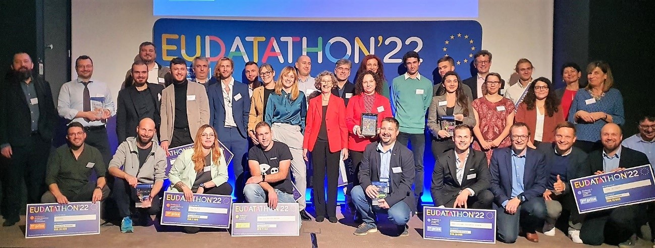
On 20 October, the EU's open data competition came to an end after several months of competition. The final of this sixth edition of the EU Datathon was held in Brussels in the framework of the European Year of Youth and was streamed worldwide.
It is a competition that gives open data enthusiasts and application developers from around the world the opportunity to demonstrate the potential of open data, while their innovative ideas gain international visibility and compete for a portion of the total prize money of €200,000.
The finalist teams were pre-selected from a total of 156 initial submissions. They came from 38 different countries, the largest participation in the history of the competition, to compete in four different categories related to the challenges facing Europe today.
Before the final, the selected participants had the opportunity to present in video format each of the proposals they have been developing based on the open data from the European catalogues.
Here is a breakdown of the winning teams in each challenge, the content of the proposal and the amount of the prize.
Winners of the “European Green Deal” Challenge
The European Green Deal is the blueprint for a modern, sustainable and competitive European economy. Participants who took up the challenge had to develop applications or services aimed at creating a green Europe, capable of driving resource efficiency.
1st prize: CROZ RenEUwable (Croatia)
The application developed by this Croatian team, "renEUwable", combines the analysis of environmental, social and economic data to provide specific and personal recommendations on sustainable energy use.
- Prize: €25,000
2nd prize: MyBioEUBuddy (France, Montenegro)
This project was created to help farm workers and local governments find regions that grow organic produce and can serve as an example to build a more sustainable agricultural network.
- Prize: €15,000
3rd prize: Green Land Dashboard for Cities (Italy)
The bronze in this category went to an Italian project that aims to analyse and visualise the evolution of green spaces in order to help cities, regional governments and non-governmental organisations to make them more liveable and sustainable.
- Prize: €7,000
"Winners of the “Transparency in Public Procurement” Challenge
Transparency in public procurement helps to track how money is spent, combat fraud and analyse economic and market trends. Participants who chose this challenge had to explore the information available to develop an application to improve transparency.
1st prize: Free Software Foundation Europe e.V (Germany)
This team of developers aims to make the links between the private sector, public administrations, users and tenders accessible.
- Prize: €25,000
2nd prize: The AI-Team (Germany)
This is a project that proposes to visualise data from TED, the European public procurement journal, in a graphical database and combine them with ownership information and a list of sanctioned entities. This will allow public officials and competitors to trace the amounts and values of contracts awarded back to the owners of the companies.
- Prize: €15,000
3rd prize: EMMA (France)
This fraud prevention and early detection tool allows public institutions, journalists and civil society to automatically monitor how the relationship between companies and administration is established at the beginning of a public procurement process.
- Prize: €7,000
Winners of the “Public Procurement Opportunities for Young People” Challenge
Public procurement is often perceived as a complex field, where only specialists feel comfortable finding the information they need. Thus, the developers who participated in this challenge had to design, for example, apps aimed at helping young people find the information they need to apply for public procurement positions.
1st prize: Hermix (Belgium, Romania)
It is a tool that develops a strategic marketing methodology aimed at the B2G (business to government) sector so that it is possible to automate the creation and monitoring of strategies for this sector.
- Prize: €25,000
2nd prize: YouthPOP (France)
YouthPOP is a tool designed to democratise employment and public procurement opportunities to bring them closer to young workers and entrepreneurs. It does this by combining historical data with machine learning technology.
- Prize: €15,000
3rd prize: HasPopEU (Romania)
This proposal takes advantage of open EU public procurement data and machine learning techniques to improve the communication of the skills required to access this type of job vacancies. The application focuses on young people, immigrants and SMEs.
- Prize: €7,000
Winners of the “A Europe Fit for the Digital Age” Challenge
The EU aims for a digital transformation that works for people and businesses. Therefore, participants in this challenge developed applications and services aimed at improving data skills, connectivity or data dissemination, always based on the European Data Strategy.
1st prize:: Lobium/Gavagai (Netherlands, Sweden, United Kingdom)
This application, developed using natural language processing techniques, was created with the aim of facilitating the work of investigative journalists, promoting transparency and rapid access to certain information.
- Prize: €25,000
2nd prize: 100 Europeans (France)
It is an interactive app that uses open data to raise awareness of the great challenges of our time. In this way, and aware of how difficult it is to communicate the impact that these challenges have on society, '100 Europeans' changes the way of conveying the message and personalises the effects of climate change, pollution or overweight in a total of one hundred people. The aim of this project is to make society more aware of these challenges by telling them through the stories of people close to them.
- Prize: €15,000
3rd prize: UNIOR NLP (Italy)
Leveraging European natural language processing techniques and data collection, the Computational Linguistics and Automatic Natural Language Processing research group at the University of Naples L'Orientale has developed a personal assistant called Maggie that guides users to explore cultural content across Europe, answering their questions and offering personalised suggestions.
- Prize: €7,000
Finally, the Audience Award of this 2022 edition also went to CROZ RenEUwable, the same team that won the first prize in the challenge dedicated to fostering commitment to the European Green Pact.
As in previous editions, the EU Datathon is a competition organised by the Publications Office of the European Union in collaboration with the European Data Strategy. Thus, the recently closed 2022 edition has managed to activate the support of some twenty partners representing open data stakeholders inside and outside the European institutions.
Noticia
The IV edition of the Aporta Challenge, whose motto has revolved around 'The value of data for health and well-being of citizens', has already announced its three winners. The competition, promoted by Red.es in collaboration with the Secretary of State for Digitalisation and Artificial Intelligence, launched in November 2021 with an ideas competition and continued earlier this summer with a selection of ten finalist proposals.
As in the three previous editions, the selected candidates had a three month period to transform their ideas into a prototype, which they presented in person at the final gala.
In a post-pandemic context, where health plays an increasingly important role, the theme of the competition sought to identify, recognise and reward ideas aimed at improving the efficiency of this sector with solutions based on the use of open data.
On 18 October, the ten finalists came to the Red.es headquarters to present their proposals to a jury made up of representatives from public administrations, organisations linked to the digital economy, universities and data communities. In just twelve minutes, they had to summarise the purpose of the proposed project or service, explain how the development process had been carried out, what data they had used, and dwell on aspects such as the economic viability or traceability of the project or service.
Ten innovative projects to improve the health sector
The ten proposals presented to the jury showed a high level of innovation, creativity, rigour and public vocation. They were also able to demonstrate that it is possible to improve the quality of life of citizens by creating initiatives that monitor air quality, build solutions to climate change or provide a quicker response to a sudden health problem, among other examples.
For all these reasons, it is not surprising that the jury had a difficult time choosing the three winners of this fourth edition. In the end, HelpVoice initiative won the first prize of €5,000, the Hospital Morbidity Survey won the €4,000 linked to second place and RIAN, the Intelligent Activity and Nutrition Recommender, closed the ranking with third place and €3,000 as an award.
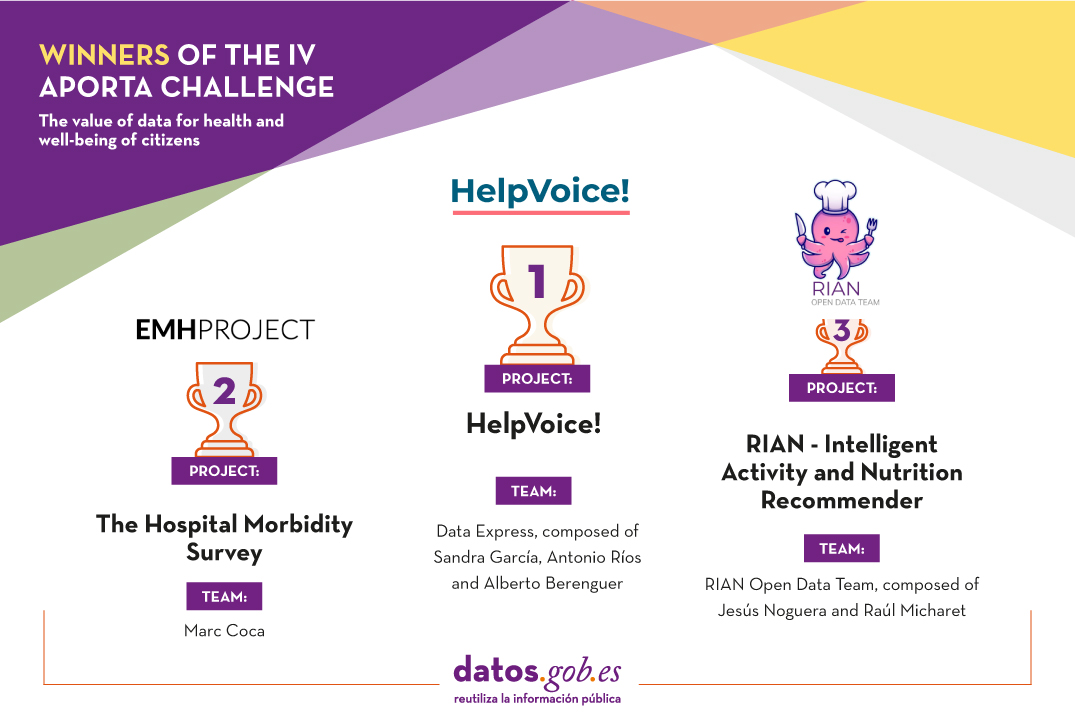
First prize: HelpVoice!
- Team: Data Express, composed of Sandra García, Antonio Ríos and Alberto Berenguer.
HelpVoice! is a service that helps our elderly through voice recognition techniques based on automatic learning. Thus, in an emergency situation, the user only need to click on a device that can be an emergency button, a mobile phone or home automation tools and tell about their symptoms. The system will send a report with the transcript and predictions to the nearest hospital, speeding up the response of the healthcare workers.
In parallel, HelpVoice! will also recommend to the patient what to do while waiting for the emergency services. Regarding the use of data, the Data Express team has used open information such as the map of hospitals in Spain and uses speech and sentiment recognition data in text.
Second prize: The Hospital Morbidity Survey
- Team: Marc Coca Moreno
This is a web environment based on MERN, Python and Pentaho tools for the analysis and interactive visualisation of the Hospital Morbidity Survey microdata. The entire project has been developed with open source and free tools and both the code and the final product will be openly accessible.
To be precise, it offers 3 main analyses with the aim of improving health planning:
- Descriptive: hospital discharge counts and time series.
- KPIs: standardised rates and indicators for comparison and benchmarking of provinces and communities.
- Flows: count and analysis of discharges from a hospital region and patient origin.
All data can be filtered according to the variables of the dataset (age, sex, diagnoses, circumstance of admission and discharge, etc.).
In this case, in addition to the microdata from the INE Hospital Morbidity Survey, statistics from the Continuous Register (also from the INE), data from the ICD10 diagnosis catalogues of the Ministry of Health and from the catalogues and indicators of the Agency for Healthcare Research and Quality (AHRQ) and of the Autonomous Communities, such as Catalonia: catalogues and stratification tools, have also been integrated.
You can see the result of this work here.
Third prize: RIAN - Intelligent Activity and Nutrition Recommender
- Team: RIAN Open Data Team, composed of Jesús Noguera y Raúl Micharet..
This project was created to promote healthy habits and combat overweight, obesity, sedentary lifestyles and poor nutrition among children and adolescents. It is an application designed for mobile devices that uses gamification techniques, as well as augmented reality and artificial intelligence algorithms to make recommendations.
Users have to solve personalised challenges, individually or collectively, linked to nutritional aspects and physical activities, such as gymkhanas or games in public green spaces.
In relation to the use of open data, the pilot uses data related to green areas, points of interest, greenways, activities and events belonging to the cities of Malaga, Madrid, Zaragoza and Barcelona. In addition, these data are combined with nutritional recommendations (food data and nutritional values and branded food products) and data for food recognition by images from Tensorflow or Kaggle, among others.
Alberto Martínez Lacambra, Director General of Red.es presents the awards and announces a new edition
The three winners were announced by Alberto Martínez Lacambra, Director General of Red.es, at a ceremony held at Red.es headquarters on 27 October. The event was attended by several members of the jury, who were able to talk to the three winning teams.

Martínez Lacambra also announced that Red.es is already working to shape the V Aporta Challenge, which will focus on the value of data for the improvement of the common good, justice, equality and equity.
Once again this year, the Aporta Initiative would like to congratulate the three winners, as well as to thank the work and talent of all the participants who decided to invest their time and knowledge in thinking and developing proposals for the fourth edition of the Aporta Challenge.
Blog
On 24 February Europe entered a scenario that not even the data could have predicted: Russia invaded Ukraine, unleashing the first war on European soil so far in the 21st century.
Almost five months later, on 26 September, the United Nations (UN) published its official figures: 4,889 dead and 6,263 wounded. According to the official UN data, month after month, the reality of the Ukrainian victims was as follows:
| Date | Deceased | Injured |
|---|---|---|
| 24-28 February | 336 | 461 |
| March | 3028 | 2384 |
| April | 660 | 1253 |
| May | 453 | 1012 |
| Jun | 361 | 1029 |
| 1-3 july | 51 | 124 |
According to data extracted by the mission that the UN High Commissioner for Human Rights has been carrying out in Ukraine since Russia invaded Crimea in 2014, the total number of civilians displaced as a result of the conflict is more than 7 million people.
However, as in other areas, the data serve not only to develop solutions, but also to gain an in-depth understanding of aspects of reality that would otherwise not be possible. In the case of the war in Ukraine, the collection, monitoring and analysis of data on the territory allows organisations such as the United Nations to draw their own conclusions.
With the aim of making visible how data can be used to achieve peace, we will now analyse the role of data in relation to the following tasks:
Prediction
In this area, data are used to try to anticipate situations and plan an appropriate response to the anticipated risk. Whereas before the outbreak of war, data was used to assess the risk of future conflict, it is now being used to establish control and anticipate escalation.
For example, satellite images provided by applications such as Google Maps have made it possible to monitor the advance of Russian troops. Similarly, visualisers such as Subnational Surge Tracker identify peaks of violence at different administrative levels: states, provinces or municipalities.
Information
It is just as important to know the facts in order to prevent violence as it is to use them to limit misinformation and communicate the facts objectively, truthfully and in line with official figures. To achieve this, fact-checking applications have begun to be used, capable of responding to fake news with official data.
Among them is Newsguard, a verification entity that has developed a tracker that gathers all the websites that share disinformation about the conflict, placing special emphasis on the most popular false narratives circulating on the web. It even catalogues this type of content according to the language in which it is promoted.
Material damage
The data can also be used to locate material damage and track the occurrence of new damage. Over the past months, the Russian offensive has damaged the Ukrainian public infrastructure network, rendering roads, bridges, water and electricity supplies, and even hospitals unusable.
Data on this reality is very useful for organising a response aimed at reconstructing these areas and sending humanitarian assistance to civilians who have been left without services.
In this sense, we highlight the following use cases:
- The United Nations Development Programme''s (UNDP) machine learning algorithm has been developed and improved to identify and classify war-damaged infrastructure.
- In parallel, the HALO Trust uses social media mining capable of capturing information from social media, satellite imagery and even geographic data to help identify areas with ''explosive remnants''. Thanks to this finding, organisations deployed across the Ukrainian terrain can move more safely to organise a coordinated humanitarian response.
- The light information captured by NASA satellites is also being used to build a database to help identify areas of active conflict in Ukraine. As in the previous examples, this data can be used to track and send aid to where it is most needed.
Human rights violations and abuses
Unfortunately, in such conflicts, violations of the human rights of the civilian population are the order of the day. In fact, according to experience on the ground and information gathered by the UN High Commissioner for Human Rights, such violations have been documented throughout the entire period of war in Ukraine.
In order to understand what is happening to Ukrainian civilians, monitoring and human rights officers collect data, public information and first-person accounts of the war in Ukraine. From this, they develop a mosaic map that facilitates decision-making and the search for just solutions for the population.
Another very interesting work developed with open data is carried out by Conflict Observatory. Thanks to the collaboration of analysts and developers, and the use of geospatial information and artificial intelligence, it has been possible to discover and map war crimes that might otherwise remain invisible.
Migratory movements
Since the outbreak of war last February, more than 7 million Ukrainians have fled the war and thus their own country. As in previous cases, data on migration flows can be used to bolster humanitarian efforts for refugees and IDPs.
Some of the initiatives where open data contributes include the following:
The Displacement Tracking Matrix is a project developed by the International Organization for Migration and aimed at obtaining data on migration flows within Ukraine. Based on the information provided by approximately 2,000 respondents through telephone interviews, a database was created and used to ensure the effective distribution of humanitarian actions according to the needs of each area of the country
Humanitarian response
Similar to the analysis carried out to monitor migratory movements, the data collected on the conflict also serves to design humanitarian response actions and track the aid provided.
In this line, one of the most active actors in recent months has been the United Nations Population Fund (UNFPA), which created a dataset containing updated projections by gender, age and Ukrainian region. In other words, thanks to this updated mapping of the Ukrainian population, it is much easier to think about what needs each area has in terms of medical supplies, food or even mental health support.
Another initiative that is also providing support in this area is the Ukraine Data Explorer, an open source project developed on the Humanitarian Data Exchange (HDX) platform that provides collaboratively collected information on refugees, victims and funding needs for humanitarian efforts.
Finally, the data collected and subsequently analysed by Premise provides visibility on areas with food and fuel shortages. Monitoring this information is really useful for locating the areas of the country with the least resources for people who have migrated internally and, in turn, for signalling to humanitarian organisations which areas are most in need of assistance.
Innovation and the development of tools capable of collecting data and drawing conclusions from it is undoubtedly a major step towards reducing the impact of armed conflict. Thanks to this type of forecasting and data analysis, it is possible to respond quickly and in a coordinated manner to the needs of civil society in the most affected areas, without neglecting the refugees who are displaced thousands of kilometres from their homes.
We are facing a humanitarian crisis that has generated more than 12.6 million cross-border movements. Specifically, our country has attended to more than 145,600 people since the beginning of the invasion and more than 142,190 applications for temporary protection have been granted, 35% of them to minors. These figures make Spain the fifth Member State with the highest number of favourable temporary protection decisions. Likewise, more than 63,500 displaced persons have been registered in the National Health System and with the start of the academic year, there are 30,919 displaced Ukrainian students enrolled in school, of whom 28,060 are minors..
Content prepared by the datos.gob.es team.
Evento
Do you accept the challenge of transforming Bizkaia from its open data? This is the "Datathon Open Data Bizkaia", a collaborative development competition organised by Lantik and the Provincial Council of Bizkaia.
Participants will have to create the mockup of an application that helps to solve problems affecting the citizens of Bizkaia. To do so, they will have to use at least one dataset from among all those available on the Open Data Bizkaia portal. These datasets may be combined with data from other sources.
How does the competition unfold?
The competition will be held in two phases:
- First phase. Participating teams must submit a proposal document in PDF format. Among other information, the proposal shall include a brief description of the solution, its functionalities and the datasets used.
- Second phase. A jury will evaluate all applications received and that are valid in time and form. Seven finalist proposals will then be selected. The shortlisted teams will have to produce a mockup and a promotional video of maximum 2 minutes, presenting the team members and describing the most outstanding features of the solution.
These phases will be carried out according to the following timetable:
- From 19 September to 19 October. Registration period open to submit proposals in pdf format.
- 26 October. Announcement of shortlisted teams.
- 14th November. Deadline for submitting the mockup and video.
- 18th November. The final will be held in Bilbao, although it will also be possible to attend, optionally, online. The videos will be presented and the winning teams will be selected.
Who can participate?
The competition is open to anyone over 16 years of age, regardless of nationality, as long as they have a valid DNI/NIF/NIE, passport or other public document that proves the identity and age of the participant.
You can participate as an individual or in teams of a maximum of six people.
What do the prizes consist of?
Two winners will be chosen from the 7 finalists, who will receive the following prize money:
- First prize: €2,500.
- Second prize: €1,500.
In addition, the other finalist teams will receive €500.
Para llevar a cabo la valoración, el jurado tomará como referencia una serie de criterios detallados en las bases de la competición: relevancia, reutilización de datos abiertos y aptitud para el propósito.
In order to carry out the assessment, the jury will take as a reference a series of criteria detailed in the competition rules: relevance, reuse of open data and fitness for purpose.
How can I participate?
Participants must upload their proposal to a sharepoint enabled for this purpose. A model document that can be used as a reference can be found on the website.
Beforehand, it is necessary to register using the form on the website. After registration, the team will receive an e-mail with instructions on how to submit the proposal.
The proposal must be submitted before 19 October 2022 at 12h.
Find out more about Open Data Bizkaia
Open Data Bizkaia provides citizens and reusing agents with access to the public information managed by the Provincial Council of Bizkaia. There are currently more than 900 datasets available.
Its website also offers resources for reusers, an API, good practices and examples of applications created with datasets from the portal that can serve to inspire the participants in this competition.
Find out more about Bizkaia's Open Data strategy in this article.
Blog
After several months of tests and different types of training, the first massive Artificial Intelligence system in the Spanish language is capable of generating its own texts and summarising existing ones. MarIA is a project that has been promoted by the Secretary of State for Digitalisation and Artificial Intelligence and developed by the National Supercomputing Centre, based on the web archives of the National Library of Spain (BNE).
This is a very important step forward in this field, as it is the first artificial intelligence system expert in understanding and writing in Spanish. As part of the Language Technology Plan, this tool aims to contribute to the development of a digital economy in Spanish, thanks to the potential that developers can find in it.
The challenge of creating the language assistants of the future
MarIA-style language models are the cornerstone of the development of the natural language processing, machine translation and conversational systems that are so necessary to understand and automatically replicate language. MarIA is an artificial intelligence system made up of deep neural networks that have been trained to acquire an understanding of the language, its lexicon and its mechanisms for expressing meaning and writing at an expert level.
Thanks to this groundwork, developers can create language-related tools capable of classifying documents, making corrections or developing translation tools.
The first version of MarIA was developed with RoBERTa, a technology that creates language models of the "encoder" type, capable of generating an interpretation that can be used to categorise documents, find semantic similarities in different texts or detect the sentiments expressed in them.
Thus, the latest version of MarIA has been developed with GPT-2, a more advanced technology that creates generative decoder models and adds features to the system. Thanks to these decoder models, the latest version of MarIA is able to generate new text from a previous example, which is very useful for summarising, simplifying large amounts of information, generating questions and answers and even holding a dialogue.
Advances such as the above make MarIA a tool that, with training adapted to specific tasks, can be of great use to developers, companies and public administrations. Along these lines, similar models that have been developed in English are used to generate text suggestions in writing applications, summarise contracts or search for specific information in large text databases in order to subsequently relate it to other relevant information.
In other words, in addition to writing texts from headlines or words, MarIA can understand not only abstract concepts, but also their context.
More than 135 billion words at the service of artificial intelligence
To be precise, MarIA has been trained with 135,733,450,668 words from millions of web pages collected by the National Library, which occupy a total of 570 Gigabytes of information. The MareNostrum supercomputer at the National Supercomputing Centre in Barcelona was used for the training, and a computing power of 9.7 trillion operations (969 exaflops) was required.
Bearing in mind that one of the first steps in designing a language model is to build a corpus of words and phrases that serves as a database to train the system itself, in the case of MarIA, it was necessary to carry out a screening to eliminate all the fragments of text that were not "well-formed language" (numerical elements, graphics, sentences that do not end, erroneous encodings, etc.) and thus train the AI correctly.
Due to the volume of information it handles, MarIA is already the third largest artificial intelligence system for understanding and writing with the largest number of massive open-access models. Only the language models developed for English and Mandarin are ahead of it. This has been possible mainly for two reasons. On the one hand, due to the high level of digitisation of the National Library's heritage and, on the other hand, thanks to the existence of a National Supercomputing Centre with supercomputers such as the MareNostrum 4.
The role of BNE datasets
Since it launched its own open data portal (datos.bne.es) in 2014, the BNE has been committed to bringing the data available to it and in its custody closer: data on the works it preserves, but also on authors, controlled vocabularies of subjects and geographical terms, among others.
In recent years, the educational platform BNEscolar has also been developed, which seeks to offer digital content from the Hispánica Digital Library's documentary collection that may be of interest to the educational community.
Likewise, and in order to comply with international standards of description and interoperability, the BNE data are identified by means of URIs and linked conceptual models, through semantic technologies and offered in open and reusable formats. In addition, they have a high level of standardisation.
Next steps
Thus, and with the aim of perfecting and expanding the possibilities of use of MarIA, it is intended that the current version will give way to others specialised in more specific areas of knowledge. Given that it is an artificial intelligence system dedicated to understanding and generating text, it is essential for it to be able to cope with lexicons and specialised sets of information.
To this end, the PlanTL will continue to expand MarIA to adapt to new technological developments in natural language processing (more complex models than the GPT-2 now implemented, trained with larger amounts of data) and will seek ways to create workspaces to facilitate the use of MarIA by companies and research groups.
Content prepared by the datos.gob.es team.
Blog
Open data portals are experiencing a significant growth in the number of datasets being published in the transport and mobility category. For example, the EU's open data portal already has almost 48,000 datasets in the transport category or Spain's own portal datos.gob.es, which has around 2,000 datasets if we include those in the public sector category. One of the main reasons for the growth in the publication of transport-related data is the existence of three directives that aim to maximise the re-use of datasets in the area. The PSI directive on the re-use of public sector information in combination with the INSPIRE directive on spatial information infrastructure and the ITS directive on the implementation of intelligent transport systems, together with other legislative developments, make it increasingly difficult to justify keeping transport and mobility data closed.
In this sense, in Spain, Law 37/2007, as amended in November 2021, adds the obligation to publish open data to commercial companies belonging to the institutional public sector that act as airlines. This goes a step further than the more frequent obligations with regard to data on public passenger transport services by rail and road.
In addition, open data is at the heart of smart, connected and environmentally friendly mobility strategies, both in the case of the Spanish "es.movilidad" strategy and in the case of the sustainable mobility strategy proposed by the European Commission. In both cases, open data has been introduced as one of the key innovation vectors in the digital transformation of the sector to contribute to the achievement of the objectives of improving the quality of life of citizens and protecting the environment.
However, much less is said about the importance and necessity of open data during the research phase, which then leads to the innovations we all enjoy. And without this stage in which researchers work to acquire a better understanding of the functioning of the transport and mobility dynamics of which we are all a part, and in which open data plays a fundamental role, it would not be possible to obtain relevant innovations or well-informed public policies. In this sense, we are going to review two very relevant initiatives in which coordinated multi-national efforts are being made in the field of mobility and transport research.
The information and monitoring system for transport research and innovation
At the European level, the EU also strongly supports research and innovation in transport, aware that it needs to adapt to global realities such as climate change and digitalisation. The Strategic Transport Research and Innovation Agenda (STRIA) describes what the EU is doing to accelerate the research and innovation needed to radically change transport by supporting priorities such as electrification, connected and automated transport or smart mobility.
In this sense, the Transport Research and Innovation Monitoring and Information System (TRIMIS) is the tool maintained by the European Commission to provide open access information on research and innovation (R&I) in transport and was launched with the mission to support the formulation of public policies in the field of transport and mobility.
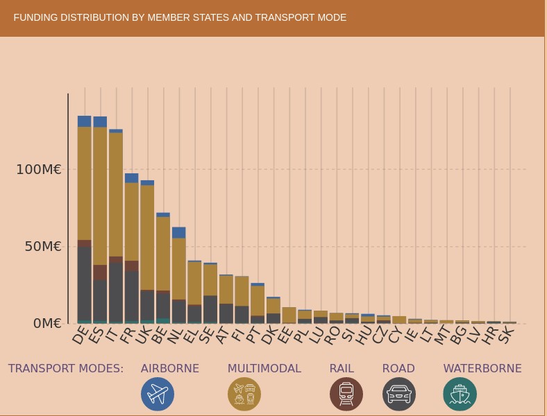
TRIMIS maintains an up-to-date dashboard to visualise data on transport research and innovation and provides an overview and detailed data on the funding and organisations involved in this research. The information can be filtered by the seven STRIA priorities and also includes data on the innovation capacity of the transport sector.
If we look at the geographical distribution of research funds provided by TRIMIS, we see that Spain appears in fifth place, far behind Germany and France. The transport systems in which the greatest effort is being made are road and air transport, beneficiaries of more than half of the total effort.
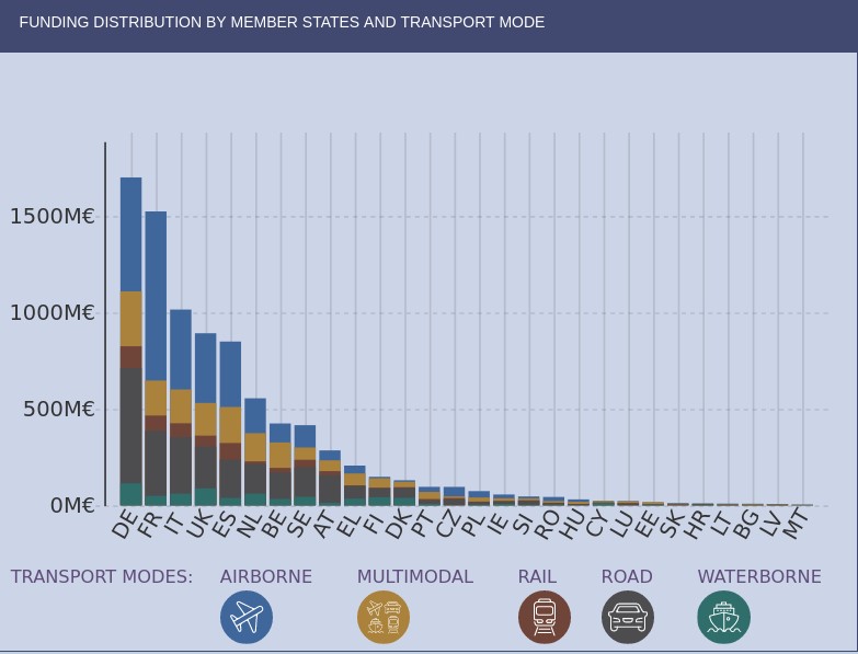
However, we find that in the strategic area of Smart Mobility and Services (SMO), which are evaluated in terms of their contribution to the overall sustainability of the energy and transport system, Spain is leading the research effort at the same level as Germany. It should also be noted that the effort being made in Spain in terms of multimodal transport is higher than in other countries.
As an example of the research effort being carried out in Spain, we have the pilot dataset to implement semantic capabilities on traffic incident information related to safety on the Spanish state road network, except for the Basque Country and Catalonia, which is published by the General Directorate of Traffic and which uses an ontology to represent traffic incidents developed by the University of Valencia.
The area of intelligent mobility systems and services aims to contribute to the decarbonisation of the European transport sector and its main priorities include the development of systems that connect urban and rural mobility services and promote modal shift, sustainable land use, travel demand sufficiency and active and light travel modes; the development of mobility data management solutions and public digital infrastructure with fair access or the implementation of intermodality, interoperability and sectoral coupling.
The 100 mobility questions initiative
The 100 Questions Initiative, launched by The Govlab in collaboration with Schmidt Futures, aims to identify the world's 100 most important questions in a number of domains critical to the future of humanity, such as gender, migration or air quality.
One of these domains is dedicated precisely to transport and urban mobility and aims to identify questions where data and data science have great potential to provide answers that will help drive major advances in knowledge and innovation on the most important public dilemmas and the most serious problems that need to be solved.
In accordance with the methodology used, the initiative completed the fourth stage on 28 July, in which the general public voted to decide on the final 10 questions to be addressed. The initial 48 questions were proposed by a group of mobility experts and data scientists and are designed to be data-driven and planned to have a transformative impact on urban mobility policies if they can be solved.
In the next stage, the GovLab working group will identify which datasets could provide answers to the selected questions, some as complex as "where do commuters want to go but really can't and what are the reasons why they can't reach their destination easily?" or "how can we incentivise people to make trips by sustainable modes, such as walking, cycling and/or public transport, rather than personal motor vehicles?"
Other questions relate to the difficulties encountered by reusers and have been frequently highlighted in research articles such as "Open Transport Data for maximising reuse in multimodal route": "How can transport/mobility data collected with devices such as smartphones be shared and made available to researchers, urban planners and policy makers?"
In some cases it is foreseeable that the datasets needed to answer the questions may not be available or may belong to private companies, so an attempt will also be made to define what new datasets should be generated to help fill the gaps identified. The ultimate goal is to provide a clear definition of the data requirements to answer the questions and to facilitate the formation of data collaborations that will contribute to progress towards these answers.
Ultimately, changes in the way we use transport and lifestyles, such as the use of smartphones, mobile web applications and social media, together with the trend towards renting rather than owning a particular mode of transport, have opened up new avenues towards sustainable mobility and enormous possibilities in the analysis and research of the data captured by these applications.
Global initiatives to coordinate research efforts are therefore essential as cities need solid knowledge bases to draw on for effective policy decisions on urban development, clean transport, equal access to economic opportunities and quality of life in urban centres. We must not forget that all this knowledge is also key to proper prioritisation so that we can make the best use of the scarce public resources that are usually available to meet the challenges.
Content written by Jose Luis Marín, Senior Consultant in Data, Strategy, Innovation & Digitalization.
The contents and views reflected in this publication are the sole responsibility of the author.
Noticia
There are only a few days left until the end of summer and, as with every change of season, it is time to review what the last three months have brought in the Spanish open data ecosystem.
In July we learned of the latest edition of the European Commission's DESI (Digital Economy and Society Index) report, which places Spain ahead of the EU average in digital matters. Our country is in seventh position, improving two places compared to 2021. One of the areas where it performs best is in open data, where it ranks third. These good data are the result of the fact that an increasing number of organisations are committed to opening up the information they hold and more reusers are taking advantage of this data to create valuable products and services, as we will see below.
Advances in strategy and agreements to promote open data
Open data is gaining ground in political strategies at national, regional and local level.
In this regard, in July the Council of Ministers approved the draft Act on the Digital Efficiency of the Public Justice Service, an initiative that seeks to build a more accessible Justice Administration, promoting the data orientation of its systems. Among other issues, this act incorporates the concept of "open data" in the Administration of Justice.
Another example, this time at the regional level, comes from the Generalitat de Valencia, which launched a new Open Data Strategy at the beginning of the summer with the aim of offering quality public information, by design and by default.
We have also witnessed the signing of collaboration agreements to boost the open data ecosystem, for example:
- The Ajuntament de L'Hospitalet and the Universitat Politècnica de Catalunya have signed an agreement to offer training to undergraduate and master's degree students in Big Data and Artificial Intelligence, based on open data work.
- The University of Castilla la Mancha has agreed with the regional government to launch the 'Open Government' chair in order to promote higher education and research in areas such as transparency, open data or access to public information.
- The National Centre for Geographic Information (CNIG) and Asedie have signed a new protocol to improve access to geographic information, in order to promote openness, access and reuse of public sector information.
Examples of data reuse
The summer of 2022 will be remembered for the heat waves and fires that have ravaged different corners of the country. A context in which open data has demonstrated its power to provide information on the state of the situation and help in extinguishing fires. Data from Copernicus or the State Meteorological Agency (AEMET) have been used to monitor the situation and make decisions. These data sources, together with others, are also being used to understand the consequences of low rainfall and high temperatures on European reservoirs. In addition, these data have been used by the media to provide the public with the latest information on the evolution of the fires.
Firefighting based on open data has also been developed at the regional level. For example, the Government of Navarre has launched Agronic, a tool that works with Spatial Data Infrastructures of Navarre to prevent fires caused by harvesters. For its part, the Barcelona Provincial Council's open data portal has published datasets with "essential information" for the prevention of forest fires. These include the network of water points, low combustibility strips and forest management actions, used by public bodies to draw up plans to deal with fire.
Other examples of the use of open data that we have seen during this period are:
- The Environmental Radiological Surveillance Network of the Generalitat de Catalunya has developed, from open data, a system to monitor the radiation present in the environment of the nuclear power plants (Vandellòs and Ascó) and the rest of the Catalan territory.
- Thanks to the open data shared by Aragón Open Data, a new scientific article on Covid-19 has been written with the aim of finding out and identifying spatio-temporal patterns in relation to the incidence of the virus and the organisation of health resources.
- The Barcelona Open Data initiative has launched #DataBretxaWomen, a project that seeks to raise public awareness of the existing inequality between men and women in different sectors.
- Maldito dato has used open data from the statistics developed by the National Statistics Institute (INE) based on mobile positioning data to show how the population density of different Spanish municipalities changes during July and August.
- Within its Data Analytics for Research and Innovation in Health Programme, Catalonia has prioritised 8 proposals for research based on data analysis. These include studies on migraines, psychosis and heart disease.
Developments in open data platforms
Summer has also been the time chosen by different organisations to launch or update their open data platforms. Examples include:
- The Statistical Institute of Navarre launched a new web portal, with more dynamic and attractive visualisations. In the process of creation, they have managed to automate statistical production and integrate all the data in a single environment.
- Zaragoza City Council has also just published a new open data portal that offers all municipal information in a clearer and more concise way. This new portal has been agreed with other city councils as part of the 'Open Cities' project.
- Another city that already has an open data portal is Cadiz. Its City Council has launched a platform that will allow the people of Cadiz to know, access, reuse and redistribute the open data present in the city.
- The Valencian Institute of Business Competitiveness (IVACE) presented an open data portal with all the records of energy certification of buildings in the Valencian Community since 2011. This will allow, among other actions, to carry out consumption analysis and establish rehabilitation strategies.
- Aragón Open Data has included a new functionality in its API that allows users to obtain geographic data in GeoJSON format.
- The National Geographic Institute announced a new version of the earthquake app, with new features, educational content and information.
- The Ministry for Ecological Transition and the Demographic Challenge presented SIDAMUN, a platform that facilitates access to territorial statistical information based on municipal data.
- The open data portal of the Government of the Canary Islands launched a new search engine that makes it possible to locate the pages of the portal using metadata, and which allows exporting in CVS, ODS or PDF.
Some organisations have taken advantage of the summer to announce new developments that will see the light of day in the coming months, such as the Xunta de Galicia, which is making progress in the development of a Public Health Observatory through an open data platform, Burgos City Council, which will launch an open data portal, and the Pontevedra Provincial Council, which will soon launch a real-time budget viewer.
Actions to promote open data
In June we met the finalists of the IV Aporta Challenge: "The value of data for the health and well-being of citizens", the final of which will be held in October. In addition, some competitions have been launched in recent months to promote the reuse of open data, for which the registration period is still open, such as the Castilla y León competition or the first UniversiData Datathon. The Euskadi open data competition was also launched and is currently in the evaluation phase.
With regard to events, the summer started with the celebration of the Open Government Week, which brought together various activities, some of them focused on data. If you missed it, some organisations have made materials available to citizens. For example, you can watch the video of the colloquium "Open data with a gender perspective: yes or yes" promoted by the Government of the Canary Islands or access the webinar presentations to learn about the Data Office and the Aporta Initiative.
Other events that have been held with the participation of the Data Office and whose videos are public are: the National Congress on Archives and Electronic Documents and the Data Spaces as ecosystems for entities to reach further.
Finally, in the field of training, some examples of courses that have been launched these months are:
- The National Geographic Institute has launched an Inter-administrative Training Plan, with the aim of generating a common culture among all the experts in Geographic Information of the public bodies.
- Andalucía Vuela has launched a series of free training courses aimed at citizens interested in data or artificial intelligence.
International News
The summer has also brought many new developments at the international level. Some examples are:
- The beginning of the meteorological summer saw the publication of the results of the first edition of the Global Data Barometer, which measures the state of data with respect to societal issues such as Covid19 or climate.
- The 12 finalists of the Eu Datathon 2022 were also announced.
- An interactive edition of Eurostat's regional yearbook 2021 was published.
- England has developed a strategy to harness the potential of data in health and healthcare in a secure, reliable and transparent way.
This is just a selection of news among all the developments in the open data ecosystem over the last three months. If you would like to make a contribution, feel free to leave us a message in the comments or write to dinamizacion@datos.gob.es.
Evento
For yet another year since 2016, the Junta de Castilla y León has opened the deadline to receive the most innovative proposals in the field of open data. The sixth edition of the competition of the same name aims to "recognise the development of projects that provide any type of idea, study, service, website or application for mobile devices, using datasets from the Open Data Portal of the Junta de Castilla y León".
With this type of initiative, Castilla y León seeks to showcase the digital talent present in the autonomous community, while promoting the use of open data and the role of reusing companies in Castilla y León.
The deadline for submitting applications has been open since 5 August and will end on 4 October. When submitting projects, participants will be able to choose between the in-person or digital option. The latter will be carried out through the Electronic Headquarters of Castilla y León and can be processed by both individuals and legal entities.
4 different categories
As in previous editions, the projects and associated prizes are divided into four different categories:
- “Ideas" category: This category includes projects that describe an idea that can be used to create studies, services, websites or applications for mobile devices. The main requirement is to use datasets from the Junta de Castilla y León's Open Data portal.
- "Products and Services" category: Includes those that provide studies, services, websites or applications for mobile devices and that use datasets from the Open Data portal of the Junta de Castilla y León, which are accessible to all citizens via the web using an URL.
- “Didactic Resource" category: This section includes the creation of new and innovative open didactic resources (published under Creative Commons licences) that use datasets from the Junta de Castilla y León's Open Data portal, and serve to support teaching in the classroom.
- “Data Journalism" category: Finally, this category includes journalistic pieces published or updated (in a relevant way) in any medium (written or audiovisual) that use datasets from the Junta de Castilla y León's Open Data portal.
Regarding the awards of this sixth edition, the prizes amount to €12,000 and are distributed according to the category awarded and the position achieved.
Ideas category
- First prize €1,500
- Second prize €500
Products and Services category
- First prize €2,500
- Second prize €1,500
- Third prize €500
- Student Prize €1,500
Didactic Resource category
- First prize €1,500
Data Journalism category
- First prize €1,500
- Second prize €1,000
As in previous editions, the final verdict will be issued by a jury made up of members with proven experience in the field of open data, information analysis or the digital economy. Likewise, the jury's decisions will be taken by majority vote and, in the event of a tie, the jury will decide who holds the presidency.
Finally, the winners will have a period of 5 working days to accept the award. If they do not accept the prize, it will be understood that they have renounced it. If you want to consult the conditions and legal bases of the competition in detail, you can access them through this link.
Winners of the 2021 edition
The 5th edition of the Castilla y León Data Competition had a total of 37 proposals of which only eight of them won some kind of award. With a view to participating in the current edition, it may be of interest to know which projects won the jury's attention in 2021.
Ideas Category
The first prize of €1,500 went to APP SOLAR-CYL, a web tool for optimal sizing of photovoltaic solar self-consumption installations. Aimed at both citizens and public administration energy managers, the solution aims to support the analysis of the technical and economic viability of this type of system.
Products and Services Category
Repuéblame is a website aimed at rediscovering the best places in which to live or telework. In this way, the app catalogues the municipalities of Castilla y León based on a series of numerical indicators, developed in-house, related to quality of life. By winning the first prize in this category, it received a cash prize of 2,500 euros.
Data Journalism Category
Asociación Maldita contra la desinformación won the first prize of €1,500 for its project MAPA COVID-19: see how many cases of coronavirus there are and how busy your hospital is.
Finally, after the jury decided that the entries submitted did not meet the criteria set out in the rules, the "Educational Resource" category was declared void and, therefore, none of the participants were awarded a prize.
If you have any questions or queries about the competition, you can write an email to: datosabiertos@jcyl.es.
Documentación
1. Introduction
Visualizations are graphical representations of data that allow the information linked to them to be communicated in a simple and effective way. The visualization possibilities are very broad, from basic representations such as line, bar or pie chart, to visualizations configured on control panels or interactive dashboards. Visualizations play a fundamental role in drawing conclusions from visual information, allowing detection of patterns, trends, anomalous data or projection of predictions, among many other functions.
Before starting to build an effective visualization, a prior data treatment must be performed, paying special attention to their collection and validation of their content, ensuring that they are in a proper and consistent format for processing and free of errors. The previous data treatment is essential to carry out any task related to data analysis and realization of effective visualizations.
In the section “Visualizations step-by-step” we are periodically presenting practical exercises on open data visualizations that are available in datos.gob.es catalogue and other similar catalogues. In there, we approach and describe in a simple way the necessary steps to obtain data, perform transformations and analysis that are relevant to creation of interactive visualizations from which we may extract information in the form of final conclusions.
In this practical exercise we have performed a simple code development which is conveniently documented, relying on free tools.
Access the Data Lab repository on Github.
Run the data pre-processing code on Google Colab.
2. Objetives
The main objective of this post is to learn how to make an interactive visualization using open data. For this practical exercise we have chosen datasets containing relevant information on national reservoirs. Based on that, we will analyse their state and time evolution within the last years.
3. Resources
3.1. Datasets
For this case study we have selected datasets published by Ministry for the Ecological Transition and Demographic Challenge, which in its hydrological bulletin collects time series data on the volume of water stored in the recent years in all the national reservoirs with capacity greater than 5hm3. Historical data on the volume of stored water are available at:
Furthermore, a geospatial dataset has been selected. During the search, two possible input data files have been found, one that contains geographical areas corresponding to the reservoirs in Spain and one that contains dams, including their geopositioning as a geographic point. Even though they are not the same thing, reservoirs and dams are related and to simplify this practical exercise, we choose to use the file containing the list of dams in Spain. Inventory of dams is available at: https://www.mapama.gob.es/ide/metadatos/index.html?srv=metadata.show&uuid=4f218701-1004-4b15-93b1-298551ae9446
This dataset contains geolocation (Latitude, Longitude) of dams throughout Spain, regardless of their ownership. A dam is defined as an artificial structure that limits entirely or partially a contour of an enclosure nestled in terrain and is destined to store water within it.
To generate geographic points of interest, a processing has been executed with the usage of QGIS tool. The steps are the following: download ZIP file, upload it to QGIS and save it as CSV, including the geometry of each element as two fields specifying its position as a geographic point (Latitude, Longitude).
Also, a filtering has been performed, in order to extract the data related to dams of reservoirs with capacity greater than 5hm3.
3.2. Tools
To perform data pre-processing, we have used Python programming language in the Google Colab cloud service, which allows the execution of JNotebooks de Jupyter.
Google Colab, also called Google Colaboratory, is a free service in the Google Research cloud which allows to program, execute and share a code written in Python or R through the browser, as it does not require installation of any tool or configuration.
Google Data Studio tool has been used for the creation of the interactive visualization.
Google Data Studio in an online tool which allows to create charts, maps or tables that can be embedded on websites or exported as files. This tool is easy to use and permits multiple customization options.
If you want to know more about tools that can help you with data treatment and visualization, see the report “Data processing and visualization tools”.
4. Enriquecimiento de los datos
In order to provide more information about each of the dams in the geospatial dataset, a process of data enrichment is carried out, as explained below.
To do this, we will focus on OpenRefine, which is a useful tool for this type of tasks. This open source tool allows to perform multiple data pre-processing actions, although at that point we will use it to conduct enrichment of our data by incorporation of context, automatically linking information that resides in a popular knowledge repository, Wikidata.
Once the tool is installed and launched on computer, a web application will open in the browser. In case this doesn´t happen, the application may be accessed by typing http://localhost:3333 in the browser´s search bar.
Steps to follow:
- Step 1: Upload of CSV to the system (Figure 1).

Figure 1 – Upload of a CSV file to OpenRefine
- Step 2: Creation of a project from uploaded CSV (Figure 2). OpenRefine is managed through projects (each uploaded CSV will become a project) that are saved for possible later use on a computer where OpenRefine is running. At this stage it´s required to name the project and some other data, such as the column separator, though the latter settings are usually filled in automatically.

Figure 2 – Creation of a project in OpenRefine
- Step 3: Linkage (or reconciliation, according to the OpenRefine nomenclature) with external sources. OpenRefine allows to link the CSV resources with external sources, such as Wikidata. For this purpose, the following actions need to be taken (steps 3.1 to 3.3):
- Step 3.1: Identification of the columns to be linked. This step is commonly based on analyst´s experience and knowledge of the data present in Wikidata. A tip: usually, it is feasible to reconcile or link the columns containing information of global or general character, such as names of countries, streets, districts, etc. and it´s not possible to link columns with geographic coordinates, numerical values or closed taxonomies (e.g. street types). In this example, we have found a NAME column containing name of each reservoir that can serve as a unique identifier for each item and may be a good candidate for linking
- Step 3.2: Start of reconciliation. As indicated in figure 3, start reconciliation and select the only available source: Wikidata(en). After clicking Start Reconciling, the tool will automatically start searching for the most suitable vocabulary class on Wikidata, based on the values from the selected column.

Figure 3 – Start of the reconciliation process for the NAME column in OpenRefine
- Step 3.3: Selection of the Wikidata class. In this step reconciliation values will be obtained. In this case, as the most probable value, select property “reservoir”, which description may be found at https://www.wikidata.org/wiki/Q131681 and it corresponds to the description of an “artificial lake to accumulate water”. It´s necessary to click again on Start Reconciling.
OpenRefine offers a possibility of improving the reconciliation process by adding some features that allow to target the information enrichment with higher precision. For that purpose, adjust property P4568, which description matches the identifier of a reservoir in Spain within SNCZI-IPE, as it may be seen in the figure 4.

Figure 4 – Selection of a Wikidata class that best represents the values on NAME column
- Step 4: Generation of a column with reconciled or linked values. To do that, click on the NAME column and go to “Edit column → Add column based in this column”. A window will open where a name of the new column must be specified (in this case, WIKIDATA_RESERVOIR). In the expression box introduce: “http://www.wikidata.org/entity/”+cell.recon.match.id, so the values will be displayed as it´s previewed in figure 6. “http://www.wikidata.org/entity/” is a fixed text string that represents Wikidata entities, while the reconciled value of each of the values we obtain through the command cell.recon.match.id, that is, cell.recon.match.id(“ALMODOVAR”) = Q5369429.
Launching described operation will result in generation of a new column with those values. Its correctness may be confirmed by clicking on one of the new column cells, as it should redirect to a Wikidata web page containing information about reconciled value.
Repeat the process to add other type of enriched information as a reference for Google and OpenStreetMap.

Figure 5 – Generation of Wikidata entities through a reconciliation within a new column.
- Step 5: Download of enriched CSV. Go to the function Export → Custom tabular exporter placed in the upper right part of the screen and select the features indicated in Figure 6.

Figure 6 – Options of CSV file download via OpenRefine
5. Data pre-processing
During the pre-processing it´s necessary to perform an exploratory data analysis (EDA) in order to interpret properly the input data, detect anomalies, missing data and errors that could affect the quality of subsequent processes and results, in addition to realization of the transformation tasks and preparation of the necessary variables. Data pre-processing is essential to ensure the reliability and consistency of analysis or visualizations that are created afterwards. To learn more about this process, see A Practical Introductory Guide to Exploratory Data Analysis.
The steps involved in this pre-processing phase are the following:
- Installation and import of libraries
- Import of source data files
- Modification and adjustment of variables
- Prevention and treatment of missing data (NAs)
- Generation of new variables
- Creation of a table for visualization “Historical evolution of water reserve between the years 2012-2022”
- Creation of a table for visualization “Water reserve (hm3) between the years 2012-2022”
- Creation of a table for visualization “Water reserve (%) between the years 2012-2022”
- Creation of a table for visualization “Monthly evolution of water reserve (hm3) for different time series”
- Saving the tables with pre-processed data
You may reproduce this analysis, as the source code is available in the GitHub repository. The way to provide the code is through a document made on Jupyter Notebook which once loaded to the development environment may be easily run or modified. Due to the informative nature of this post and its purpose to support learning of non-specialist readers, the code is not intended to be the most efficient but rather to be understandable. Therefore, it´s possible that you will think of many ways of optimising the proposed code to achieve a similar purpose. We encourage you to do it!
You may follow the steps and run the source code on this notebook in Google Colab.
6. Data visualization
Once the data pre-processing is done, we may move on to interactive visualizations. For this purpose, we have used Google Data Studio. As it´s an online tool, it´s not necessary to install software to interact or generate a visualization, but it´s required to structure adequately provided data tables.
In order to approach the process of designing the set of data visual representations, the first step is to raise the questions that we want to solve. We suggest the following:
-
What is the location of reservoirs within the national territory?
-
Which reservoirs have the largest and the smallest volume of water (water reserve in hm3) stored in the whole country?
-
Which reservoirs have the highest and the lowest filling percentage (water reserve in %)?
-
What is the trend of the water reserve evolution within the last years?
Let´s find the answers by looking at the data!
6.1. Geographic location and main information on each reservoir
This visual representation has been created with consideration of geographic location of reservoirs and distinct information associated with each one of them. For this task, a table “geo.csv” has been generated during the data pre-processing.
Location of reservoirs in the national territory is shown on a map of geographic points.
Once the map is obtained, you may access additional information about each reservoir by clicking on it. The information will display in the table below. Furthermore, an option of filtering by hydrographic demarcation and by reservoir is available through the drop-down tabs.
View the visualization in full screen
6.2. Water reserve between the years 2012-2022
This visual representation has been made with consideration of water reserve (hm3) per reservoir between the years 2012 (inclusive) and 2022. For this purpose, a table “volumen.csv” has been created during the data pre-processing.
A rectangular hierarchy chart displays intuitively the importance of each reservoir in terms of volumn stored within the national total for the time period indicated above.
Ones the chart is obtained, an option of filtering by hydrographic demarcation and by reservoir is available through the drop-down tabs.
View the visualization in full screen
6.3. Water reserve (%) between the years 2012-2022
This visual representation has been made with consideration of water reserve (%) per reservoir between the years 2012 (inclusive) and 2022. For this task, a table “porcentaje.csv” has been generated during the data pre-processing.
The percentage of each reservoir filling for the time period indicated above is intuitively displayed in a bar chart.
Ones the chart is obtained, an option of filtering by hydrographic demarcation and by reservoir is available through the drop-down tabs.
View the visualization in ful screen
6.4. Historical evolution of water reserve between the years 2012-2022
This visual representation has been made with consideration of water reserve historical data (hm3 and %) per reservoir between the years 2012 (inclusive) and 2022. For this purpose, a table “lineas.csv” has been created during the data pre-processing.
Line charts and their trend lines show the time evolution of the water reserve (hm3 and %).
Ones the chart is obtained, modification of time series, as well as filtering by hydrographic demarcation and by reservoir is possible through the drop-down tabs.
View the visualization in full screen
6.5. Monthly evolution of water reserve (hm3) for different time series
This visual representation has been made with consideration of water reserve (hm3) from distinct reservoirs broken down by months for different time series (each year from 2012 to 2022). For this purpose, a table “lineas_mensual.csv” has been created during the data pre-processing.
Line chart shows the water reserve month by month for each time series.
Ones the chart is obtained, filtering by hydrographic demarcation and by reservoir is possible through the drop-down tabs. Additionally, there is an option to choose time series (each year from 2012 to 2022) that we want to visualize through the icon appearing in the top right part of the chart.
View the visualization in full screen
7. Conclusions
Data visualization is one of the most powerful mechanisms for exploiting and analysing the implicit meaning of data, independently from the data type and the user´s level of the technological knowledge. Visualizations permit to create meaningful data and narratives based on a graphical representation. In the set of implemented graphical representations the following may be observed:
-
A significant trend in decreasing the volume of water stored in the reservoirs throughout the country between the years 2012-2022.
-
2017 is the year with the lowest percentage values of the total reservoirs filling, reaching less than 45% at certain times of the year.
-
2013 is the year with the highest percentage values of the total reservoirs filling, reaching more than 80% at certain times of the year.
It should be noted that visualizations have an option of filtering by hydrographic demarcation and by reservoir. We encourage you to do it in order to draw more specific conclusions from hydrographic demarcation and reservoirs of your interest.
Hopefully, this step-by-step visualization has been useful for the learning of some common techniques of open data processing and presentation. We will be back to present you new reuses. See you soon!