29 posts found
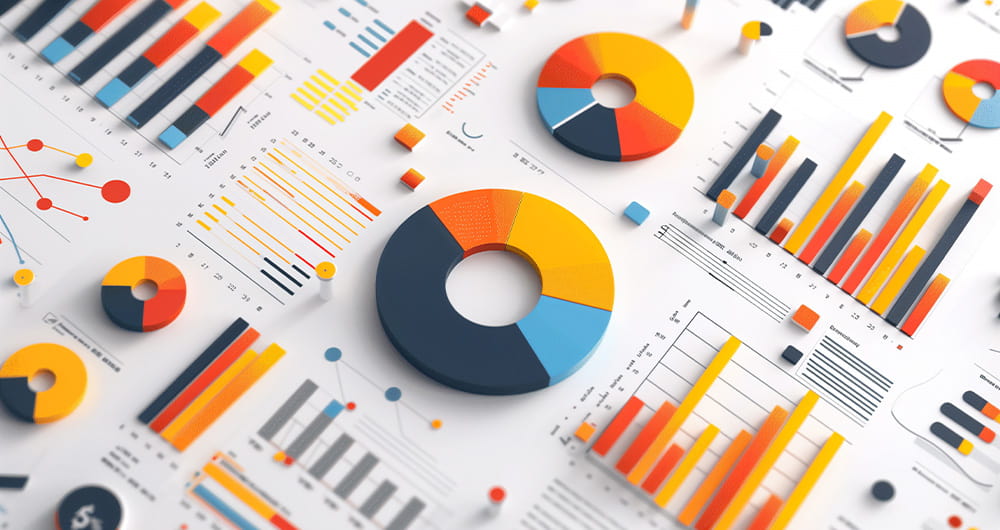
Benefits and opportunities of public initiatives for open data visualisation
Imagine you want to know how many terraces there are in your neighbourhood, how the pollen levels in the air you breathe every day are evolving or whether recycling in your city is working well. All this information exists in your municipality's databases, but it sits in spreadsheets and technical d…
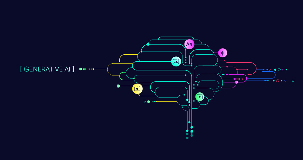
SLM, LLM, RAG and Fine-tuning: Pillars of Modern Generative AI
In the fast-paced world of Generative Artificial Intelligence (AI), there are several concepts that have become fundamental to understanding and harnessing the potential of this technology. Today we focus on four: Small Language Models(SLM), Large Language Models(LLM), Retrieval Augmented Generation…
RAG techniques: how they work and examples of use cases
In recent months we have seen how the large language models (LLMs ) that enable Generative Artificial Intelligence (GenAI) applications have been improving in terms of accuracy and reliability. RAG (Retrieval Augmented Generation) techniques have allowed us to use the full power of n…

How to improve data visualisation: the example of the European drugs report
The European Drug Report provides a current overview of the drug situation in the region, analysing the main trends and emerging threats. It is a valuable publication, with a high number of downloads, which is quoted in many media outlets.
The report is produced annually by the Europe…
How Artificial Intelligence and Open Data can re-imagine our cultural future
We are currently in the midst of an unprecedented race to master innovations in Artificial Intelligence. Over the past year, the star of the show has been Generative Artificial Intelligence (GenAI), i.e., that which is capable of generating original and creative content such as images, text or music…

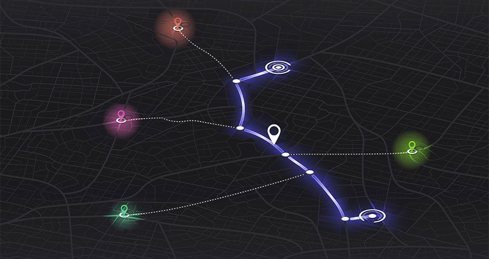
Our first digital navigation. Open source alternatives to Google Maps
In the vast technological landscape, few tools have made as deep a mark as Google Maps. Since its inception, this application has become the standard for finding and navigating points of interest on maps. But what happens when we look for options beyond the ubiquitous map application? In this post w…
Data visualization: the best charts for representing comparisons
Data is a valuable source of knowledge for society. Public commitment to achieving data openness, public-private collaboration on data, and the development of applications with open data are actions that are part of the data economy, which seeks the innovative, ethical, and practical use of data to…

GPT-3 chat: we programmed a data visualisation in R with the trending AI
Talking about GPT-3 these days is not the most original topic in the world, we know it. The entire technology community is publishing examples, holding events and predicting the end of the world of language and content generation as we know it today. In this post, we ask ChatGPT to help us in progra…

Open data as a source of knowledge for generative artificial intelligence
Generative artificial intelligence refers to machine’s ability to generate original and creative content, such as images, text or music, from a set of input data. As far as text generation is concerned, these models have been accessible, in an experimental format, for some time, but began to generat…

How to choose the right chart to visualise open data
A statistical graph is a visual representation designed to contain a series of data whose objective is to highlight a specific part of the reality. However, organising a set of data in an informative way is not an easy task, especially, if we want to capture the viewer’s attention and to present the…
