22 posts found
Applications of artificial intelligence in professional sports
Sport has always been characterized by generating a lot of data, statistics, graphs... But accumulating figures is not enough. It is necessary to analyze the data, draw conclusions and make decisions based on it. The advantages of sharing data in this sector go beyond mere sports, having a positive…

Benefits and opportunities of public initiatives for open data visualisation
Imagine you want to know how many terraces there are in your neighbourhood, how the pollen levels in the air you breathe every day are evolving or whether recycling in your city is working well. All this information exists in your municipality's databases, but it sits in spreadsheets and technical d…
How to improve data visualisation: the example of the European drugs report
The European Drug Report provides a current overview of the drug situation in the region, analysing the main trends and emerging threats. It is a valuable publication, with a high number of downloads, which is quoted in many media outlets.
The report is produced annually by the Europe…
The benefits of sharing sport-related data
In the digital age, data has become an invaluable tool in almost all areas of society, and the world of sport is no exception. The availability of data related to this field can have a positive impact on the promotion of health and wellbeing, as well as on the improvement of physical performance of…

Our first digital navigation. Open source alternatives to Google Maps
In the vast technological landscape, few tools have made as deep a mark as Google Maps. Since its inception, this application has become the standard for finding and navigating points of interest on maps. But what happens when we look for options beyond the ubiquitous map application? In this post w…

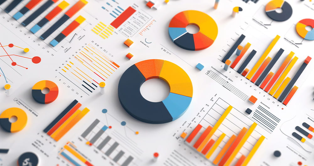
Data visualization: the best charts for representing comparisons
Data is a valuable source of knowledge for society. Public commitment to achieving data openness, public-private collaboration on data, and the development of applications with open data are actions that are part of the data economy, which seeks the innovative, ethical, and practical use of data to…

GPT-3 chat: we programmed a data visualisation in R with the trending AI
Talking about GPT-3 these days is not the most original topic in the world, we know it. The entire technology community is publishing examples, holding events and predicting the end of the world of language and content generation as we know it today. In this post, we ask ChatGPT to help us in progra…

How to choose the right chart to visualise open data
A statistical graph is a visual representation designed to contain a series of data whose objective is to highlight a specific part of the reality. However, organising a set of data in an informative way is not an easy task, especially, if we want to capture the viewer’s attention and to present the…

Artificial Intelligence applied to the identification and classification of diseases detected by radiodiagnosis
In this post we have described step-by-step a data science exercise in which we try to train a deep learning model with a view to automatically classifying medical images of healthy and sick people.
Diagnostic imaging has been around for many years in the hospitals of develo…

11 libraries for creating data visualisations
Programming libraries are sets of code files that are used to develop software. Their purpose is to facilitate programming by providing common functionalities that have already been solved by other programmers.
Libraries are an essential component for developers to be able to program in a simple way…