23 posts found
Benefits and opportunities of public initiatives for open data visualisation
Imagine you want to know how many terraces there are in your neighbourhood, how the pollen levels in the air you breathe every day are evolving or whether recycling in your city is working well. All this information exists in your municipality's databases, but it sits in spreadsheets and technical d…
How to improve data visualisation: the example of the European drugs report
The European Drug Report provides a current overview of the drug situation in the region, analysing the main trends and emerging threats. It is a valuable publication, with a high number of downloads, which is quoted in many media outlets.
The report is produced annually by the Europe…
High-value meteorological datasets
The cross-cutting nature of open data on weather and climate data has favoured its use in areas as diverse as precision agriculture, fire prevention or the precision forestry. But the relevance of these datasets lies not only in their direct applicability across multiple industries, but also in thei…

Complying with Europe. The Mobility High Value Datasets Regulation
Spain, as part of the European Union, is committed to the implementation of the European directives on open data and re-use of public sector information. This includes the adoption of initiatives such as the Implementing Regulation (EU) 2023/138 issued by the European Commission, whic…

Complying with Europe. The High Value Sites of Earth Observation and Environment Regulation
The European Commission Implementing Regulation (EU) 2023/138 sets clear guidelines for public bodies on the availability of high-value datasets within 16 months from 20 January 2023. These high-value high value datasets (High value datasets or HVD) are grouped into the following themes, which were…

Our first digital navigation. Open source alternatives to Google Maps
In the vast technological landscape, few tools have made as deep a mark as Google Maps. Since its inception, this application has become the standard for finding and navigating points of interest on maps. But what happens when we look for options beyond the ubiquitous map application? In this post w…

Data visualization: the best charts for representing comparisons
Data is a valuable source of knowledge for society. Public commitment to achieving data openness, public-private collaboration on data, and the development of applications with open data are actions that are part of the data economy, which seeks the innovative, ethical, and practical use of data to…

GPT-3 chat: we programmed a data visualisation in R with the trending AI
Talking about GPT-3 these days is not the most original topic in the world, we know it. The entire technology community is publishing examples, holding events and predicting the end of the world of language and content generation as we know it today. In this post, we ask ChatGPT to help us in progra…

How to choose the right chart to visualise open data
A statistical graph is a visual representation designed to contain a series of data whose objective is to highlight a specific part of the reality. However, organising a set of data in an informative way is not an easy task, especially, if we want to capture the viewer’s attention and to present the…

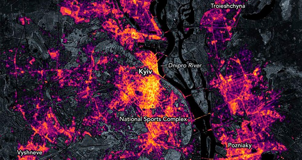
Collecting and analysing data to improve humanitarian assistance and restore damage during the Ukrainian war
On 24 February Europe entered a scenario that not even the data could have predicted: Russia invaded Ukraine, unleashing the first war on European soil so far in the 21st century.
Almost five months later, on 26 September, the United Nations (UN) published its official figures: 4,889 dead and 6,263…